 Open UI
Combobox (Explainer)
- @sudheer-gowrgiari, @gregwhitworth
- Last updated: May 1, 2024
- Feedback: https://github.com/openui/open-ui/issues/924
Table of Contents
- Background and scope of this document
- Anatomy
- Default Behavior
- Combobox with selectedoption/optgroup
- Introducing filter attribute
- Introducing search attribute
- Future: Introduction of multiple attribute
- Keyboard Behavior
- Key decisions
- Appendix
Background and scope of this document
Background
From the early days of the web, form controls have been pivotal in creating interactive and dynamic user experiences. Elements like <input>, <button>, and <select> were foundational, offering basic interactivity. As the web matured, so did the demands of web designers and developers. They sought more versatile and customizable controls to cater to a myriad of designs and functionalities.
The <select> element, for instance, while functional, lacks flexibility. It offers limited customization, which often leads developers to craft their own solutions. These custom implementations, while visually appealing, often come at the cost of performance, reliability, and most importantly, accessibility.
To address these limitations, the concept of a Stylable Select Element has emerged. This element, inspired by the traditional <select> but with enhanced flexibility and customizability, allows developers to create button-triggered dropdowns with unique appearances and behaviors. Paired with <datalist> and including <option> and <optgroup> for structuring choices, the Stylable Select Element presents a modern, adaptable, and accessible solution for web controls.
Right now, many websites have their own type of ‘combobox’, but they’re all a bit different. We often see a mix of <input> fields and <datalist> elements trying to do the job, but it’s not quite perfect. By creating a standard <combobox>, we’re aiming to simplify things.
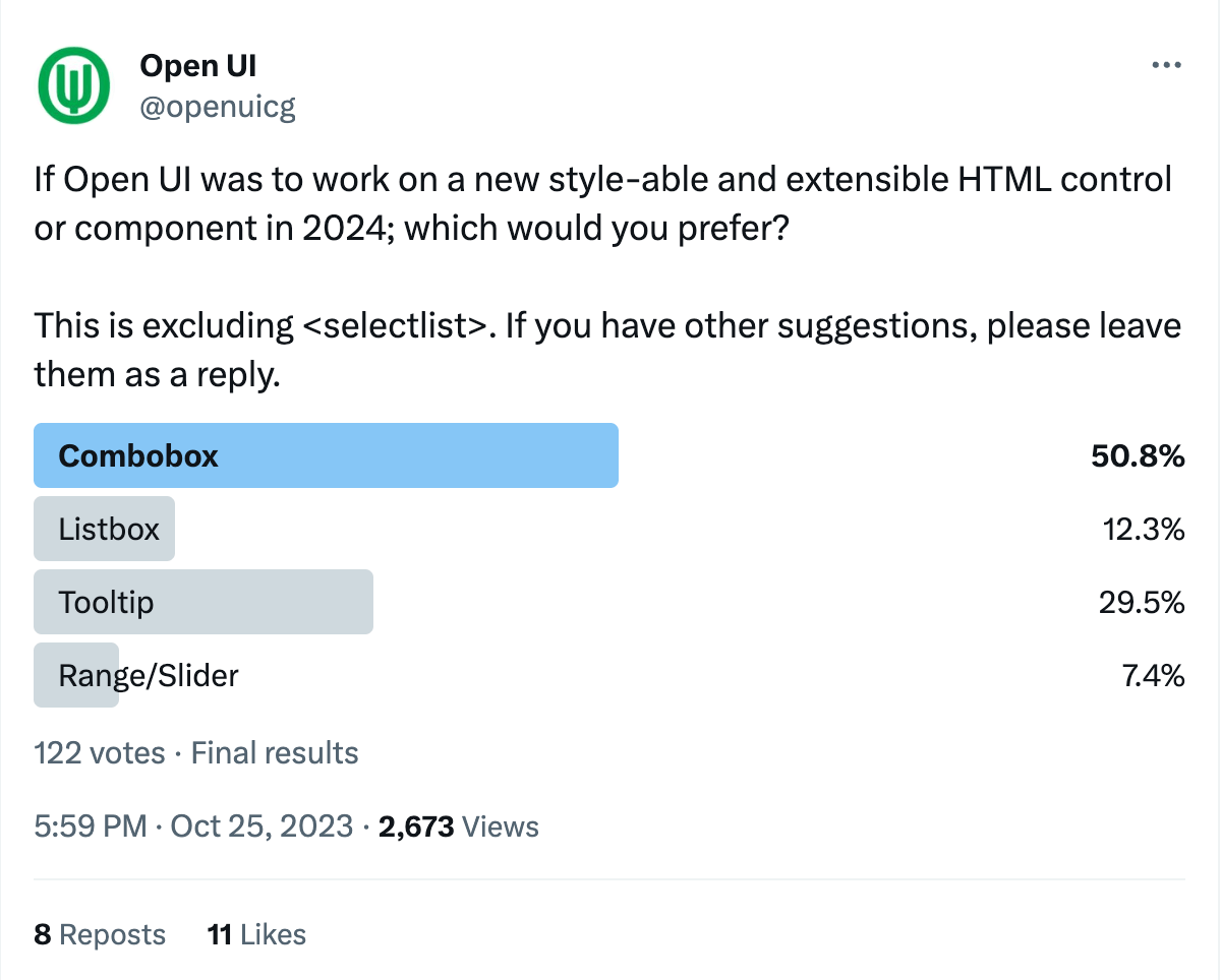
Further highlighting the need for such a solution, a recent Twitter poll run by the Open UI Community Group underscored the widespread demand for a standardized combobox
This proposal for <combobox> leverages the strengths of the Stylable Select Element and <datalist>, offering developers a versatile control that is intuitive for users and accessible to all. By establishing such a standard, we strive to bridge the gap between design requirements and the necessity for performant, reliable, and universally accessible web controls.
Scope of this document
This document aims to provide a complete view of combo-box utilisation across the web to inform a potential proposal within Open UI. The goal of this document is to propose a very basic anatomy to simplify the initial shipment of <combobox> (or some other name) in the web platform. It will heavily build upon stylable select but provide a better accessible and extensible solution than that of an input bound with datalist.
Anatomy
<combobox>
  <input type="text"/>
  <button><selectedoption></selectedoption></button>
  <datalist>
    <option>Create a merge commit</option>
    <option>Squash and merge</option>
    <option>Rebase and merge</option>
  </datalist>
</combobox><combobox>: The root container that encapsulates the entirecomboboxstructure. It provides context for the interaction between theinputand thedatalist.- Attributes:
- search: Indicates the combobox will actively fetch results based on user input.
- filter: Indicates the combobox will narrow down visible options based on user input.
- multiple: Allows multiple options to be selected.
- Attributes:
<input type=text>: This is where the user can type input. It acts as the trigger to display the datalist. In addition to the commonly used text type, other supported input types that could be effectively utilized within the combobox including, search for query inputs, email for email addresses, url for web addresses, and tel for telephone numbers, each tailored to optimize user interaction and data entry specific to its context.- selectedoption: To display the currently selected option from the
datalist.
Default Behavior
The <combobox> doesn’t need much to get started. Here’s how you can set it up with the basics:
<combobox>
  <option>Option 1</option>
  <option>Option 2</option>
  <option>Option 3</option>
</combobox>
When an author uses it like this, the combobox creates the parts they need: an input to drop down the list, a place showing your selected option, and the datalist itself.
Combobox with selectedoption/optgroup
To showcase the selected option within a combobox, you can include a <selectedoption> element. This allows you to present the chosen value separately from the input element,
<combobox>
    <input type="text" placeholder="Select or type an item...">
    <button><selectedoption></selectedoption></button>
    <datalist>
        <option>Apple</option>
        <option>Banana</option>
        <!-- Group of options with a legend -->
        <optgroup>
            <legend>Citrus Fruits</legend>
            <option>Orange</option>
            <option>Lemon</option>
        </optgroup>
        <!-- Another group of options with a legend -->
        <optgroup>
            <legend>Berries</legend>
            <option>Strawberry</option>
            <option>Blueberry</option>
        </optgroup>
    </datalist>
</combobox>
Introducing filter attribute
The filter bool attribute enhances the <combobox> by dynamically narrowing down choices to match user input, making selection faster and more intuitive.
<combobox filter>
    <input type="text" placeholder="Select fruit">
    <datalist>
        <option>Apple</option>
        <option>Apricot</option>
        <option>Banana</option>
        <!-- ... -->
    </datalist>
</combobox>
Here’s how the filter attribute simplifies finding and selecting options in a combobox:
- When the combobox loads, it’s ready to filter options.
- Start typing, and it will only show you matching options.
- Only options that start with what you’ve typed will show up.
- Click or press enter to select from the shorter list.
- When you select, the list closes and shows your choice.

For discussion and suggestions on the naming of the filter attribute, please see Issue #932.
Introducing search attribute
The search attribute adds smart search features to <combobox>. It lets users find options in different ways:
Attribute values:
- pattern: Matches options against a pattern. For example, typing ”^a” finds options starting with ”a”. definition here.
- startswith: Shows options that start with the user’s input. Typing ”Ap” will display “Apple” and “Apricot” but not “Banana”. This is the default behavior for
<select>definition here. - includes : Searches anywhere in the option text. Typing ”a” will display “Apple”, “Apricot”, and “Banana”. definition here.
<combobox search>
    <input type="text" placeholder="Select fruit">
    <datalist>
       <option>Apple</option>
        <option>Apricot</option>
        <option>Banana</option>
        <!-- ... -->
    </datalist>
</combobox>
Join the conversation on the naming and values of the search attribute in Issue #931.
Future: Introduction of multiple attribute
The multiple attribute will be specified in detail in a forthcoming update.
Keyboard Behavior
Details regarding keyboard interaction for the combobox will follow the W3C ARIA Authoring Practices for combobox patterns. For further development and discussions, please see the filed issue.
Key decisions
- Naming of
comboboxelement: Issue #930
Appendix
Explored Anatomy Options for <combobox>
Approach 1
<input type="text" list="browsers"  />
<datalist id="browsers">
	<option>firefox</option>
	<option>Chrome</option>
</datalist>
Pros:
- Native elements
Cons:
- You can’t achieve multi-select with
<datalist>: - grouping options or adding icons next to options, the
<datalist>approach falls short. - Inconsistent Browser Support: While most modern browsers support
<datalist>, the appearance and behavior can be inconsistent across different browsers.
Approach 2
<select combobox>
  <input type=text>
  <datalist>
	<option>One</option>
	<option>Two</option>
  </datalist>
</select>
Pros:
- Leveraging the existing
<select>
Cons:
- Need to rely on an opt-in attribute(
combobox) to modify the behavior of<select>.