 Open UI
Radio Button
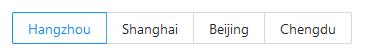
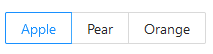
- Radio - Ant Design, Atlaskit, Bootstrap, Chromium, Evergreen, FAST, Firefox, Web Platform, WebKit
- Radios - Boosted
- Radio Button - Carbon Design System
- ChoiceGroup - UI Fabric
- Radio Group - Lightning Design System
- Radio Buttons - Material Components Web
Introduction
(For a lengthier discussion, on which this page was based, please refer to the original radio button issue)
The research showed that different design systems treat radio buttons in one of two ways, i.e.:
- as a standalone component, that could be hosted on a “radio button group” component;
- as an invariably non-independent part of a “radio button group” component (just like
<option>tags are dependent on<select>tags).
The two approaches seem very similar at first, but the former seems to indicate that single “radio buttons” could exist, to probably indicate a binary state (on or off). The latter, however, shifts the scope up to the “radio button group”, which, although nonexistent as an HTML element, is an important concept for the W3 specification:
“A document must not contain an input element whose radio button group contains only that element.”
Besides, the mere existence of both approaches made elaboration of a concept table rather difficult, because it was not always clear whether a concept should apply to the radio button or the radio group. In any case, this research shows that most concepts apply to the radio buttons, while only some apply to the groups, eg:
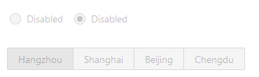
- radio-button-group-orientation
- required-group
- disabled / readonly (for the whole group)
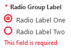
- group-label
After the research there are still discussions to be made, where any help would be welcome.
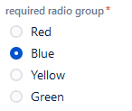
Anatomy
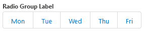
- radio-button-group
- radio-button-group-label
- checked-indicator
- label
- radio-button-group-required-indicator
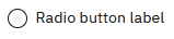
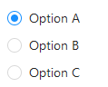
- Radio button
- Label
- error-message
Concepts


Discussion
At a point during the research, the scope of this study os shifted from the “radio button” to the “radio button group”, because there is no particular strong use case for a standalone “radio button”, and also because this use case is against the W3 Specification, the actual component to be considered is the “radio button group”, being composed of two or more radio buttons.
Also based on this fact and on the current state of the design systems, a more final anatomy was proposed.
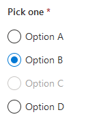
Proposed Anatomy - by Tag Hierarchy
This section shows the proposed visual constituents for the Radio Button Group, which is here considered to be the actual component, while the radio buttons are a part of the group.
- Radio Button Group (the actual component)
- Group Label (functions as a label for the whole group)
- Required Indicator
- Radio Button (at least two required)
- Checked Indicator (input)
- Label (optional)
- Radio Button
- and so on…
- and so on…
The problem
The above anatomy is regular enough to be assembled in a way similar to (but more complex than) a <select>. Attributes set on the group would allow the developer to set the whole group as “disabled”, “readonly”, vertically or horizontally laid out, types of display (like buttons, radio buttons, combobox, etc), and attributes set on the radio buttons would set their specific states, as we do with <option> tags. It is important to understand that the function of radio buttons is almost the same as a <select> tag, and this is why the comparison makes sense.
However, by being so regular and requiring a specific HTML structure, we would lose structural flexibility. For this, here is another proposal.
Proposed Anatomy - by Attribute Binding
If the above proposal would accept other nodes as valid children, or at least a set of attributes that could replace some of the nodes (eg. an aria-label to replace the “Group Label”), the flexibility could be reestablished, by allowing the construction of more complex layouts, eg. semantic differential scales, such as:
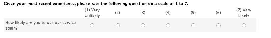
This could be achieved by combining table elements with radio button inputs and grouping attributes.
The problem
One could say it’s exactly the same behavior we have nowadays, because the radio buttons are bound together by the name attribute. However, the current structure still depends on a fieldset tag to visually group and label the collective of radio buttons, and this requirement prevents us from doing that exact table layout with actual tables, because we can’t use the fieldsets to group rows and put a legend inside it as well.
Today, the structure of such semantic differential scale could be represented like this:
| Question | Answer 1 | Answer 2 | … |
|---|---|---|---|
| (table cell) | (input name=1)(label) | (input name=1)(label) | … |
| (table cell) | (input name=2)(label) | (input name=2)(label) | … |
Each field has its label (or could have an aria-label), but the group itself has no formal label. This could be solved by having a way of binding a label to a group by using attributes, like this:
| Question | Answer 1 | Answer 2 | … |
|---|---|---|---|
| (groupLabel labels=1) | (input name=1)(label) | (input name=1)(label) | … |
| (groupLabel labels=1) | (input name=2)(label) | (input name=2)(label) | … |
The above case creates a new tag (or an unsemantic tag with a new aria-attribute) that labels the whole group by referring to its name.
Another alternative would be:
| Question | Answer 1 | Answer 2 | … |
|---|---|---|---|
| (input name=1) | (option group=1) | (option group=1) | … |
| (input name=1) | (option group=3) | (option group=2) | … |
In this case the label is the actual input, and it could have an appearance of a simple text. The answers, on the other hand, could be an alternative use for the <option> tag, with an attribute to reference the name of the input. Selecting an option would change the value of the input.
To be discussed
The two main approaches presented above should be analysed in order to decide
- In the first case:
- whether the first, more rigid proposal should be developed;
- or maybe even create an attribute to the
<select>tag that would make it behave visually like radio buttons
- Or, in the second case, strive for flexibility and:
- propose modifications to the labeling of the current radio buttons;
- or change the tags used to create them, like in the last example.