 Open UI
[object Object]
This document represents a component specification template. Its purpose is to provide a point-in-time guide as to how a component should be authored, in light of common anatomies, behaviors, and accessibility. The primary audience is a developer authoring a given component.
{ComponentName} Component Specification
Overview
The name of the component, along with a high-level description.
Background
Relevant historical or background information, related existing issues, etc.
Use Cases
Primary use cases for this component.
Non-goals
A list of use cases, features, or functionality which are not goals for the component.
Features
A list of the key features unique to this component.
Risks and Challenges
Notable risks or challenges associated with the component. Link issues related to platform blockers.
Prior Art/Examples
Link to the OpenUI research page for the component. If any existing, canonical, or exemplary implementations of the component are found beyond what is documented in the research page, make a separate PR to add them there.
Design
Describe the design of the component, thinking through several perspectives:
- A customer using the component on a web page.
- A developer building an app with the component and interacting through HTML/CSS/JavaScript.
- A designer customizing the component.
APIs
Outline the key elements of the component’s public API surface, taking into consideration conformance guidelines. Make sure to discuss differences and rationalizations. Consider high and low-level APIs. Attempt to design a powerful and extensible low-level API with a high-level API for developer/designer ergonomics and simplicity.
Properties and Attributes
Example Table
| Property Name | Attribute Name | Type | Default Value | Description |
|---|---|---|---|---|
value | value | number | Value of min | The current value of the slider. |
min | min | number | 0 | The minimum value of the slider. |
Methods
Example Table
| Signature | Description |
|---|---|
increment(value: number = this.step): void | Increments the value of the component by the amount specified by step, clamped within min/max values. |
decrement(value: number = this.step): void | Decrements the value of the component by the amount specified by step, clamped within min/max values. |
Events
Example Table
| Event Name | Detail Type | Bubbles | Composed | Cancellable | Dispatch Behavior |
|---|---|---|---|---|---|
change | none | true | true | false | Fired when the slider’s value changes. |
Appearance
Screenshots and/or description of the basic appearance of the component.
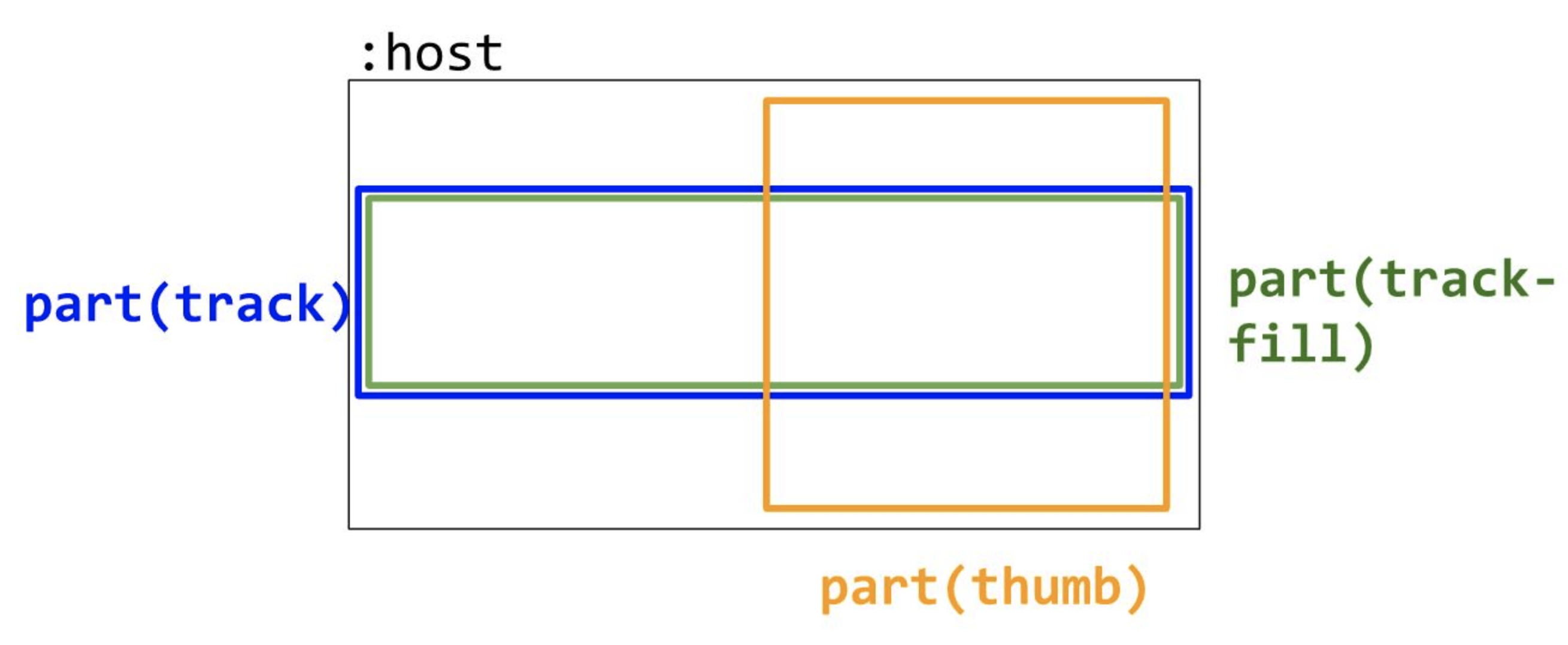
Anatomy
Outline the component’s structure with a diagram of its render tree. Enumerate key areas of visual composition and customization.
Diagram
Example
DOM Structure
Define the recommended DOM to represent the component’s anatomy, as shown above. Show how important attributes (aria attributes especially) are applied to the various parts. In cases where a component nests other components, expand the full DOM structure to understand the expectation and any shortcomings in the child components’ customizability.
Slots
What parts of the component are composable or replaceable?
Example Table
| Slot Name | Description | Fallback Content |
|---|---|---|
thumb | Enables replacing the component’s thumb part with custom markup. | A default thumb implementation is provided. |
Host Classes
What classes does the component add to the host element?
| Class Name | Description |
|---|
Slotted Content Classes
What classes on slotted content does the component respond to?
| Class Name | Description |
|---|
CSS Parts
What parts of the component are exposed for styling?
Example Table
| Part Name | Description |
|---|---|
thumb | Enables styling the thumb part without requiring it to be completely replaced via its slot. |
Behavior
States and Interactions
List key component states, valid state transitions, and how interactions trigger state transitions.
- Are states changed as a result of keyboard? mouse? touch?
- Are there corresponding keyboard interactions for mouse/touch interactions?
- Are some events triggered on key down vs key press?
Example Table
| State Group | States | Initial State | Description | Interaction/Transition |
|---|---|---|---|---|
disabled | true/false | false | When true, disables the control, preventing user interaction and displaying the control with a disabled appearance. | No interaction. Controlled programmatically. |
Accessibility
Consider the accessibility of the component.
Keyboard Navigation and Focus
- Arrow vs tabbing key behavior
- Modifier key effects (e.g. shift, ctrl, meta)
- Does this component use focus delegation?
Example Table
| Key | Description |
|---|---|
| Up/Right | Increments the value of the component by calling the increment method. If the shift modifier is pressed, increases by 10x the step value. |
| Down/Left | Decrements the value of the component by calling the decrement method. If the shift modifier is pressed, decreases by 10x the step value. |
Form Input
Does this component integrate with form submission, form validation, etc.? Can integration be accomplish with standard APIs or are special work-arounds required?
Use with Assistive Technology
Are there any details about shadow dom, focus delegation, or aria attributes that need special attention?
Globalization
Consider whether the component has any special globalization needs such as:
- Special RTL handling
- Swapping of internal icons/visuals
- Localization
Security
Are there any security implications surrounding the component?
Performance
Are there any performance pitfalls or challenges with implementing the component? (examples below)
- If the component renders a loop of items, should certain areas be considered for virtualization?
- If the component needs to measure an area before rendering, how will jank be avoided?
- If any measuring is needed at all, can rAF techniques help queue measures and prevent synchronous reflows?
Dependencies
Will implementing the component require taking on any dependencies?
- 3rd party libraries
- Upcoming standards we need to polyfill
- Do any dependencies bring along an associated timeline?
Platform Requirements
Are there any core web platform features that are needed to implement this component well?
Tooling
Are there any special considerations for DevTools? Will tooling changes need to be made? Is there a special way to light up this component in DevTools that would be compelling for developers/designers?
Resources
Any related resource links such as web standards, discussion threads, diagrams, etc.
Next Steps
What next steps, if any, are there? Is there some functionality that would be a nice-to-have or a common feature in other implementations that could be added but is not considered part of the MVP? Link all feature additions, modifications, bugs, or editorial change issues.