 Open UI
 Design Systems Analysis
Open UI uses design systems as one of its forms of evidence for cataloging emergent UI standards. Design systems are documented in json format according a JSON schema. This provides us with a consistent and machine readable way of documenting the design system.
What’s a Design System?
A design system is a collection of assets and components used to create and maintain UIs on multiple platforms. Examples:
During the research phase of the proposal, we analyse the UI practices from a variety different design systems. Our design systems list is a non-exhaustive list of the design systems we utilise for research purposes.
Design System Criteria
In order to succeed as an open standard, Open UI must collect the most useful ideas and patterns that exist. Because of this, not all design systems are suitable to use as Open UI sources.
We believe the most useful ideas are those that:
- ✅ support designers and developers
- ✅ support multiple platforms and frameworks
- ✅ support accessible users
- ✅ support small and enterprise projects
- ✅ demonstrate organic adoption in a wide community
- ✅ demonstrate significant real-world usage
- ✅ demonstrate deep thought and debate by many experienced minds
A design system does not need to meet all of these criteria but it should meet many of them. The design systems we’ve launched with, we believe are representative of these criteria. We may not accept PRs contributing design systems that are lacking by these criteria.
Adding a design system
Create a json file in /sources for the design system, like /antd.json.
Add the $schema key pointing to our design-system.schema.json schema and complete the required fields.
{
  "$schema": "../schemas/design-system.schema.json",
  "name": "Ant Design",
  "description": "An enterprise-class UI design language and React UI library.",
  "url": "http://ant.design",
  "by": "AFX"
}
Adding your design system’s component
After you create the base schema file, add in each component for your design system into a components array that
resides in the schema document. This information will populate the Component Name Matrix.
Note: Do not document utility components. Only document components which render a user interface that can be experienced either visually, by keyboard, or narration.
{
  "$schema": "../schemas/design-system.schema.json",
  "name": "Ant Design",
  "description": "An enterprise-class UI design language and React UI library.",
  "url": "http://ant.design",
  "by": "AFX",
  "components": [{ "name": "Button" }]
}
Concepts
Component concepts are terms used to described the appearance and behavior of a component.
Things like primary for a Button.
A term is a concept if the component can “be” that concept.
For example, no one says a Button can be size but it can be small.
Put another way, record “is” relationships which denote qualities, like “that button is small”.
Ignore “has a” relationships which denote properties, like “that button has a size”.
  components: [
    {
      name: 'Button',
      concepts: [
        { name: 'primary', category: 'type' },
      ],
    },
  ],
:bulb: Always use kebab-case for concept names.
Adding images to a component
An image of the concept should be included with each concept. This allows a visual aid to be shown when the concept might need to be clarified in the specifications.
  components: [
    {
      name: 'Button',
      concepts: [
        { name: 'primary', category: 'type', image: 'antd-button-primary.png' },
      ],
    },
  ],
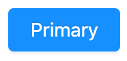
You can use a screenshot tool to capture these images directly from the design system. Here’s an example image of the primary Button in Ant Design.
If the image requires showing motion or interaction, consider using a gif tool.

Try it out
You should now be able to yarn start the docs and see your component in the menu.
You should also have a toggle on the component page to switch between the proposal page and research page.
:smile: You’re all set! We’re looking forward to your contribution to Open UI!
Creating a component spec
Adding a component to Open UI is a research process. Because of this, two pages are created for each component; a research page and a proposal page. You’ll want to create both at the same time as Open UI leverages the research page to document anything for
- Anatomy
- States
- Behaviors
Utilize the Component Spec Template to begin to tease the component apart.
Create your component pages like so:
/src
  /components
    your-component.proposal.mdx
    your-component.research.mdx
Copy the content from the Component Spec Template and paste it into your proposal document.
:bulb: These pages will be displayed as a single page on Open UI.
Research Page
The research page is a place to collect, analyse, and deeply understand the data available on the component.
Define your research page front matter.
The pathToProposal key tells your research page where its proposal page is hosted.
Example:
---
name: Test
pathToProposal: /components/test
layout: ../layouts/Layout
---
Research page content
After this front matter, copy in the content from the Component Research Template.
This template includes a few optional partials you can import into the research page.
Each of these walks through the design system json files in /sources to finds components where the openUIName value matches the Name value of your research page front matter.
- Anatomy: lists out component anatomy by part, if any matching components have defined an anatomy.
- Concept Coverage: lists matching components according to unique names, as well as which design systems use that name.
- Concepts: for each unique concept defined for matching components (per the concepts section of this documentation) the research page will display: this concept name, the various names used by different design systems for this concept, and examples of this concept from the design systems.
You may also collect and add research manually to this page.
Additional research pages
For any other research that you believe will make more sense on its own, create a seperate research document
following <component-name.research.<research-topic>.mdx.
Link to these documents within your research page under a section title accordingly. For example, the <select>
control has research pages for behaviors.