 Open UI
Interest Invokers (Explainer)
- Authors
- @mfreed7, @keithamus
- Created
- Last Updated
- WHATWG Issue
- https://github.com/whatwg/html/issues/10309
- WHATWG PR
- https://github.com/whatwg/html/pull/11006
The Pitch
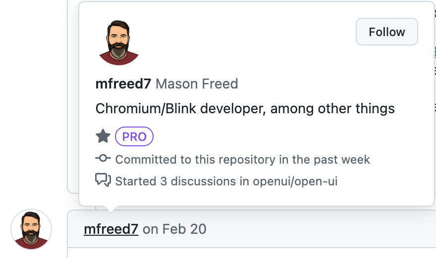
When you write @mfreed7 or #743 on Github, the text is automatically upgraded to links pointing to the user’s profile page or the issue/PR page. And if you hover over that link instead of clicking it, you get a nice “hovercard” popover containing more detailed information. Users really like this feature, because it gives them the bit of information they want (“who or what is this?”), including common quick actions like “Follow this user”, without requiring them to leave the page, potentially losing state in the process.
In a survey of the top 50 sites by traffic, 94+% of them include hover-triggering functionality like this, ranging from small text-based tooltips to large interactive hovercards with useful links and buttons. However, implementing this behavior takes a remarkable amount of work and code. Careful attention must be paid to managing mouse hover and de-hover states, keeping track of hover delays and states, implementing keyboard activation, getting accessibility right, and all of the related interactions. As a result, many developers’ implementations aren’t accessible to keyboard users (about 50% of the sites we surveyed), and virtually none are accessible to touchscreen users. As a result, mouse users have access to significantly more functionality and information than users who do not use a mouse. The User Agent should provide this functionality natively, so that developers don’t have to keep re-inventing this wheel and/or leaving behind their non-mouse users.
The Pitch in Code
<a interestfor="my-hovercard" href="...">Hover to show the hovercard</a>
<span popover=hint id="my-hovercard">This is the hovercard</span>
Introduction
The Invoker Commands API, consisting of the command and commandfor attributes, provides an easy declarative way to make buttons directly trigger actions on a target element, such as showing a popover or a modal dialog when the button is clicked. This API, interestfor, is very similar, in that it also provides a declarative way to invoke actions on a target element. However, rather than being activated via a click on the element, this API uses a lighter-touch way for the user to “show interest” in an element without fully activating it. For example, a link <a href="..." interestfor=foo> element can be hovered with the mouse, which might trigger a hovercard preview of the link, without actually navigating to the link destination URL. Of course, if the link is clicked, then a normal navigation will occur.
The interestfor capability is supported on these interactive elements:
<button><a href=something>- SVG
<a href=something> <area>.
It is possible that this list could be expanded later: see #908 and #1138. It is also possible that some elements could be removed from the list: see #1138.
The user will be able to “show interest” in an element through various means. For keyboard and mouse users, focusing or hovering the element for a period of time will “show interest”. See the HIDs and interest section for all the details.
Since one of the primary use cases for this API is the activation of hovercards, when the target element of interestfor is a popover (with the popover attribute), the popover will automatically be shown. This provides an easy way to allow disclosure of high fidelity hovercards in a more accessible and declarative way. It is also possible to connect other actions to the target element, via the "interest" event: when interest is shown in an element with interestfor, an InterestEvent with type "interest" will be fired at the element referenced by interestfor.
It is also possible to trigger actions that occur when the user “loses interest” in the element and its target. In a very similar way to how “showing interest” is defined, “losing interest” happens in different ways based on the input modality. But the concept is clear: once the user has shown interest in an element, they need a way to show that they have “lost” that interest. For the typical hovercard use case, losing interest would cause the hovercard/popover to close. In all cases, when interest is lost, an InterestEvent with type "loseinterest" will be fired at the target element.
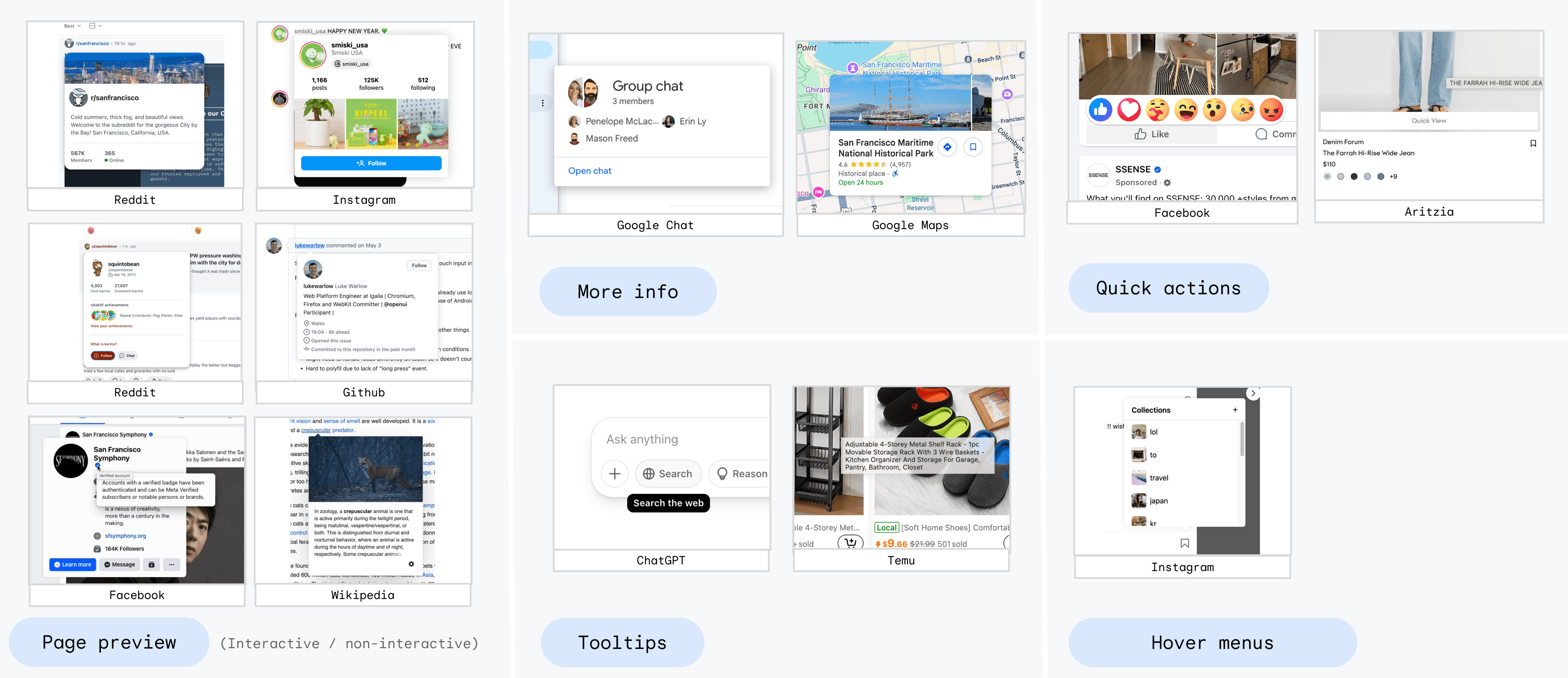
Survey of Use Cases
There are myriad use cases for the behaviors provided by the interestfor API. The collection of screenshots below shows a number of live production examples from across the web, grouped into common categories such as:
- Page preview
- Tooltips
- More info
- Quick actions
- Hover menus
Some of these occur when showing interest in links, and some when showing interest in buttons. While “More info” and “Page preview” might look/seem similar or the same, they are different in one critical way: page previews show some kind of “preview” of the page you will navigate to if you actually click the same link. In contrast, “more info” hovercards show more info about something, while actually clicking that same link or button does not navigate the page or transition to another screen. For example, the Google Chat information hovercard shows details about the person or group the user showed interest in; clicking that same button (actually a <div> with click handlers) opens a separate action menu for the person/group.
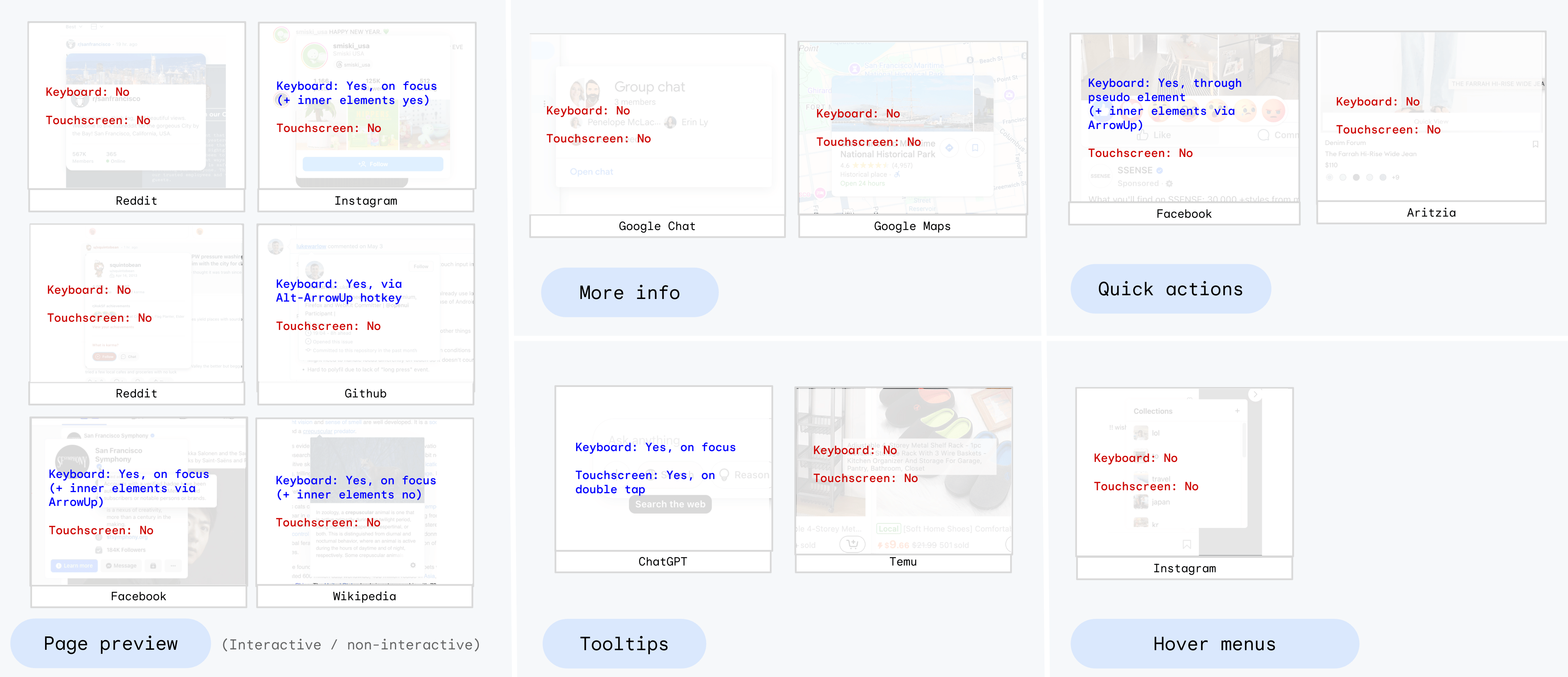
The following image shows the same sites as the image above, overlayed with their keyboard and touchscreen support:
Wikipedia example
Wikipedia provides an interesting example case. It has a number of quite useful hover-triggered bits of UI:
- Page previews for any link to another Wikipedia article.
- Interactive “more info” hovercards (not a page preview) for any link to a footnote on the same page.
- Non-interactive tooltips for some links and buttons.
These can all be nested in fairly complex ways, as seen here:
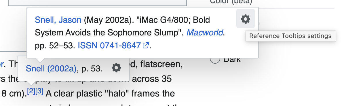
None of the above UI is available to keyboard users, because the footnote hovercards are not triggered on focus, unlike the rest of the page previews. The “gear” icon (which is on all hovercards) is not keyboard focusable at all, so keyboard users cannot adjust hovercard settings. And finally, while the main page preview hovercards are triggered on keyboard focus, they do not go away when the focus is moved, nor do they respond to the ESC key. So once they’ve been shown via focus, there’s no easy way to hide them, and they obscure some page content.
This section is not meant to pick on Wikipedia at all - the site has obviously gone to significant lengths to make a valuable and usable feature that many (mouse) users enjoy. These issues are quite typical to all of the sites we surveyed: the mouse experience is usually very good; the keyboard experience is usually less good and fairly hit-or-miss in terms of accessibility; and as mentioned, touchscreen users are typically left out completely. None of these are the developers’ fault: since the web platform does not provide this functionality at all, they are forced to fend for themselves and do the best they can. Developers, and their non-mouse users, need the interestfor API.
Survey conclusions
There are three important conclusions:
- Almost every production site has some sort of hover-triggered UX.
- While all support mouse-hover, many don’t support keyboard activation. Those sites that do support keyboard activation each have a bespoke implementation and methodology that developers had to manually create, and that users have to separately learn.
- Only one of the sites surveyed offered any support for touchscreen users.
HIDs and Interest
Users access the web using many different Human Interface Devices (HIDs), including mouse, keyboard, touchscreen, and even things like voice control, eye tracking, and other specialty HIDs. However, as mentioned above, “showing” and “losing” interest are intentional abstractions that do not refer to specific actions such as “hover” or “long press”. This is on purpose: the developer should not have to worry about handling all of the various input modalities specifically, in the same way that a <button> element can be activated in various ways such as tapping, clicking, or hitting Enter on the keyboard. The user agent provides this functionality “for free”: developers don’t need think about HIDs. This provides two benefits:
- The implementation burden is lowered, since developers don’t need to implement support for all forms of HID.
- Users, particularly those using less common HIDs, benefit greatly, since all users now have a way to show interest in elements. They don’t get locked out of particular site functionality simply because the site developer didn’t make specific affordances for their particular HID.
Nevertheless, the specification for this feature, and the implementation in browsers, should agree on the behavior for the most common forms of HID, so that most users get a common experience when navigating the same site on different browsers. This section of the explainer walks through these common HIDs.
Mouse
Mouse users will show interest in an element by mouse-hovering the element for a period of time. They will lose interest in that element when they de-hover the element (i.e. hover something unrelated) for a period of time. (See the Mouse/Keyboard delays section for more detail.) If the target is a popover, then both the element with interestfor and the target popover need to be de-hovered. In this way, a user can hover to get a hovercard, and then move the mouse over to that hovercard (e.g. to select/copy some text) without the popover closing.
Keyboard
For keyboard users, there is a tension between discoverability and annoyance. The most discoverable way to “show interest” via the keyboard is simply for keyboard focus to trigger interest. The downside of this pattern is that users who are merely trying to keyboard-navigate through a document might be annoyed if popovers begin to appear as they tab through the document. An activation delay, combined with the ESC key always losing interest and closing popovers, mitigates this problem. A prior proposal (see the alternatives section) included a more complicated “partial interest” concept that was intended to remedy this problem. However, it turned out to be very complicated for developers, and annoying for users. The presence of the ESC key to “escape” from interest turns out to fix most annoyance problems.
Touchscreen and AR
For touchscreen users, the widely-adopted standard for “showing interest” in an element is the long-press gesture. For native apps, this is the user-expected shortcut to show context menus and access other actions without explicitly activating the element. (See this comment for more context on this point, from developers.) While “inventing” a new interaction pattern such as long-press-and-drag or other “magic” might sound appealing, users would not know or expect this pattern to work, since it would only exist on one (or a handful) of apps on their phone: browsers. For all other native mobile apps, long-press is the standard way to show interest, and for that reason, developers need interestfor to re-use this standard UX pattern.
On the web, however, most browsers already overload the long-press gesture to provide additional functionality. For example, long-pressing on plain text nodes often creates a text selection around that text, and sometimes provides an additional context menu containing actions like “copy” or “look up”. Long-pressing a link (an <a> element) in most browsers provides a more involved context menu with additional operations such as “open in a new tab”, “add to reading list”, “share”, or even full inert/anonymous previews of the target URL’s content. Users often appreciate these additional capabilities, and do not want to lose access to them. Therefore, the interestfor API must provide a way to keep both capabilities: the interestfor behavior and the existing context menus and behaviors.
Many different options for providing touchscreen support were discussed and even prototyped, and the details can be found in the alternatives section. The final selected proposal is to simply add an item to the pre-existing long-press context menu, such as “Show Details”, which (if selected) shows interest in the element. If the element being long-pressed would not ordinarily show a context menu (such as a <button> in many browsers), then the long press itself is enough to show interest directly.
The ::interest-button pseudo element
This is “Option 3.5” in the Touchscreen options section, and is discussed in CSSWG issue 12437. Adding an item to the long-press context menu meets the use case of ensuring all users have access to hovercard content. However, it is a bit more difficult to discover and use. In some cases, developers might want to provide a more visible way to show the user that there is more content to access. Importantly, in other cases, developers (or more often designers) explicitly do not want this - they want to keep an uncluttered page layout without extra affordances.
In the case that the developer wants to add additional visibility, they can opt in to an addition button/icon via the ::interest-button pseudo element:
@media (any-pointer: coarse) {
  /* On touch devices, show the interest-button pseudo */
  .my-link::interest-button {
    content: '?';
    /* button-like styles */
  }
}
When the ::interest-button pseudo element has content, and is used on an element with the interestfor attribute, the pseudo-element is generated following the element. Typically, this is rendered as a small (i) icon or ? or similar, but the decision of what to render in the button will be up to the developer. When the user taps or clicks (not long-presses) on this icon/button, interest is shown in the originating element, showing the hovercard. Importantly, the CSS delays do not apply here - clicking/tapping immediately shows interest.
In this mode, long-pressing the originating element still brings up the context menu, which still has the additional “View more info” item that can also be used to show interest. And tapping the originating element (not the ::interest-button pseudo element) still activates the element normally. So everything else continues to work as before, just with an easier way for the user to show interest, without long pressing.
Importantly, this new pseudo element is not keyboard focusable. Adding another focus navigation stop is not good from a keyboard and AT user perspective, because keyboard focus already shows interest. Adding it to the focus navigation order would add a) two sibling elements that do the same thing, and b) additional noise in the keyboard navigation order. The desired behavior for this pseudo element is that of <span onclick="{show interest}">.
Other
The “other” category includes many HID types, including assistive technologies, eye tracking and VR interfaces, voice control systems, switch access, and future HIDs that haven’t been developed yet.
Since this category of HIDs contains less-commonly-used HID types, and because it also contains future HIDs that don’t even exist yet, the specification for interestfor will simply mandate that the User Agent provide a way for users to both “show interest” and “lose interest” in elements, no matter what HID is in use, without specifying exactly what form that might take.
Likely, most HIDs in this category will need to rely on the existing affordances described above, such as invoking the context menu, or clicking on the ::interest-button pseudo element.
Exceptions
While several sections above use words like “mandate” and “require”, there are exceptions. As with all things, the UA (as the user’s agent) is still free to decide not to provide some users in some circumstances with the ability to show interest. For example, on extremely small touchscreens such as watch faces, the UA might decide that there’s no practical UX that will serve users, and so will decide not to provide access. However, it is expected that UA’s broadly provide users with a method for showing and losing interest in elements, when that is feasible, regardless of the user’s chosen input modality.
Mouse and Keyboard delays
For mouse or keyboard users, delays are important for a number of reasons:
- Simply hovering or focusing an element should not be enough to show interest in that element, since the user might just be moving from one place to another, and not trying to pause and show interest. It would be highly distracting to the user if such a move caused many popovers to show up. For this reason, showing interest needs to be done by hovering/focusing an element for a period of time.
- For a similar reason, losing interest cannot be provided by just de-hovering/blurring the element. For example, in the common case of a link that has a hovercard, it is very common for the hovercard to be separated from the element by some padding space. And it is also common for mouse users to want to move their mouse from the link to the hovercard, e.g. to select and copy some text. However, since there’s a gap between the elements, moving the mouse across that gap constitutes a de-hover of both the element and its target. For this reason, losing interest needs to be done by de-hovering the element (and its target) for a period of time.
Both of these time periods need to be CSS-configurable, because different use cases can require different delays. For example, a responsive gaming site might want very short delays, including potentially zero-delay. On the other hand, information-rich sites such as Wikipedia might want longer delays to ensure their content is easily accessible to all. To achieve this, two properties, interest-delay-start and interest-delay-end, will control the corresponding delays. Because, as described above, both of these delays are fairly critical to proper operation of the interest mechanism, both properties will default to a non-zero value, 0.5 seconds. A shorthand interest-delay property will control both.
There was some discussion about the need to allow UAs to modify these delays based on user needs. For example, some users might require longer delays to be able to navigate between popovers. There was a discussion about potentially using keywords (e.g. “short”, “medium”, “long”) rather than explicit numbers for these properties. However, there was strong pushback against that for several reasons, the primary one being that it’s not possible to normalize all sites down to a small set of named values. The alternative suggestion, which meets the use case, is that the UA is allowed to modify delays, as needed, to be a proper agent for the user. One example might be a setting like “multiply all delays by 10x”, or “all delays have a minimum of 5s”, etc.
The CSS properties for controlling delays were discussed in https://github.com/w3c/csswg-drafts/issues/9236.
Pseudo Classes
It is handy to be able to select elements that both a) have the interestfor attribute, and b) are currently being shown interest. The :interest-source pseudo class matches elements in exactly this state. Two common use cases arise:
- Styling the trigger element to indicate that it’s showing interest:
:interest-source {
  background-color: lightgreen;
  border: 2px solid green;
}- “Speeding up” the
interest-delay-startwhen another element already has interest. This is a common request: for example, the first popover hovercard takes ~1 second to show up. But then if you quickly hover another element that also triggers a hovercard, that one shows up much more quickly:
[interestfor] {
  interest-delay: 1s;
}
container:has(:interest-source) [interestfor] {
  interest-delay-start: 0s;
}
It is sometimes also convenient to be able to style the target of an interest invoker based on whether its invoker has interest. For that purpose, we introduce another pseudo classes, :interest-target, which works the same way as :interest-source, except that it matches the target rather than the invoker/source. These can be used to e.g. change the style of popovers that are transiently-invoked vs. those that are invoked via a less transient mechanism such as commandfor or popovertarget.
[popover] {
  background-color: green;
}
[popover]:interest-target {
  background-color: orange;
}
The pseudo class functionality was discussed in https://github.com/w3c/csswg-drafts/issues/12154, and their naming is being discussed in https://github.com/w3c/csswg-drafts/issues/12515.
Implementation Details
In the style of commandfor, we propose to add a global attribute called interestfor, which can be used on <button>, <a>, and <area> elements:
interface mixin InterestInvokerElement {
  [CEReactions, Reflect="interestfor"] attribute Element? interestForElement;
};

HTMLButtonElement includes InterestInvokerElement;
HTMLAnchorElement includes InterestInvokerElement;
HTMLAreaElement includes InterestInvokerElement;
SVGAElement includes InterestInvokerElement;
The interestfor value should be an IDREF pointing to an element within a single document or shadow root. The interestForElement IDL attribute also exists on the element to imperatively assign a node to be the invoker target, allowing for cross-root invokers (in some cases, see attr-asociated element steps for more). We define this target element to be the “Interestee”.
Elements with an interestfor attribute will dispatch an InterestEvent on the Interestee when the element Shows Interest or Loses Interest. When the user Shows Interest in the element, the event type will be "interest". If the user has already shown interest in the element, and interest is subsequently lost, an InterestEvent with the type of "loseinterest" will be dispatched on the Interestee. The event also contains a source property that will reference the element with interestfor. InterestEvent objects are always non-bubbling, non-composed, cancellable events.
[Exposed=Window]
interface InterestEvent : Event {
  constructor(DOMString type, optional InterestEventInit interestEventInit = {});
  readonly attribute Element source;
};
dictionary InterestEventInit : EventInit {
  Element? source = null;
};
Both interestfor and commandfor can exist on the same element at the same time, and both should be respected/functional, since they are activated using strictly separate actions by the user.
While commandfor is ignored for <button>s that are form participants, or have type=submit, the interestfor is still valid in these scenarios.
Example Code
Popovers
Use interestfor to declaratively build a hovercard using popover (in this case using popover=hint):
<button interestfor="my-popover" type=button>Hover for popover</button>
<div id="my-popover" popover="hint">Hello world</div>
Custom delays and multiple actions
Expanding on the example above, here we add custom hover delays for show and hide, and also show that a single element can have both interestfor and commandfor:
<button interestfor=hovercard commandfor=application command="show-modal">
  Start
</button>

<div id=hovercard popover=hint>
  Clicking this button will open a new application
</div>

<dialog id=application>
  Modal application window
</dialog>

<style>
  [interestfor] {
    interest-delay-start: 0.5s;
    interest-delay-end: 200ms;
  }
</style>
Custom behaviour
The InterestEvent interface allows for custom JavaScript to be triggered when interest is shown and lost, without having to wire up manual event handlers (such as for mouseenter and mouseleave):
<button interestfor="my-custom">
  While interest is being shown in this button, the div below will be displayed.
</button>

<div id="my-custom">Supplementary information</div>

<script>
  const custom = document.getElementById("my-custom");
  custom.addEventListener("interest", (e) => {
    custom.classList.add('active')
  });
  custom.addEventListener("loseinterest", (e) => {
    custom.classList.remove('active')
  });
</script>
Feature detection
To feature-detect this overall API, the following code does the trick:
const supported = HTMLButtonElement.prototype.hasOwnProperty("interestForElement");Polyfilling
A basic polyfill has been written, which implements the behaviors described by this explainer. The touchscreen behavior, due to being impossible to polyfill, is not implemented. But roughly-full support for mouse and keyboard activation patterns is included.
The polyfill is available at Github and npm:
Patches are welcome!
Accessibility
Since popover=hint is a common target for interestfor, for the purpose of building “tooltips” and “hovercards”, there are a few additional definitions and considerations:
- When the target is a
popover=hintelement, and that hint popover contains only elements with a computed role of generic, text or image, we will call that a “plain hint”. - When the target is a
popover=autoorpopover=manual, or it is apopover=hintwith contents beyond those allowed by “plain hint”, then we will call that a “rich hint”.
Plain hints (aka tooltips)
For a screen reader user, there already exist simple settings and commands to read accessible descriptions, which are just an additional piece of text associated with an object, such as used by a title or aria-description attribute. When a plain hint is just used for a prettier tooltip, a screen reader can reuse this simple mechanism and act like a title was present. There is no need for the user to navigate to the hint popover itself, since there’s nothing to explore.
For the above reason, the browser will simply expose the the contents of a plain hint on the interest invoker element. The actual popover element and its descendants can be invisible/ignored in the AX tree. In particular:
- If no other accessible name is available, use the
popover=hint’s inner text for the accessible name. - If it’s used as the name, then use it to compute the description, setting the
describedbyrelation to point from the interest invoker to the hint element - There is no need to make
aria-detailsconnections or setaria-expandedon the interest invoker for plain hints.
Rich hints (aka hovercards or other)
Since rich hints have additional content that might want to be explored directly, additional connections need to be made here:
- Set a minimum role of “tooltip” on the target popover.
- Set
aria-expanded=truewhen the rich hint is open, andfalsewhen it is not. - Create an
aria-detailsrelation between the interest invoker and the rich hint popover.
As with popovertarget, when a rich hint is shown, sequential focus navigation will be adjusted so that the target popover is “next” in the tab navigation cycle after the interest invoker. Since by definition “plain hints” do not have anything focusable, sequential focus navigation is not affected.
See also, https://github.com/w3c/aria/issues/979.
FAQ (Frequently Asked Questions)
Why No interestaction Attribute?
The command/commandfor API, as its name suggests, provides two attributes. One (commandfor) is the link to the target element, and the other (command) describes what action to take on the target element. That is appropriate, because when activating a button, many different types of actions could be desired, even for the same target element. A button might want to open, open-modal, close, or request-close a dialog, for example. Or it might want to play, pause, or mute a video.
The same is not true for interestfor. When the target is a popover, the only set of actions that makes sense is to show the popover when interest is shown, and hide the popover when interest is lost. There are no identified use cases that invert those actions. Alternatively, defining show and lose interest actions to both toggle the popover can lead to serious out-of-sync problems that would be major footguns. So for popovers, there is no need for a separate attribute controlling the behavior, because there is only one rational set of behaviors. And as described above, popovers are the only kind of target element that comes with default actions. Other actions might use the "interest" and "loseinterest" events to add additional behavior, but in that case, they can provide their own definitions of actions to take. And again because of the above points, there isn’t a future-compat problem like there might be for the commandfor attribute.
See https://github.com/openui/open-ui/issues/1064#issuecomment-2581511411 (particularly this comment) for more discussion of this section.
Why the name interest? Why not hover or focus?
Much like click, hover or focus are specific to certain types of HID, and are not terms which encompass all viable methods of interaction. Many alternatives were discussed and it was deemed that interest is the best name to explain the concept of a “hover or focus or equivalent”.
See https://github.com/openui/open-ui/issues/1136.
Why is interestfor supported on more elements than commandfor?
While invocation should only be limited to buttons, disclosure of supplementary information can be expanded to all interactive elements. There are many useful use cases for offering a hovercard on anchors, such as signalling that they are external, or that they will open in a new window, or to show preview information (think: preview windows on iOS Safari or the hovercards that display on GitHub over a user’s handle). To start, a limited set of elements is supported, to make sure they can be made accessibly. This set could be expanded in the future.
See https://github.com/openui/open-ui/issues/839.
Why is interestfor not unlimited, like title is?
It could be considered a mistake to allow title on all elements; as adding interactivity to non-interactive elements creates many problems. Limiting where interestfor is allowed aims to create a “pit of success”, guiding developers to use it only on interactive elements, where it makes sense.
For example, arbitrary elements are not usually focusable, and it is unclear how to ensure that keyboard users can still show interest in these elements. It is not impossible, however: perhaps elements with interestfor become focusable by default, or only work if tabindex has been used. However, these potentialy solutions are not particularly popular, especially among accessibility experts and keyboard-users. So more work would be necessary to navigate the pitfalls.
Interaction with Speculation Rules and Preloading Tech
The Speculation Rules API has an eagerness setting, for which the moderate value specifically calls out hovering a link for a period of time. Other similar preloading technologies like instant.page and quicklink have very similar features. In some cases, e.g. when interestfor is used to provide a very informative hovercard on such a link, the user might be much less likely to click the same link, because they got all of the information they needed from the hovercard. In other cases, the hovercard might contain information that “entices” them to click the link, increasing the likelihood that they navigate. Because of this, the developer should carefully consider modifying any such preloading rules for these links accordingly, e.g. to exclude the first class of links from preloading, or to increase the eagerness for the second class of links.
Fingerprinting concerns
Since this API does not expose any details of how the user indicated interest, it does not introduce any fingerprinting concerns. It should be noted that other pre-existing events (such as focusin or mouseenter) already expose such details. But this API does not change that fact or expose any additional details about the user.
Safe Area Triangle
The events interest and loseinterest are intentionally abstract to allow more complex usability concepts to unfold. It is possible that a future capability might be to add automatic “safe areas” or “hit triangles”, which allow the user to move the pointer between the Interest Invoker (e.g. the button) and Interestee (e.g. the hovercard), regardless of the interest-delay-end setting. See #963 for more.
What if I (the developer) don’t want the touchscreen context menu
It might be the case that in some circumstances, the “developer knows best” that the UA-provided context menu isn’t needed/helpful on some element that uses interestfor attribute. In that case, the (existing) mechanism to do that is to call preventDefault() on the contextmenu event, plus setting -webkit-touch-callout:none for WebKit browsers:
<a href=foo interestfor=bar>Interest invoker link</a>
<script>
  document.body.querySelector('a').forEach(el => {
    el.addEventListener('contextmenu', (e) => e.preventDefault());
  });
</script>
<style>
  /* Required for Safari: */
  a {
    -webkit-touch-callout: none;
  }
</style>
Alternatives Considered
This section details various alternative proposals that were discussed or prototyped, and a bit about why they were not selected.
Touchscreen options
Option 1 - leave the details to UAs
{This idea is opposed by WebKit, and Mozilla, who both want the exact behavior to be specified for touchscreen.}
The original proposal for touchscreen behavior was to leave the specifics up to user agents. I.e. specify that browsers must provide their users (all of them) a way to “show interest” in an element, without specifying exactly how to to that on touchscreens. Since it is currently impossible on the web to provide users a similar functionality (access context menu and hovercard with a single gesture), there is no obvious cow-path to pave on touchscreen. So this option leaves the details of the behavior unspecified, which allows user agents to experiment and iterate on good UX patterns.
Option 2 - show both at the same time
{This approach is opposed by both WebKit and Mozilla, as being too confusing to users, and potentially a security issue.}
After significant brainstorming and discussion in OpenUI, a specific approach was designed wherein both the UA context menu and the site’s hovercard could both be shown at the same time. The short version of this approach is that to show interest in an element via touchscreen, the user simply long-presses that element. This does not activate (e.g. click) the element, it merely triggers interest in the element. This long press immediately fires the "interest" event, but also shows any context menus that would have shown if the interestfor attribute were not present. Both things happen together. In the case of a popover target element, the idea is that the hovercard popover shows up in addition to the context menu, so that the user can tap on either of those things. The user can trigger "loseinterest" by tapping either outside the target popover, or on one of the provided context menu items (if any). If the user taps outside both the context menu and the popover, that should constitute both a loss of interest (closing the popover) and also a signal to close the context menu (since on most platforms, tapping outside the context menu closes it).
One difficulty of this option is that the two things (the popover target and the UA-provided context menu) need to coordinate, at least on positioning. It would be a bad user experience if the context menu showed up on top of the popover, obscuring part or all of it. To provide this coordination, a few more things will be included:
- When the long-pressed element has
interestfor, any UA-provided context menu will not blur or otherwise obscure the web content it covers. In this way, the page will still be visible “under” the context menu. - The portion of the renderer window that is still visible (not obscured by the context menu) will be exposed to the developer via four new
env()values, tentatively calledcontext-menu-inset-top,context-menu-inset-right,context-menu-inset-bottom, andcontext-menu-inset-left. In this way, the developer can safely position the target popover within the area that isn’t obscured by the context menu. - An attempt will be made to provide at least half of the screen (or a “reasonable” amount of screen real estate) for developer content, e.g. by moving the context menu down rather than centering it within the viewport.
Importantly, the User Agent will still be in control of a few things:
- The position and size of the UA-provided context menu.
- The available space and location for the developer/site-provided hovercard.
- The decision whether to show interest at all. For example, on very small screens, the UA might decide to only show the context menu and not trigger interest, because there’s no space.
<a> - long-press | <button> - long-press |
|---|---|
 |  |
Option 3 - add an item to the context menu
{This option is the final one that was selected, and is left in this list as “option 3” for posterity.}
This is likely the most straightforward approach that still meets all of the requirements. For elements that already have long-press-activated context menus, simply add an item to that menu (e.g. “View more info”). When this item is tapped, context menu is dismissed, and “interest is shown” in the link element. This approach does not affect the existing UX at all, and is straightforward to implement. It does represent a bit more friction for users, relative to desktop users: touchscreen users must first long-press the link, then single-tap a menu item, in order to show interest. However, this is still infinitely better than the current state of the art, which is to deny most touchscreen users any access to the hovercard.
<a> - long-press | <button> - long-press |
|---|---|
 | |
Option 3.5 - add an opt-in “info” button pseudo element
While Option 3 is a great way to ensure that all users have access to hovercard content, it is a bit more difficult to discover. In some cases, developers might want to provide a more visible way to show the user that there is more content to access. (In other cases, developers explicitly do not want this - they want to keep an uncluttered page layout.)
In the case that the developer wants to add additional visibility, they can opt in to an addition button/icon via the new ::interest-button pseudo element:
@media (any-pointer: coarse) {
  /* On touch devices, show the interest-button pseudo */
  .my-link::interest-button {
    content: '' / 'profile preview';
    background-image: url('icon.png');
    /* styles */
  }
}
When the ::interest-button pseudo element has a value set for content on an element with the interestfor attribute, the pseudo-element is generated as a button following the element. Typically, this is rendered as a small (i) icon or similar, but the decision of what to render in the button will be up to the developer. When the user taps (not long-presses) on this icon/button, interest is shown in the originating element, showing the hovercard.
In this mode, long-pressing the originating element still brings up the context menu, which still has the additional “View more info” item that can also be used to show interest. And tapping the originating element (not the ::interest-button pseudo element) still activates the element normally. So everything else continues to work as before, just with an easier way for the user to show interest, without long pressing.
<a> - long-press | <button> - long-press |
|---|---|
 | Not typical, since long-press on the button already shows interest immediately |
Option 4 - single tap interest
{This option is confusing for users, since it is not safely discoverable. Tapping a link might sometimes navigate, and might sometimes show interest. This negative opinion was echoed in this Mozilla standards position comment.}
Another approach is to not use the long-press gesture at all, but instead make a single-tap on a link with interestfor “show interest”. A second tap on that same link (perhaps within a time delay?) would then navigate to the link. This side-steps the context menu problem entirely, since the user can still long-press the same link and get access to the context menu. However, it does introduce a bit of “tap uncertainty” for users. Simply looking at a link on the screen does not provide any indication of whether a single-tap will navigate to a new page, or show interesting information. Without pre-exploring a site, it will be unclear whether the user is “safe” to tap links without leaving the site. Since links are the heart of the web, it seems bad to discourage tapping them.
<a> - single-tap | <button> - single-tap |
|---|---|
 |  |
Option 5 - do not show the context menu
{Users appreciate the context menu items that UAs currently provide, such as “Open in new tab”, “copy to clipboard”, etc. As such, this option takes away user choice, and/or forces developers to choose between offering hovercard functionality or browser context menu functionality. For these reasons, this option was not selected.}
Another approach is to simply not show the context menu on long press, for elements with interestfor. Long-pressing the element triggers interest and opens the hovercard. There is no way for the user to access the context menu, but perhaps that’s “ok”, since the site has provided a highly-customized hovercard for the link that obviates the user’s desire to navigate to the link. Still, it is likely that some users will be annoyed at the lack of functionality, e.g. their inability to copy the link URL to the clipboard.
<a> - long-press | <button> - long-press |
|---|---|
 | |
Option 6 - invent a new gesture
{As mentioned previously, this option is not discoverable by users, and does not match platform expectations. Therefore, it was not selected.}
One final approach would be to “invent” a new gesture that users can use to show interest. For example, long-press for a specific amount of time, or long-press and “wiggle”. Or something else. While UX designers could get creative and come up with something intuitive, it’s important to point out again that on every other native mobile app besides a web browser app, long-press is the expected/trained UX pattern for showing interest in something. Creating a brand new gesture that only works on a single set of apps (browsers) and is different from the entire universe of other mobile apps, creates an extreme discovery problem. Users will not be aware of this magic gesture, and it will go unused. It does, however, get around the conflict between showing interest and showing the context menu.
Selection of a final option
The debate about the touchscreen UX pattern occurred in several places, mostly these three:
- WHATWG’s touchscreen behavior discussion
- The Mozilla standards position on interestfor
- The WebKit standards position on popover=hint
Keyboard “partial interest”
The “partial interest” concept was one intended to avoid user annoyance at showing popovers/interest via keyboard focus. The thought was that it might be annoying to have a popover show up while simply navigating via keyboard, and to have that popover “steal” the sequential focus navigation order. It turns out, the ESC key is always there if this happens, and the “partial interest” activation to actually navigate to the popover was much more trouble, both for the user and for the developer. So this mode was removed from the proposal.
Details
The “partial interest” mode is a somewhat more complicated approach, which attempts to keep all of the good parts of focus-triggered-interest while mitigating the bad parts:
When keyboard focus triggers interest, the target popover is activated in “partial interest” mode, in which case none of its contents are keyboard focusable. To achieve that, the following additional behaviors take place:
- if the target is a popover, and the popover contains keyboard-focusable elements, then it’s put into “partial interest” mode, whereby interactive contents within the popover act as if they have
tabindex=-1. This keeps the popover from inserting any additional tab stops into the sequential focus navigation order. - a hotkey (e.g. Alt-UpArrow) will cause the popover to be “fully activated” which removes the special
tabindex=-1behavior, making it available in the focus navigation order. This hot-key must be chosen by the UA to be convenient for the user, while also not conflicting with existing UA-provided and OS-provided hot-keys. Other ideas include Alt-Space or Ctrl-Space for the show interest hot key. The hotkey should not be an arrow key without a modifier, since that will interfere with scrolling and editing. - a new set of pseudo classes will match on the interest invoker and the target popover, only when it is in the “partial interest” state. For example,
:has-partial-interestwill match the invoker, and:target-of-partial-interestwill match the popover. - the special
tabindex=-1behavior will be implemented with a new UA stylesheet rule::target-of-partial-interest {interactivity:not-keyboard-focusable}. See the interactivity:not-keyboard-focusable section for more detail. - a new UA stylesheet rule will will also be added, such as:
:target-of-partial-interest::after {content: "Press Alt-UpArrow to activate"}. This adds (developer-stylable or -hideable) hints to the user about the hotkey, so that it is discoverable.
See https://github.com/openui/open-ui/issues/1133 for a much more detailed conversation with developers about keyboard behavior. That extended discussion led to the behaviors described in this section.
Mixed keyboard/mouse usage
While an invoker is activated in “partial interest” mode (via the keyboard), it is still possible for a user to be also using a mouse. In that case, hovering an invoker or its target popover with a mouse also causes the target to be upgraded to “full interest” immediately. That’s important so that any interactive elements in the popover such as buttons can be clicked with the mouse.
interactivity: not-keyboard-focusable
As a prerequisite for interestfor, a new value for the interactivity CSS property needs to be added:
interactivity: auto: the (existing) ‘auto’ behavior. Some elements (such as buttons) are made focusable by the user agent, and others (such as<div>) are not.interactivity: inert: the (existing) ‘inert’ behavior. Nothing in the subtree is interactive, focusable, clickable, etc., and content is not present in the accessibility tree.interactivity: not-keyboard-focusable: (new value) the element and its subtree will not be keyboard focusable, but will retain all other forms of interactivity such as mouse-clicks. Note that the element might still be focusable overall (e.g. programmatically or via the mouse), it will merely not be present in the sequential focus navigation order. The element, in other words, behaves as if it hastabindex=-1.
This property inherits, so that children of the element also follow the behavior. An explicit tabindex value on an element should override the value of this property.
Note: adding such a CSS property likely precludes the later addition of something like :focusable, due to circularity concerns.
Issues / Discussions
This section links to all of the relevant discussions and issues related to interestfor:
- Overall WHATWG issue for interestfor
- WHATNOT meeting that decided to go to stage 1
- The TAG review
- OpenUI’s touchscreen behavior discussion
- WHATWG’s touchscreen behavior discussion
- OpenUI’s keyboard behavior discussion
- WHATWG’s keyboard behavior discussion
- The WebKit standards position for popover=hint (has a lot of
interestfordiscussion) - The WebKit standards position on interestfor (“concerns: portability”)
- The Mozilla standards position on interestfor (“defer”)
- CSSWG discussion of the delay control properties
- CSSWG discussion of the pseudo classes
- (OpenUI) Don’t use interestfor for modal dialogs
- (OpenUI) We don’t need an interestaction attribute
- The ::interest-button pseudo element