 Open UI
 Menu Elements (Explainer)
- Authors
- @domfarolino, @dizhang168, @josepharhar, @mfreed7, @dbaron
- Created
- Last Updated
Introduction
An application menu is a common way to group actions together in the form of menu items, and provide users the ability to execute commands.
This proposal introduces the <menubar>, <menulist>, <menuitem>, and <submenu> elements
to support application menus on the web.
These menus will:
- Represent commands as
<menuitem>s, grouped together in a<menulist>popover or in-page<menubar>. - Represent state in checkable and radio-style menu items.
- Provide the correct implicit ARIA roles and keyboard interaction model out of the box.
- Give web developers default styles that create functional menus without having to re-invent common popover and anchor positioning patterns, or re-implement ARIA patterns.
Note that this explainer only covers application menus, not navigation menus. Navigation menus are a different pattern covered by a different (as yet unpublished) proposal altogether. However, we hope that a future proposal for navigation menus will be able to reuse many pieces of this proposal, and differ only where differences are necessary or useful.
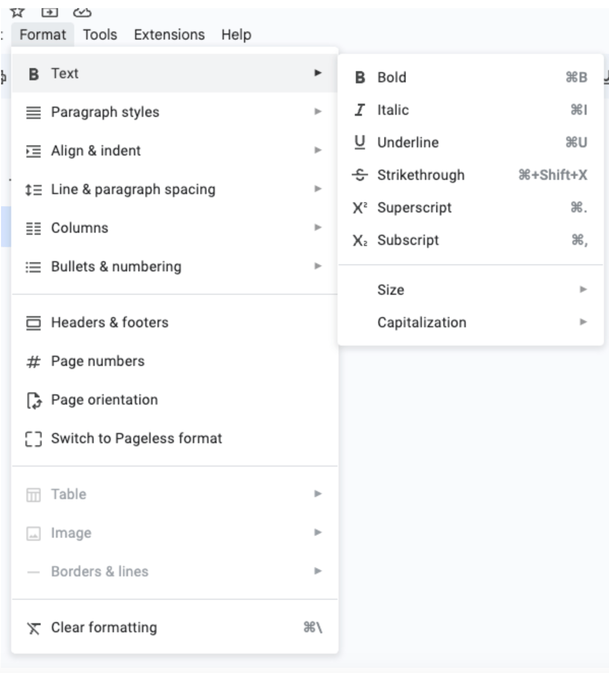
Examples & code snippets
The goal of our proposal is to make it easy for web developers to author accessible menus with very little markup and JavaScript. Consider the following examples:
<menubar>
  <submenu>
    <menuitem>File</menuitem>
    <menulist>
      <menuitem>New</menuitem>
      <submenu>
        <menuitem>Open Recent</menuitem>
        <menulist>
          <menuitem>Document1.txt</menuitem>
          <menuitem>Report.docx</menuitem>
          <menuitem>Spreadsheet.xlsx</menuitem>
          <hr>
          <menuitem>Clear List</menuitem>
        </menulist>
      </submenu>
      <hr>
      <menuitem>Save</menuitem>
      <menuitem>Save As...</menuitem>
      <menuitem disabled>Print</menuitem>
      <hr>
      <menuitem>Exit</menuitem>
    </menulist>
  </submenu>
  <submenu>
    <menuitem>Edit</menuitem>
    <menulist>
      ...
    </menulist>
  </submenu>
  <submenu>
    <menuitem>View</menuitem>
    <menulist>
      ...
    </menulist>
  </submenu>
  <submenu>
    <menuitem>Help</menuitem>
    <menulist>
      ...
    </menulist>
  </submenu>
</menubar>
<menubar>
  <submenu>
    <menuitem>File</menuitem>
    <menulist></menulist>
  </submenu>
  <submenu>
    <menuitem>Edit</menuitem>
    <menulist></menulist>
  </submenu>
  <submenu>
    <menuitem>View</menuitem>
    <!-- View Menu (Level 1) -->
    <menulist>
      <!-- This item triggers a nested submenu (Level 2) -->
      <submenu>
        <menuitem>Zoom</menuitem>
        <!-- Zoom Menu (Level 2) -->
        <menulist>
          <fieldset checkable="single">
            <menuitem>50%</menuitem>
            <menuitem>75%</menuitem>
            <menuitem defaultchecked>100%</menuitem>
            <menuitem>150%</menuitem>
            <menuitem>200%</menuitem>
          </fieldset>
        </menulist>
      </submenu>
      <menuitem>Full Screen</menuitem>
      <hr>
      <fieldset checkable="multiple">
        <menuitem defaultchecked>Show Ruler</menuitem>
        <menuitem>Show Outline</menuitem>
        <menuitem defaultchecked>Show Comments</menuitem>
      </fieldset>
    </menulist>
  </submenu>
  <submenu>
    <menuitem>Help</menuitem>
    <menulist></menulist>
  </submenu>
</menubar>
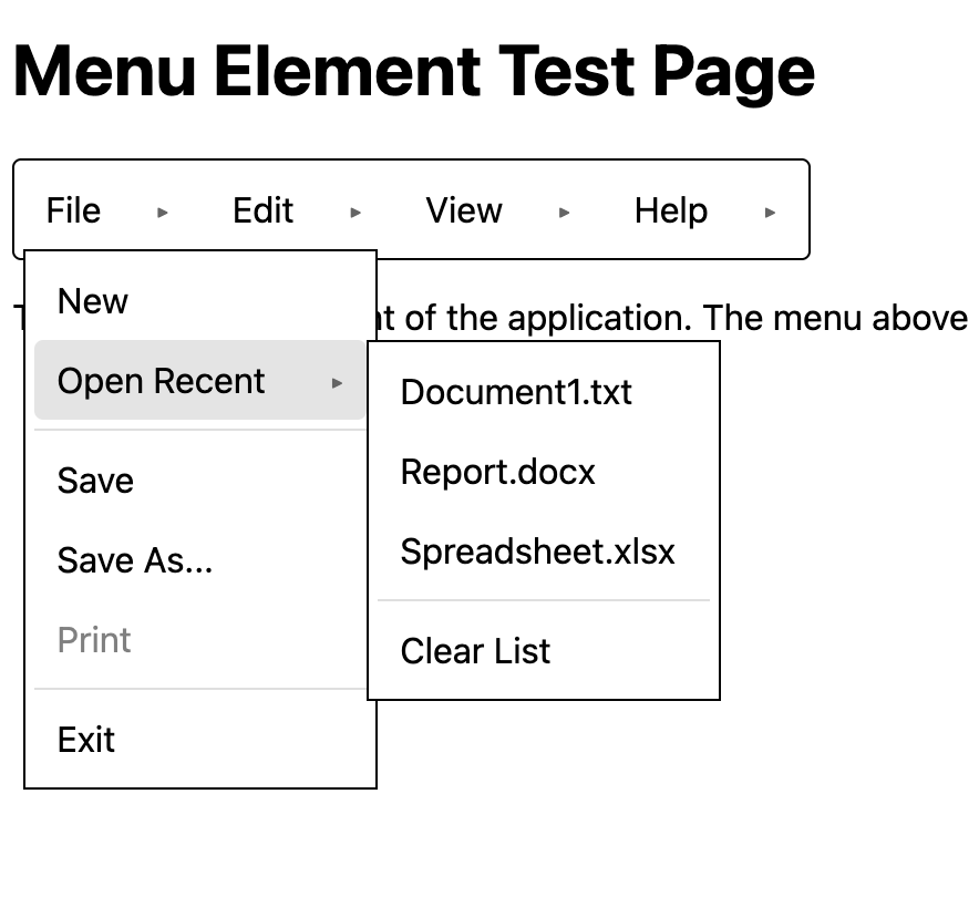
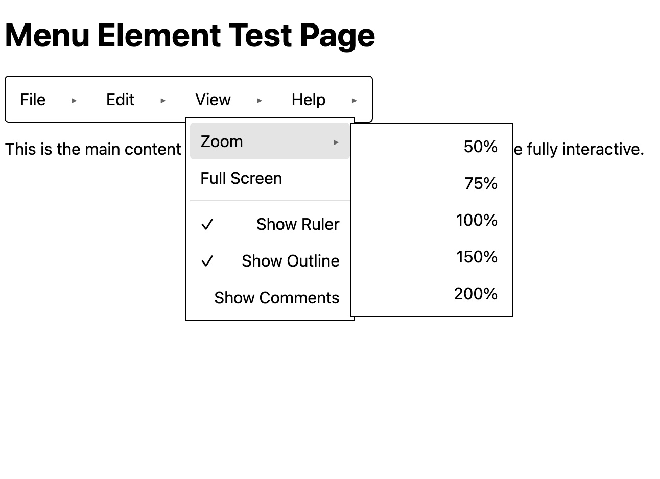
These images were captured using our test site (old syntax) to test and demo these new elements.
Because new elements in the markup above build off of existing features such as the Popover API, Invoker Commands, and CSS anchor positioning, much of the behaviors needed by the menu use case are provided natively, and do not need to be re-invented by web developers or library authors.
Further, these elements will have the correct implicit ARIA roles, states, and properties, as well as a keyboard interaction & focus model that users expect.
The <menubar> element
The <menubar> element represents an in-page group of <menuitem> elements that can invoke
commands or <submenu> elements that can open submenus.
It defaults to a horizontal orientation, and its child
elements are flex items displayed in a row.
This element:
- Provides the implicit
menubarARIA role. - Provides the correct keyboard and focus behavior across child menu items and sub menulists.
Content model: the <menubar> element allows the following elements as descendants:
<menuitem><submenu><fieldset>(containing<div>(with transparent content model) or<menuitem>)<div>(with transparent content model)- Anchor
<a>tags are disallowed in menu bars, due to accessibility concerns around exposing links in ARIA menus, and concerns around the navigation menubar pattern. We enforce this with the content model, and propose defaultdisplay: nonestyles for anchors that are descendants of<menubar>elements.
The <menulist> element
The <menulist> element is another way to group <menuitem>s together. This element is a native
popover, and must be invoked by a button or a <menuitem> to show what it represents—a stack
of <menuitem>s with default styles that resemble an application drop-down menu.
This element:
- Provides the implicit
menuARIA role. - Has default anchor positioning styles that anchor it to its
implicit anchor—the
button or menuitem that invoked it.
(This means the positioning of the
<menulist>happens through anchor positioning rather than through DOM tree relationships.) - Behaves as though it has
popover=autowhen nopopoverattribute is present, which gives it all native popover behaviors. - Can be invoked with the new
toggle-menucommand, and is referenced by its ID from its invoker. - Provides the correct keyboard and focus behavior across sub-menulists, menubars, and child menu items.
Content model: the <menulist> element allows the following elements as descendants:
<menuitem><hr><fieldset>(containing<div>(with transparent content model) or<menuitem>)<div>(with transparent content model)- This initial version does not allow other content. While there is some desire to allow
some types of interactive content inside of menu lists,
we would need to answer a number of questions around the desired keyboard navigation behavior
and ARIA roles, since many types of interactive content would not fit with the navigation
by arrow keys that is expected of elements with
menu*ARIA roles. However, in the future we might want to figure out how to support interactive content as a sibling of<menuitem>s, not nested inside them, as nested interactive content is generally inaccessible. See Issue #1323 for more discussion on how we might support other interactive content in menus, such as<input type=search>. - Anchor
<a>tags are disallowed in menu lists, due to accessibility concerns around exposing links in ARIA menus, and concerns around the navigation menubar pattern. We enforce this with the content model, and propose defaultdisplay: nonestyles for anchors that are direct descendants of<menulist>elements.
The <fieldset> element is used in a <menulist> to group menu items that serve a common purpose.
It gives two key pieces of functionality:
- Captioned groups, with its optional
<legend>for labeling. - A common ancestor for checkable
<menuitem>s. This supports both exclusively checkable and multi-checkable menu items.
Checkable menu items
To support checkable menu items, we propose the new checkable content attribute on
<fieldset>, reflected by a corresponding boolean IDL attribute, to group items as either
radios or checkboxes; its allowed values are checkable=single and checkable=multiple:
<menulist id=sort-menu>
  <fieldset checkable=single>
    <legend>Sort by</legend>
    <menuitem>Recently added</menuitem>
    <menuitem>Date created</menuitem>
    <menuitem>Creator</menuitem>
  </fieldset>

  <fieldset checkable=multiple>
    <menuitem>1 bedroom</menuitem>
    <menuitem>2 bedrooms</menuitem>
    <menuitem>3 bedrooms</menuitem>
  </fieldset>
</menulist>
Note that <fieldset> is totally optional—it is only needed to support captioned or checkable menu
items. If <menuitem>s appear bare in a <menulist> or <menubar> without a <fieldset>, then
they are just grouped together under their parent list or bar, but are logically separate and not
checkable.
The <menuitem> element
Activating the <menuitem> element is how users invoke actions from an application menu. As
discussed, these can appear in <menubar> or <menulist> elements, and are used to invoke
commands, track checkable state, or open submenus with more menu items.
This element:
- Provides the implicit
menuitemARIA role.- See “checkability” below for how this can change
- Provides the correct keyboard and focus behavior across sub-menulists, menubars, and sibling menu items.
- Has
command/commandforattributes to invoke sub-menus or issue other commands. - Has a
disabledIDL attribute and corresponding content attribute. - Supports the
:enabledand:disabledCSS pseudo-classes. - Events:
- A
clickevent is fired upon activation. See Issue #1312. Firing a syntheticclickhere is consistent with the HTML Standard’s prose on activation. - For checkable menu items,
if the
clickevent is not canceled (also known asdefaultPrevented), then the following also happens synchronously after theclickevent (See Issue #1321):- The internal checked state changes as part of the
menuitem’s activation behavior. - A
checkedevent is fired. - Note that this happens before closing of any popovers that need to be closed as a result of activation.
- The internal checked state changes as part of the
- A
- Checkability:
- Supports checkability, by being contained in a
<fieldset checkable=single|multiple>. - Has a
checkedboolean IDL attribute that does NOT reflected any content attribute, to track live-checked-ness. - Has a
defaultcheckedcontent attribute reflected by adefaultCheckedboolean IDL attribute to cover checked initial-ness. See Issue #1205. - Supports the
:checkedCSS pseudo-class and::checkmarkCSS pseudo-element. - Provides the right implicit ARIA role, either
menuitemcheckboxforcheckable=multipleormenuitemradioforcheckable=single.
- Supports checkability, by being contained in a
Content model:
We expect the content in a menu to be in <menuitem> elements.
This includes non-interactive elements and design items such as logos, images, text.
See Issue #1323 for more discussion on how we might
support other interactive content in menus alongside the <menuitem> element in a later version of this feature, such as <input type=search>.
The <submenu> element
The <submenu> element groups a <menuitem> child that opens a submenu
and a <menulist> child that is that submenu.
This element has display:contents so that its child <menuitem> can participate
in the layout of the parent.
Content model:
One <menuitem> child followed by one <menulist> child.
Invoking a <menulist> from a <button>
The <menulist> popover element can be used without a <menubar> invoking it through a <submenu> and its <menuitem>. It
can be invoked by any command invoker element, such as the <button> element. This is a pattern
commonly seen on sites that provide one-off drop-down menus or filter overlays.
Similarly, <button> elements that reveal menus are commonly used in tables/grids to allow for
adjustments to the presentation of the tabular data, or to edit or delete specific row or cell
content:
Toolbars or other groupings of controls beyond menubars may include buttons that display a popover list of actions that appear in a menulist:
Button elements outside the context of a <menubar> can invoke <menulist> elements to fulfill the
use cases above by leveraging the command and commandfor attributes, and the new menu (or
existing popover) commands.
<button command=toggle-menu commandfor=menu>Actions</button>

<menulist id=menu>
  <menuitem>Foo</menuitem>
</menulist>
A button that invokes a menulist in this way would have an implicit aria-haspopup=menu property,
along with an impliict aria-expanded state, reflecting whether the menulist is rendered (expanded)
or not (collapsed). It would not have an implicit aria-details property. This is because unlike
other more generic popovers, keyboard focus should immediately move from the invoking button to the
first focusable element, or element with the autofocus attribute, of the rendered <menulist>.
Accessibility
One goal of this proposal is to make the menu elements we propose accessible by default. To achieve this in part, our proposal follows the ARIA Authoring Practices Guide on the Menu and Menubar pattern and best practices curated from accessibility experts as closely as possible; deviations are discussed with accessibility experts and documented here to the best of our ability. This section describes the concrete implications on our proposal.
Native ARIA role mapping
- The
<menubar>element exposes the implicit ARIAmenubarrole. - The
<menulist>element exposes the implicit ARIAmenurole. - The
<menuitem>element exposes the implicit ARIAmenuitemrole by default.
While the <menuitem> element’s native ARIA role defaults to menuitem, it is responsive to
whether the element is embedded in a <fieldset checkable=single|multiple>. The
menuitemradio role is exposed for items in a
<fieldset checkable=single>, and the
menuitemcheckbox role is exposed for items in a
<fieldset checkable=multiple>.
ARIA attributes
aria-expanded- The
<menuitem>element’saria-expandedattribute reflects whether or not a popover invoked by the<menuitem>is expanded. This includes sub-menu<menulist>elements (invokeable via thetoggle-menucommand), or other popovers unrelated to our proposal
- The
aria-checked- For checkable
<menuitem>element, thearia-checkedattribute reflects whether their current state is checked
- For checkable
aria-disabled- See § Soft disabling
Soft disabling
A <menuitem disabled> element will be marked as aria-disabled=true, however the element will
still be keyboard reachable and focusable, just not activatable. See Issue
#1274 for more discussion.
Or maybe it won’t be; this requires further discussion.
Keyboard behavior
See § What should the keyboard behavior be? for details.
Navigation menubars
In short, there are longstanding accessibility issues with navigation menus and our proposal does not support the navigation menubar use case or pattern. See both the § How does this proposal relate to navigation menus? section and Issue #1193 for more information.
General questions
What should the keyboard behavior be?
We propose the keyboard behavior as described in the table of the ARIA Authoring Practices Guide, which is demonstrative of the keyboard expectations for how menus and menubars work in operating systems.
- A menubar and the menulists it invokes have a single tab stop.
- Pressing tab when a
menuitemhas focus leaves the set of menus and closes the menulists. - There may be exceptions to this rule when the content model is not followed.
- Pressing tab when a
- A menulist is invoked when its popovertarget (a menuitem or a button). Focus would automatically move to its first focusable child.
- Tab focus will not trigger the menuitem to get selected/checked, but only when an explicit Enter/choice happens.
- An explicit Enter/Space does not close the menulist if the menuitem selected has a
toggle-menucommand that opens another menulist (a submenu). - An explicit Enter/Space on any other menuitem inside a menulist will close that menulist.
- An explicit ESC will close the current popover menulist that has focus and return focus to its invoking element (which may be a menuitem inside a menulist or a menubar; or is a button element).
- Arrow keyboard events will allow navigating between menuitems, in some cases opening and closing menus as appropriate.
Questions
- Do we need special behavior for hot keys?
Why not reuse the <menu> element?
The existing
<menu> element nominally represents a “toolbar”
of commands, despite having no related implicit ARIA role, no native command-invoking behavior, and
no other menu, menubar, or toolbar behaviors or keyboard interactions. Rather, it is a <ul> with a
different name. Due to these legacy behaviors (or lack thereof), we opted to not modify it at all,
and instead introduce the new <menubar> and <menulist> elements. You can read more about what
the existing menu element is and isn’t here.
Our proposal does not modify this existing element or its processing model, although we could
consider an opt-in that gives the existing <menu> element all of the semantics proposed here, or
simply change its semantics and processing model when it contains a new <menuitem> element as a
child. See https://github.com/openui/open-ui/issues/1194 for more discussion.
Should the menu elements use id references or nesting for submenu relationships?
Discussion: Issue #1456
Should submenu relationships be expressed by ID references, as the previous version of the proposal does:
<menubar>
  <menuitem command=toggle-menu commandfor=file-menu>File</menuitem>
  <menuitem command=toggle-menu commandfor=edit-menu>Edit</menuitem>
</menubar>

<menulist id=file-menu>
  <menuitem>New</menuitem>
  <menuitem>Open</menuitem>
</menulist>

<menulist id=edit-menu>
  <menuitem>Cut</menuitem>
  <menuitem>Copy</menuitem>
  <menuitem>Paste</menuitem>
</menulist>
… or should they be expressed through DOM tree nesting relationships, as we do now:
<menubar>
  <submenu>
    <menuitem>File</menuitem>
    <menulist>
      <menuitem>New</menuitem>
      <menuitem>Open</menuitem>
    </menulist>
  </submenu>
  <submenu>
    <menuitem>Edit</menuitem>
    <menulist>
      <menuitem>Cut</menuitem>
      <menuitem>Copy</menuitem>
      <menuitem>Paste</menuitem>
    </menulist>
  </submenu>
</menubar>
… or should both variants be allowed?
Some considerations for each of these options:
ID references
- Precedents:
<input>/<datalist><dialog>popover
- Advantages (relative to both other options):
- Requires fewer elements total, since avoiding nested interactive elements comes naturally rather than needing an extra wrapper element.
- Disadvantages (relative to both other options):
- Requires naming elements and referencing them by name.
DOM Nesting
- Precedents:
<ul>/<ol><select>and<option>- Material Web menu component (avoids nested interactives)
- React Spectrum v3 Menu component (avoids nested interactives)
- Semantic UI Menu collection (has nested interactives)
- Advantages (relative to both other options):
- Easier to describe
clickevents firing on activated menuitems (since events can be redirected like<label>does). - More natural to take event handling approach of handling all the events in a handler on the root of a widget (though possible with either approach if the menus are all in a common container).
- Easier to describe
- Disadvantages (relative to both other options):
- Requiring the entire menu structure in one place may make composing the menu more difficult when parts of the menus are managed by different teams.
- Requires extra nesting elements to avoid having nested interactive elements.
- If the tree traversed is the light DOM, then harder or impossible to use across shadow DOM boundaries. (Either alternative can be used with
referenceTarget.
Allow either ID references or nesting
- Precedents:
<label for=>form=on form controls- maybe
aria-labelledbyand similar attributes
- Advantages (relative to both other options):
- Developers can write whichever way they prefer.
- Disadvantages (relative to both other options):
- Has more complexity for anyone who needs to handle both cases (implementors, and in some cases also developers).
Another relevant discussion on this topic was the discussion (back when the current proposal did not use nesting) on whether to use use aria-owns
natively to establish a parent-child relationship for these menus in the accessibility tree. This
was discussed in Issue 1297, where we resolved
against doing this.
What’s the difference between this and the <toolbar> proposal?
There is a lot of nuance between the various menu-adjacent patterns: menubar, navigation menu, and toolbar. See Issue #1188 for discussion about how to better crystalize this distinction in this explainer.
In short, menu elements provide a hierarchical structure to represent application menus and their commands—they’re generally used to acccess settings and application-wide configuration tools. Toolbars, on the other hand, provide quick, in-page access to commands pertaining to a specific component that the user is interacting with, like style settings for a document. Toolbars can contain a variety of controls, for example, buttons and comboboxes (which can also invoke menu lists).
How best to represent checkable <menuitem>s?
GitHub: Issue #1189
We want to be able to represent two types of checkable menuitems:
- exclusive checkable menuitems, where only one item in a group can be checked, typically represented with radio buttons
- multiply-checkable menuitems, where multiple items in a group can be checked (although there might be just one item), typically represented with checkboxes
There are two high-level approaches for doing this:
- with an attribute on each menu item, plus a name to group the exclusive items
- with a grouping element that contains the items
The advantage of a grouping element is that it pushes content authors to follow good practice for exclusive checkable menuitems, which is that all of the items in a group should be together with no other items between them (though separators are allowed). It also pushes authors to avoid mixing checkbox and radio items together. (Controlling whether an item is a radio or a checkbox with attributes on the item, rather than with attributes on the grouping element, makes it easier for authors to do mix items in ways that are bad practice.)
We would also like that grouping element to be a <fieldset>
because in some cases it makes sense to label a group of menuitems,
and <fieldset> provides an existing mechanism to do that.
In the typical case we would expect such a label to be visible and also be
exposed to assistive technology when navigating through the menuitems.
In some cases it may also be desirable for
the label to be exposed only to assistive technology but not be visible.
(This labeling may also apply to menuitems that are not checkable;
thus <fieldset> should be usable around other menuitems as well.)
Thus the current proposal introduces a single <menuitem> element
to represent all menu items,
including checkable state-bearing ones.
Instead of representing both checkable & non-checkable menu items with a single element, we could:
- Add a
typeattribute to<menuitem>, giving:<menuitem type=checkbox>and<menuitem type=radio>.- When present, the element’s
checkedanddefaultCheckedattribute would take effect, much likeHTMLInputElement#checkeddoes on checkable inputs (while doing nothing on non-checkable inputs like<input type=date>).
- When present, the element’s
- Add a
checkableIDL attribute on<menuitem>- This attribute would control whether the element can be checked.
- It could be a boolean IDL attribute, or take one of two values
checkable=single|multiple, for radios and checkboxes respectively.
- Introduce new
<menuitemcheckbox>and<menuitemradio>elements- These represent ARIA roles, and could be exposed as elements, but it adds complexity to the proposal without giving us any accessibility wins.
These alternatives all have the disadvantages stated above that they make it easier
for authors to do things that are bad practice.
They don’t appear to have any significant advantages,
except for the case of an isolated checkbox menuitem
which in our proposal requires the additional <fieldset> container.
These proposals would also require the additional complexity of a mechanism
to group all menu items that
participate in the same exclusive group, which would probably be the name attribute. Then, in
order to create a group of radio exclusive menu items, you either have to set two attributes instead
of one, or remember to use a new element and a new attribute.
Is <fieldset> necessary to group <menuitem>s together?
We considered using the name attribute to group
exclusively checkable menu items, however it is confusing to use a form control attribute in this
setting which is distinct from forms altogether.
Further, if we want to support captioned / labeled groups of menu items, the name attribute
wouldn’t be sufficient. So if we used the name attribute to control checkable exclusivity, then
we’d still need a grouping element like <fieldset>.
NOTE: <fieldset> is a more general grouping element than <optgroup>, which we briefly
considered, but decided against since it is used for grouping options in select elements, and should
stay that way.
Are radio and checkbox menu items allowed as direct children of a <menubar>?
Currently, we don’t see a need for this. All menuitems inside a menubar should perform some action
like opening a sub <menulist>, however we will reconsider this restriction if good use cases
arise, however these use cases are probably best solved with the
<toolbar> proposal.
For example, a text editor might use a <menubar> to provide basic font style adjustments. While it
might seem reasonable to use checkable <menuitem> elements to style content as “Bold”, “Italic” or
“Underlined”, the <toolbar> proposal is more
apt to satisfy this use case.
Note: Currently the content model does allow this. We should figure out why the content model disagrees with this part of the explainer and update one of them.
What’s the difference between <select> and these new menu elements?
Like <select>, the menu element we propose offer a list of choices to pick from, and with
customizable select now available, users might be confused when to use which one.
The <select> element is a form-associated element containing <option> elements. Each of these
options must have a server-readable value. As a user chooses an option, specific events are
triggered (change, input) and a new value is set.
On the other hand, our proposed menu elements display a list of commands/actions that carry an entirely different semantic meaning, along with a keyboard interaction model that generally adheres to the ARIA guidelines for the menu and menubar pattern, allowing users to traverse through deeply nested menu lists. Each menu item is a command that is activatable, and can open a new/nested menulist or to trigger a specific command.
Why are we adding <menuitem> and not re-using the <command> element?
See <command> element’s deprecated specification
here. In the last year, the command
and commandfor attributes were introduced so buttons can perform actions on other elements
declaratively. We thought re-using this obsolete element with the same name would be confusing to
developers.
Additionally, command is a single element, where as this proposal is introducing various elements with additional grouping semantics and keyboard behaviors beyond what a single ‘command’ element would represent - or reasonably be capable of creating parity with the various ARIA roles these new proposed elements would be natively introducing to HTML.
Invoker semantics for <menuitem>
- We should allow command invokers.
- Useful for menu items that invoke custom commands.
- Useful for interest invoker targets.
- Useful to show modal dialog.
- To decide: Do command invokers make sense for radio/checkbox menuitems? Do we have use cases of a menuitem that toggles its checked state and invoke a behavior at the same time?
Popover semantics for <menulist>
A <submenu> element creates a relationship that allows its child <menuitem> to
invoke its child <menulist>.
This is similar to what the toggle-popover command does
but it also implies some additional menu-specific
behavior and relationships, such as keyboard navigation and focus behavior.
- Should
<menulist>be a popover by default?- Yes, the popover attribute is not necessary. A menulist is by default a popover with value auto.
- Since
<menulist>s are popovers by default, what happens if we add a popover attribute on top of it?- It can be specified to overwrite the
popover=autodefault and to set topopover=hintorpopover=manual.
- It can be specified to overwrite the
- Should menulist.showPopover() be the way to open these from script?
- Yes (for now).
Why are we using popover instead of openable for <menulist>?
An “openable” is an element rendered in-page with display:none until it is opened. This could be useful for mobile apps, where the menubar is shown vertically in-page.
An element with role=menu is most commonly rendered as a popover. If someone wanted an in-page menu, then a menubar or fieldset of controls may be more appropriate. Though, if one wanted to show/hide a grouping of <menuitem> elements within a <menulist> popover, rather than as an adjacent submenu popover, then the following could be done:
<menulist>
  ...
  <menuitem command="toggle-openable" commandfor="o">Colors</menuitem>
  <fieldset aria-label=colors openable id=o>
    <!-- grouped menuitems go here -->
  </fieldset>
</menulist>
Someone could show/hide a menubar - much like how Google docs allows one to show/hide the menubar with the toggle on the right side of the toolbar (hide the menus (ctrl+shift+f) button).
Openable is currently not standard. If there are valid cases of needing the <menulist> element to be in-page and the feature is mature enough, we can revisit this.
Should clicking/activating a menuitem close the menu by default?
When user clicks on a menuitem:
- If it has a valid reference to a menulist:
- If menulist is open, close the menulist (and all its nested menulist children).
- Else, open it and move focus.
- Else, if menuitem is contained inside an open menulist, close its parentMenulist.
The algorithm when the user activates a <menuitem> in a <fieldset checkable=multiple>:
- Set it to checked.
The algorithm when the user activates a <menuitem> in a <fieldset checkable=single>:
- Set it to checked.
- Set all other radio menu items in the same group to unchecked.
Questions
- Should there be an attribute to control this behavior?
- Should “focusout” on a
<menulist>cause it to close? - What about hovering on
<menuitem>? This is not supported for popovers yet. - Define the click and drag behavior.
- Define the activation behavior.
- Define the behavior for nested list cases. We can leverage that menulist are popovers, meaning the focus is scoped already.
Should any of these elements be form-associated?
No. the menu elements proposal is intended to be semantically different from customizable <select>, which is in part achieved by the difference in form-association support. Supporting form-assocation also increases complexity (it raises questions like: what do we do if some of the controls appear outside of the menu element tree? how does form-association integrate with menu nesting?) with no obvious benefit; until a strong use case materializes, our default will be to not form-associate elements in this proposal.
However, we do recognize there are use cases where users might want to have inputs inside the menulists or menubars. For example, searchable menus using an input element. In such cases, the control is allowed in the menulist or menubar, but is not associated with a form.
How can users customize the UI of these menu elements with CSS?
We propose these elements should not support the CSS appearance property and just have a “base” appearance by default like the <dialog> element.
Questions
<menubar>should list<menuitem>s horizontally, but support using CSS writing-mode.- Can have vertical case by:
- Set CSS
writing-mode: vertical-lron the<menubar> - Set CSS
writing-mode: horizontal-tbon the<menuitem>inside the<menubar>
- Set CSS
- Can have vertical case by:
<menulist>can support more than top to bottom layout:- Set CSS
display: gridand use rows/columns.
- Set CSS
- For checkable
<menuitem>, should the check mark be on the left or the right?- Default should be on the left.
- This can depend on the CSS
directionproperty.
- For
<menuitem>, should there be a default slot for the icon? If so, should it be on the left or the right?- Default should be on the left.
- This can depend on the CSS
directionproperty.
There was a proposal for a Context Menu years ago. How is this different?
Previously, “context menus” were specified to allow developers to define custom context menus declaratively. This was being prototyped by Mozilla. Blink also had an implementation behind a flag.
<menu id="menu1" type="context">
  <a href=#>Cancel</a>
</menu>

<button contextmenu="menu1">Right-click me</button>
Per comment and PR, this feature was removed from the HTML specification because there was a lack of active interest by at least two implementers.
From Chromium, the reasoning for removing support was:
- There is doubt whether the API is well designed.
- This was considered a low priority because “reaching outside the content area and contributing items to the browser’s context menu” is a new capability and needs thorough designing. There was no bandwidth for new capabilities work.
- This is not an interoperability priority (only existed in Firefox)
Chromium bug: https://issues.chromium.org/issues/40589971
Mozilla bug: https://bugzilla.mozilla.org/show_bug.cgi?id=617528
Mozilla bug to remove support: https://bugzilla.mozilla.org/show_bug.cgi?id=1372276
Webkit bug about the touch bar API: https://bugs.webkit.org/show_bug.cgi?id=179020
The specification were removed per:
https://github.com/whatwg/html/pull/2742
https://github.com/whatwg/html/pull/2342
https://github.com/whatwg/html/pull/244
How can we use menu elements to support custom right click Context Menus?
We discourage users from using these new elements to build a custom context menu. There are good reasons to keep the user agent defined context menu. For example, it allows users to copy/paste consistently across sites and to have browser extension options added. We do not plan to provide a declarative way to build a context menu.
However, this proposal is not about removing the existing web capabilities. Authors can use Javascript to add an event listener on “contextmenu” and call preventDefault to not show the default context menu. They can support custom context menus (similar to Google Doc) by showing a <menulist> at the cursor location.
We understand it would be helpful to have this feature be natively supported. If we want to open the conversation about supporting this, here are some open questions to resolve:
- What should be the keyboard behavior?
- What are the accessibility mappings? See open ARIA issue.
- Can we add support to add individual
<menuitem>to the existing UA context menu? - How can we keep the OS context menu’s style?
- Before we can support this, we need to fix this popover bug about values auto vs manual.
How does this proposal relate to navigation menus?
Navigation menus allow users to access different pages or sub-pages of a web application. They commonly appear in a few different forms:
- The
<nav>element, which implicitly exposes the ARIA landmarknavigationrole.- Since hyperlinks and buttons are commonly children of this sort of navigation menu, authors generally do not need to declare specific ARIA roles to be accessible, and users can rely on standard Tab keey navigation to reach each interactive navigation element.
- The abused Navigation Menubar Pattern
- These generally have poor accessibility characteristics, and are not recommended.
- The Disclosure Navigation Menu Pattern
- The APG describes this as a better alternative to the navigation menubar pattern above.
In Issue #1193 we discussed the possibility of
supporting the Navigation Menubar Pattern with our proposal, and primarily due to accessibility
concerns, ultimately resolved not support it. Conceretely, this means that our proposal will
discourage the use of embedding <a> hyperlinks in menus alongside menuitems, likely through the
content model and default styles.
Page navigation can still be triggered with menu items, but will have to be done so with JavaScript
event listeners that handle the activation of the menu item, and do something like location.href = foo; in response. We expect that this will result in our menu elements not being used as primary
navigation components on web pages; rather navigation menu items as we just described will be
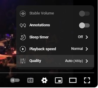
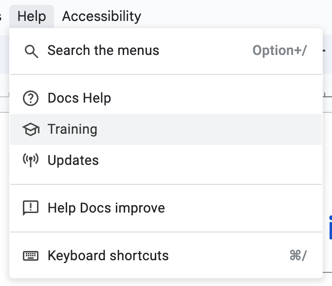
one-offs, much like the following “Training” example, which opens a new page upon activation, but
does not need to be enumerated as anything other than an application menu item by screen readers:
To support something similar to the Disclosure Navigation Menu Pattern, a new OpenUI proposal will
be formed, introducing something like a <navigationbar> element which is the navigation analogue
to our proposal’s <menubar>, and has the right keyboard interaction model out-of-the-box.
How can we use menu elements to support Touch Bar?
There is a history of attempting to do this in Webkit, for example for a Touch Bar. The idea is to collect all your “commands” and put them into the macOS menu bar (or expose them some other way). Our proposal does not address this use case.
Examples in code
Google Docs: nested menulist
<menubar>
  <submenu>
    <menuitem>Format</menuitem>
    <menulist>
      <submenu>
        <menuitem>Text</menuitem>
        <menulist>
          <fieldset checkable="multiple">
            <menuitem id="bold-menuitem">Bold</menuitem>
            <menuitem>Italic</menuitem>
            <menuitem>Underline</menuitem>
          </fieldset>
        </menulist>
      </submenu>
      <submenu>
        <menuitem>Paragraph styles</menuitem>
        <menulist></menulist>
      </submenu>
      <submenu>
        <menuitem>Align & indent</menuitem>
        <menulist></menulist>
      </submenu>
    </menulist>
  </submenu>
  <submenu>
    <menuitem>Tools</menuitem>
    <menulist></menulist>
  </submenu>
  <submenu>
    <menuitem>Extensions</menuitem>
    <menulist></menulist>
  </submenu>
</menubar>

<script>
document.querySelector('#bold-menuitem').addEventListener("click", () => {
  // Toggle bold-ness.
  if (text.style.fontWeight === 'normal') {
    text.style.fontWeight = 'bold';
  } else {
    text.style.fontWeight = 'normal';
  }
});
</script>
Future enhancements
We envision more advanced capabilities in the future that could enhance the usability of the menu elements designed in this explainer, but that are not necessarily in scope for our initial proposal.
One such capability is keyboard shortcuts to invoke <menuitem> commands; see
https://github.com/openui/open-ui/issues/1225. We envision that this could be provided by a more
advanced version of the
accesskey
primitive, that would provide customizable key commands that apply outside the scope of our
proposal.
Reading List
Menus have been heavily discussed, please see below to learn about the existing specification and efforts.
ARIA guidelines
- the ARIA menu role
- the ARIA menubar role
- the ARIA menuitem role
- the ARIA menuitemcheckbox role
- the ARIA menuitemradio role
- the Core AAM mappings
- the HTML AAM for <menu>
Relevant ARIA issues
Relevant Navigation specific issues
- [ARIA practices] Clarify Purpose of Menu Navigation
- [OpenUI] Navigation vs menu items use case
- [ARIA] Concerning navigation “menus” (open ui related)
APG pattern recommendations (note these are not guidelines)
HTML specification
- The menu element
- The nav element
HTML specification for previous efforts
Blog posts from accessibility community
- https://www.scottohara.me/blog/2021/10/21/menu.html
- https://adrianroselli.com/2017/10/dont-use-aria-menu-roles-for-site-nav.html
- https://adrianroselli.com/2019/06/link-disclosure-widget-navigation.html
- https://adrianroselli.com/2023/05/be-careful-using-menu.html
Blog posts for Design System
- https://webflow.com/blog/navigation-bar-design
- https://developer.apple.com/design/human-interface-guidelines/the-menu-bar
Issues / Discussions
This section links to all of the relevant discussions and issues related to menu:
OpenUI
- Menu elements proposal
- Explicitly mention whether reading-flow should impact arrow key navigation
- improve distinction between menubar and toolbar
- How should we group checkboxes and radios, and how should we decide if they are checkboxes or radios?
- Activation behavior for opening submenus
- Explicitly mention support for HR as a separator
- When should activating a menuitem close the menu?
- Navigation vs menu items use case
- Consider reusing
<menu>and<nav>HTML elements - allow buttons to open menu(list) popups
- [openable] allow author choice of opening a submenu inline or as a popup
- do we need to introduce menuitem elements?
- define orientation attribute
- Define a default checked attribute for menuitem
- Keyboard shortcuts?
- Should menulist be a popover by default?
- [menu] Soft disabling menuitem elements
- Is aria-owns the right relationship for sub-menus?
- [menu] Should an event be fired when a
<menuitem>is selected? Which event? - What event should fire on checkable menu items?
- How to support interactive content like
<input type=search>in a menu? - Can we give menuitems a default command?
- [focusgroup] Feedback: Mousepointer hover on other items should re-focus
- [focusgroup] Feedback: Pointer-activated menu should not focus first item, but clicking down arrow after clicking the menu trigger should still activate the first item ( autofocus or tab-into should not be necessary)
- [focusgroup] Moving focus between horizontal submenus
- menubar/menulist/menuitem content model
- What should the tab key do in menu elements?
- [menu] moving keyboard focus into submenus
- Do we need command=show-menu and command=hide-menu?
- Nested structure for menus?
WHATWG
- Introduce the new menu elements
- This is the HTML spec PR to add the new elements
CSSWG / WHATWG / OpenUI Task Force
- [menu] support :open pseudo-class on
<menuitem>s that open submenus - [css-ui] Add or reuse pseudo-element for openable-submenu indicator (triangle)
- This issue has the discussion that chose the name of the
::expand-iconpseudo-element.
- This issue has the discussion that chose the name of the