 Open UI
 Switch (Explainer)
- Authors
- @gfellerph
- Created
- Last Updated
Overview
A switch toggles a binary state on or off. Other names include “toggle”, “lightswitch”, “toggle switch” or “toggle button”. 1
Dictionary
- Switch
- The component described in this editors draft.
- Active state
- Refers to the “on” position of the switch.
- Inactive state
- Refers to the “off” position of the switch.
Alternative proposal
There is a switch proposal at WHATWG (also see the original issue at https://github.com/whatwg/html/issues/4180) that would re-use the input element (<input type="checkbox" switch>) to implement a switch component. This explainer here is focusing on a different approach, using a standalone <switch> element. See the comparison section for a list of differences between the switch attribute proposal and the switch element explained here.
An implementation of this specification was already introduced by Safari Technology preview and Safari Beta (https://github.com/whatwg/html/pull/9546#issuecomment-1865357407).
Background
The history of light switches date back to the 80’s, and they were used for just the On-Off purpose. The technological advancements of the day allow performing numerous tasks with the help of these light switches, including the adjustment of brightness of lamps.
The first ever light switch worked on a technology called the quick-break mechanism. Invented by John Henry Holmes in 1884, there used to be formation of a residue in the previous arcing technologies, thus reducing the life of the switch.
The word “toggle” is a reference to a kind of mechanism or joint consisting of two arms, which are almost in line with each other, connected with an elbow-like pivot. However, the phrase “toggle switch” is applied to a switch with a short handle. 2 and 3
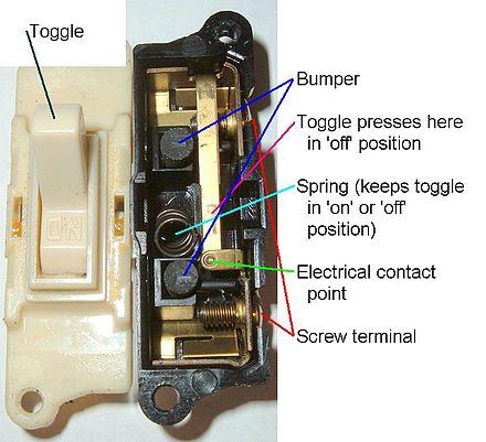 Attribution: Scott
Ehardt
Attribution: Scott
Ehardt
Use Cases
A switch can be used to toggle a binary state. Popular use-cases inlcude switching dark mode on or off, switching WiFi or other settings on or off and extends to any situation where a user is limited to a binary state - true or false, on or off.
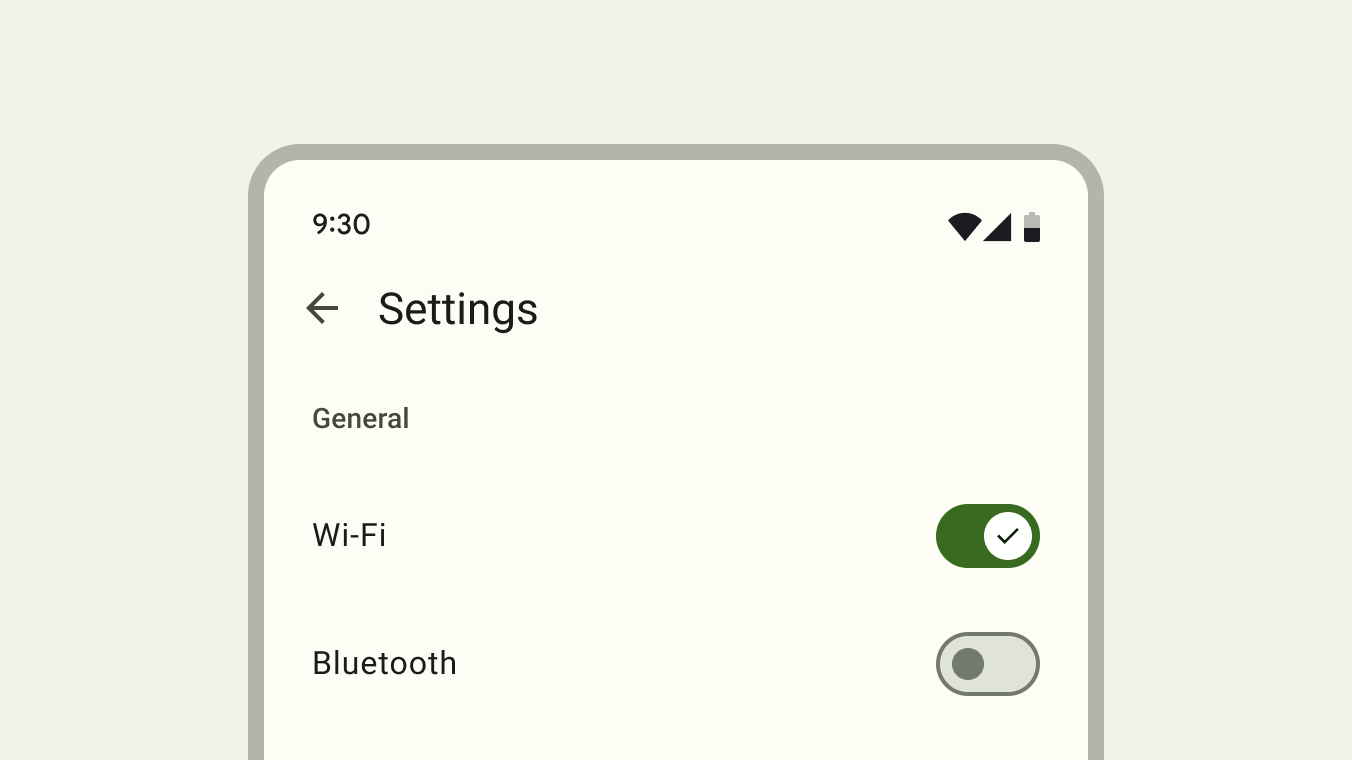 Attribution: Material Design, Google Inc.
Toggling a switch always has an immediate effect.
Comparison switch attribute vs. switch element
| Description | Switch attribute | Switch element |
|---|---|---|
| Markup | | or |
Styling (re-coloring tracks) | | |
Customizing icon on thumb |
|
|
Localization of track content |
|
|
Non-goals
Non-binary states
It’s not recommended to use a switch to toggle between two opposite states4. This could include a list vs. map view or switching between light and dark mode. Light mode can be switched on or off, but don’t toggle between light and dark - two opposing states.
Non-immediate action
Should the “switch” be used to trigger immediate actions only? A majority of analyzed Design Systems recommend this behavior. This decision can have influence on the API in regards to form association and validation.
Don’t use a switch to select one or more options from a list. Switches should provide an immediate noticeable effect that doesn’t require the user to click Save or Submit to apply the new state. 4
Toggles should never require users to press a button to apply the settings. 5
| Design System | Base element | Recommends immediate action | Recommends form usage* | No recommendation |
|---|---|---|---|---|
| Ant Design (uses button) | button | ✅ | ||
| Material Design 3(uses buttons) | button | ✅ | ||
| Evergreen (uses checkbox) | checkbox | ✅ | ||
| Fast (uses div) | div | ✅ | ||
| Atlaskit (uses checkbox) | checkbox | ✅ | ||
| Carbon (uses button) | button | ✅ | ||
| Fluent UI (uses button) | button | ✅ | ||
| Lion (uses div) | div | ✅ | ||
| Primer (uses button) | button | ✅ | ||
| Bootstrap (uses checkbox) | checkbox | ✅ | ||
| Lightning (uses checkbox) | checkbox | ✅ | ||
| KoliBri (uses checkbox) | checkbox | ✅ | ||
| Semantic UI (uses checkbox) | checkbox | ✅ | ||
| Spectrum (uses checkbox) | checkbox | ✅ | ||
| Tailwind Elements (uses checkbox) | checkbox | ✅ | ||
| WAI-ARIA (examples include button and checkbox variant) | button/checkbox | ✅ |
* No Data found for explicit form usage encouragement, allthough implementations that rely on a checkbox indirectly allow that behavior.
Pattern differentiation
The switch is not a checkbox or radio button alternative.
A switch differs from a checkbox because:
- It has no indeterminate state
- It requires an immediate action, no confirmation is needed for the state to take effect
A switch differs from a radio button because:
- It always has an initial state, either on or off. A radio button group can be in an initial “nothing selected” state
- Switches cannot be grouped together like radio buttons with the same
nameattribute. Two switches cannot have the samenameattribute. - It requires an immediate action, no confirmation is needed for the state to take effect
Features
Form association
How should form validation work? Is there a way to describe that the valid state is “off” instead of “on” if this is required for some reason?
A <switch> can be part of a form. The value of a switch is reported to the form target as either “on” or “off”.
Animation
Two popular animation techniques are supported.
Background fade
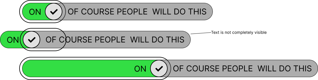
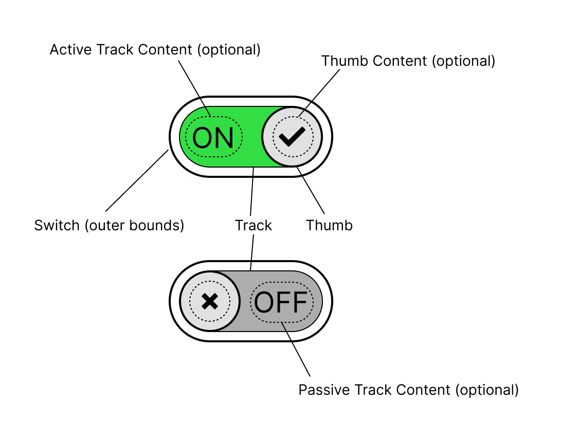
Upon toggling the switch, it’s background changes from grey (off) to green (on) and the toggle slides to the respective position. Content on the thumb can indicate the currently active state. Track content is also possible in this variant, but as the track does not move, the content is being hidden and revealed by the sliding thumb.
Track slide
Upon toggling the switch, the track and the thumb slide together to the respective position. The track reveals the active side of the track while the inactive track side is being hidden. This variant imitates physical switches and can also reveal track content on either side of the thumb, describing the currently active state.
Risks and Challenges
Implementing the switch as a form element could lead developers to use it as a checkbox replacement.
Prior Art/Examples
Open UI research page: https://open-ui.org/components/switch/
Atlassian Design System switch animation with content on the track and a thumb that reveals the active content while hiding the inactive content.
Various Ant Design switch animation with content on the track and a sliding track animation.
Design
User interaction
From a user standpoint, the following interactions should be supported
- Click/tap: toggles the switch
- Spacebar: toggles the switch which has keyboard focus
- Swipe: Switch should support gesture support akin to input type=“range” (#1045)
Styleability
All parts described in the anatomy section should be styleable by either providing an element or pseudo-element.
APIs
Properties and Attributes
| Property Name | Attribute Name | Type | Default Value | Description |
|---|---|---|---|---|
checked | checked | boolean | false | Indicates if the initial state should be “on” initially. |
value | value | string | "off" | The current value of the switch. |
name | name | string | "" | The name of the component. |
id | id | string | "" | The unique identifier of the component. |
disabled | disabled | boolean | false | Indicates that the switch is in a disabled state. |
autofocus | autofocus | boolean | false | Get focus by default. |
required | required | boolean | false | Indicates that the switch is invalid unless on. |
form | form | string | "" | Associates the element with a form in the document whose id is this value. |
Methods
Events
| Event Name | Detail Type | Bubbles | Composed | Cancellable | Dispatch Behavior |
|---|---|---|---|---|---|
change | none | true | true | false | Fired when the switch value changes. |
input | none | true | true | false | Fired when the switch value is commited by the user. |
Appearance
Anatomy
Switch with moving track
If the track content on either side can be of arbitrary length, the track width needs to be 2 * longest side and the switch needs to be track width / 2 (not accounting for thumb width,
paddings and borders). Is it possible to style this?
Animation variant where the thumb and the track move together to reveal the hidden side of the track. Any text displayed on the switch is optional and defined by the author through a slot or other means.
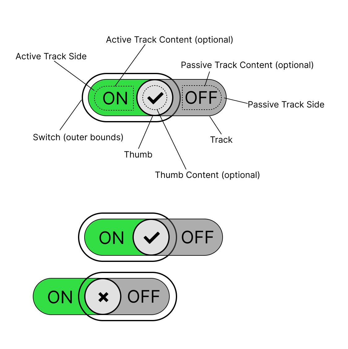 Source: Figma source of switch anatomy with moving track
Edge cases:
This is a list of potential styling challenges.
- The thumb needs to be at least the height of the track in order to hide the boundary between active and inactive track side underneath.
- It’s unclear how to style the track and slider if the track content can be of arbitrary length.
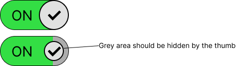
Switch with static track
Should the thumb width be dynamically adapted to the largest track content width, if any? This would ensure that the thumb is always able to hide active and inactive track content.
Animation variant where only the thumb moves and the background of the switch changes color only. Any text displayed on the switch is optional and defined by the author through a slot or other means.
 Source: Figma source of switch anatomy with static track
Edge cases:
This is a list of potential styling challenges.
- The content on both sides cannot be wider than the thumb. Otherwise, the thumb is no longer capable of hiding the content of the inactive track content.
DOM Structure
There are two variants of how state transitions work:
- Static track: Thumb moves to the end, background-color fades from grey to green
- Moving track: Thumb moves to the end, the track moves with the thumb, revealing the active track, hiding the inactive track side.
Should both variants be supported, maybe through an attribute, or is one or the other obsolete? Can a base markup be provided that enables devs to do one or the other variant with custom styles?
The thumb is located outside the track because it can overlap the track and the track needs
overflow: hidden in order to hide the inactive portion of the track. When transitioning in
“moving track” mode, the thumb and track need to be animated individually, but need to move
together in order to hide the line separating on and off states on the track (thumb needs to fill
the height of the track). Is there a better way to solve this issue?
<switch>
  <track>
    <toggled></toggled>
    <untoggled></untoggled>
  </track>
  <thumb></thumb>
</switch>
- Updated the DOM structure to match the “elements” approach. 6
- Input for naming the elements welcome
Allowed content
There are limitations on what type of elements are allowed as children of the track and thumb elements.
Thumb: the <thumb> element should allow for img/svg content excluding <foreignObject> 7
Toggled and untoggled elements: the <toggled> and <untoggled>elements should allow for text and img/svg content excluding <foreignObject> 8
Slots
What should the track slot names be? There are many possibilities here like with or without hyphen, “track” as pre- or postfix, something else entirely… (https://github.com/openui/open-ui/issues/804)
Research on real world examples shows that about 30% of analyzed Design Systems use slotted content. For the detailed data, please visit the switch slotted content research spreadsheet. The dataset for this research are variations of the switch found at the component gallery for switch.
Findings (from 44 analyzed Design Systems):
- 70% of Design Systems don’t display any content inside their switches
- 30% display content on the track
- 18% display content on the thumb
- 88% use the background color transition animation
- 16% use a track slide animation
Some Design Systems offer variants with or without slotted content or with both animation techniques.
| Slot Name | Description | Fallback Content |
|---|---|---|
thumb | Enables slotting custom content into the thumb. | A default thumb implementation is provided. |
track | Enables slotting of custom elements inside the track, e.g. for more intricate animations | No default content |
toggled (?) | Enables inserting content on the toggled (end) side of the track | No default content |
untoggled (?) | Enables inserting content on the non-toggled (start) side fo the track | No default content |
Behavior
States and Interactions
Should the switch value type be a boolean or the string set [“on”, “off”]?
| State Group | States | Initial State | Description | Interaction/Transition |
|---|---|---|---|---|
value | "on"/"off"(?) | "off" | Determines the current value of the component. | Changed upon user interaction on click, touch, space key (when focused), enter key (when focused, optional) |
disabled | true/false | false | When true, disables the control, preventing user interaction and displaying the control with a disabled appearance. | No interaction. Controlled programmatically. |
focused | true/false | false |
Accessibility
The control can be in a checked or unchecked state. 9
The <switch> element can be assigned the default role of switch as described in the Core Accessibility API Mappings. 10
The swich is a labellable element.
Content for thumb and either track side can be defined by the author.
Keyboard Navigation and Focus
| Key | Description |
|---|---|
| Space | Should toggle the switch when focused. |
| Enter (optional) | Should toggle the switch when focused. |
Form Input
The switch is a form associated element.
Use with Assistive Technology
The switch element can be associated with the existing role="switch".
Accessibility ressources
Globalization
The switch should adapt to the current text direction11.
| Writing mode | Direction | ”on” position |
|---|---|---|
| horizontal-tb | Right to left | left side |
| horizontal-tb | Left to right | right side |
Security
No security implications are expected.
Related issues
- switch: What customizability for animations should be supported?
- [switch]: Naming of the component and it’s parts
Resources
- Checkbox vs Toggle Switch: 7 Use-Cases of Forms Design: https://uxdworld.com/2018/08/13/checkbox-vs-toggle-switch-7-use-cases-of-forms-design/
- Extreme use cases, useful for scope: https://uxdesign.cc/the-good-the-bad-and-the-toggle-2abc0fbbd099
- Indeterminate state: https://uxplanet.org/ui-switch-component-3f29bc7f4f45
- When to use a toggle switch: https://www.thedesignerstoolbox.com/design-system/when-to-use-toggle-switch-in-ux/
- History Of Toggle + UI/UX Case Study + UI Samples: https://www.behance.net/gallery/70302039/History-Of-Toggle-UIUX-Case-Study-UI-Samples
- Material 3 Switch: https://m3.material.io/components/switch/overview
References:
Footnotes
-
https://www.behance.net/gallery/70302039/History-Of-Toggle-UIUX-Case-Study-UI-Samples ↩
-
Wikipedia Light Switch https://en.wikipedia.org/wiki/Light_switch ↩
-
Material Design 3 Switch, Guidelines https://m3.material.io/components/switch/guidelines#59aa5700-2061-4f12-ad17-3afeb6b1c805 ↩ ↩2
-
Atlaskit Switch, Usage best practices https://atlassian.design/components/toggle/usage#best-practices ↩
-
Elements approach resolution https://github.com/openui/open-ui/issues/702#issuecomment-1664464531 ↩
-
Thumb content resolution https://github.com/openui/open-ui/issues/979 ↩
-
Track content resolution https://github.com/openui/open-ui/issues/978 ↩
-
Review by scottaohara https://github.com/openui/open-ui/pull/785#discussion_r1279305903 ↩
-
Review by scottaohara https://github.com/openui/open-ui/pull/785#discussion_r1279310394 ↩
-
Direction change resolution https://github.com/openui/open-ui/issues/1098 ↩