 Open UI
 Popup
A popup is a piece of transient UI that “pops up” over all other web app UI, i.e. “on the top layer”. A popup may be its own standalone element (such as a teaching bubble) or it may be part of a larger composited component (such as a combobox). Popups differ from other top-layer UI in that they are inherently transient: only one can be shown at a time unless chained by ancestry, and popups are dismissed upon “light dismiss” user interactions (e.g. sending focus out of the popup or hitting the ESC key). They can contain arbitrary content, including interactive descendents.
This research page gathers together various subclasses of popups into one collection. It is likely sensible to explore several of these concepts more deeply in additional Open UI components. It may also be reasonable to consider new web platform primitives/elements to handle specific but common types of popups. For now, the following are considered appropriate candidates for use of the proposed popup element.
Additional research
Behaviors
- Mutual exclusivity: popups are inherently transient, and it is expected that a user would interact with only one at a time. Popups that are parented to another are the exception: for example, menu buttons with multiple levels of popup menus are a common paradigm.
- Invocation: popups could be said to have discrete
show()andhide()methods, whether they are invoked by app logic or by interacting with other UI (including parts of the same component). - Light dismiss behaviors: most popups “light dismiss”, in that the following will dismiss the popup: pressing the ESC key, invoking elsewhere in the document, invoking another popup (unless it is a child of the currently opened popup).
- Positioning: popups are displayed in a top layer above all other UI, out of flow. They are often but not always anchored to another UI element’s position.
- Popups may vary in: focus behaviors: for example, whether focus is trapped within the popup, whether focus is automatically sent to the popup and where exactly auto focused is placed, whether the tab/arrow keys are used to traverse content.
Anatomy
Frequently, a popup is a part of a larger composite component, such as a select, a combobox, or a menu. A popup’s anatomy will vary depending on the subclass of popup, and in some cases a popup can contain arbitrary content at the developer’s discretion. Likewise, semantics may vary as well: particular subclasses of popups may require more specific semantic representation, and could be a candidate for further expansion of the web platform if appropriate.
Popup subclasses
These details document the reality of popups in implementation as opposed to suggesting a standard design.
| Subclass | Semantics (used ARIA roles) | Invocation | Focus | Dismissal | Modal? | Positioning |
|---|---|---|---|---|---|---|
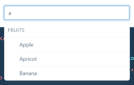
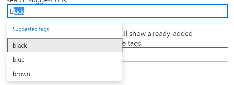
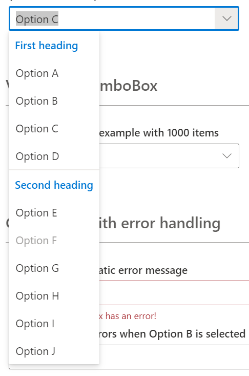
| Autocomplete (Popup Part): similar to an input and datalist, the user types into a field and options to complete their input appear. | Usually role="listbox", often within a role="combobox". Sometimes no role. | Typing in a text field. | Remains in the text field; can use arrow keys to traverse options. | Light dismiss, selecting an option. | No | Anchored to a text field; highest stacking context. |
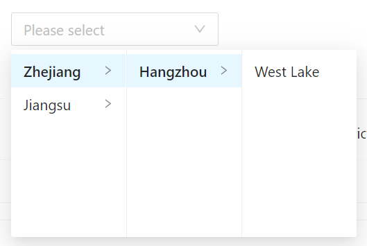
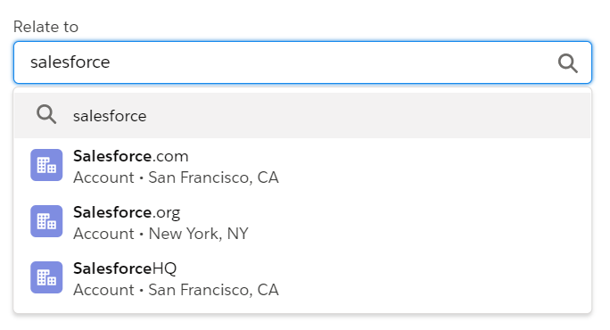
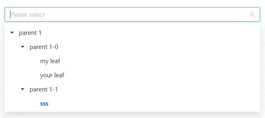
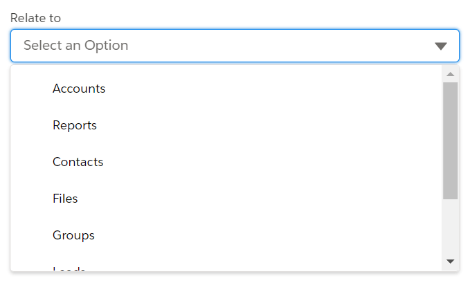
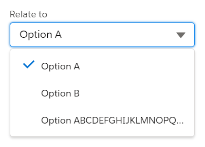
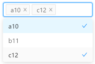
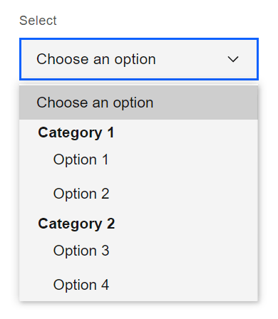
| Combobox (Popup Part): the user can choose to enter text in a field or make a selection from a pre-populated list | role="listbox" | Often: typing into text input. Often: pressing a button (sometimes only if pressing a button) | Sometimes: remains on activating element. Sometimes: moves to first option. Arrow keys to move between options; may or may not cycle back to first option. | Light dismiss, selecting an option. | No | Anchored to activating element; highest stacking context |
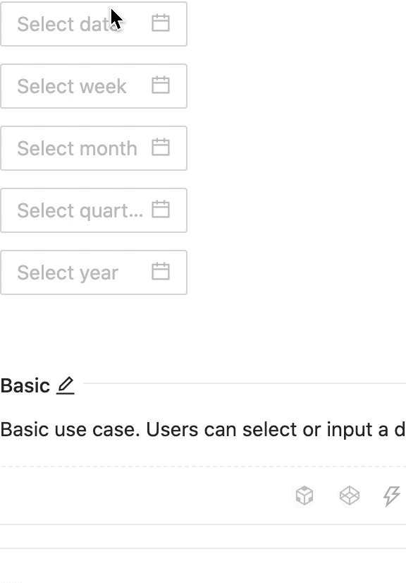
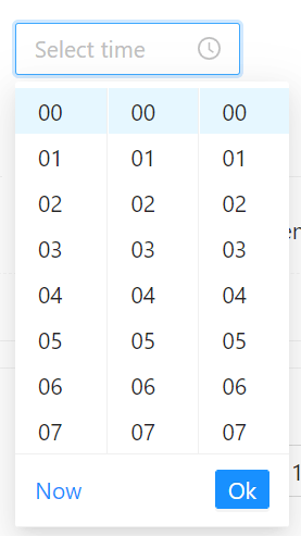
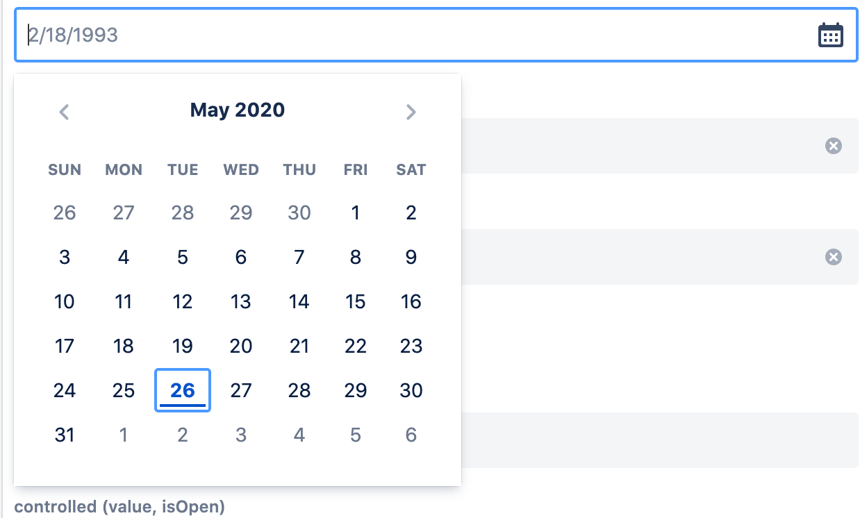
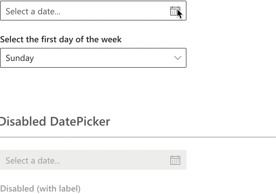
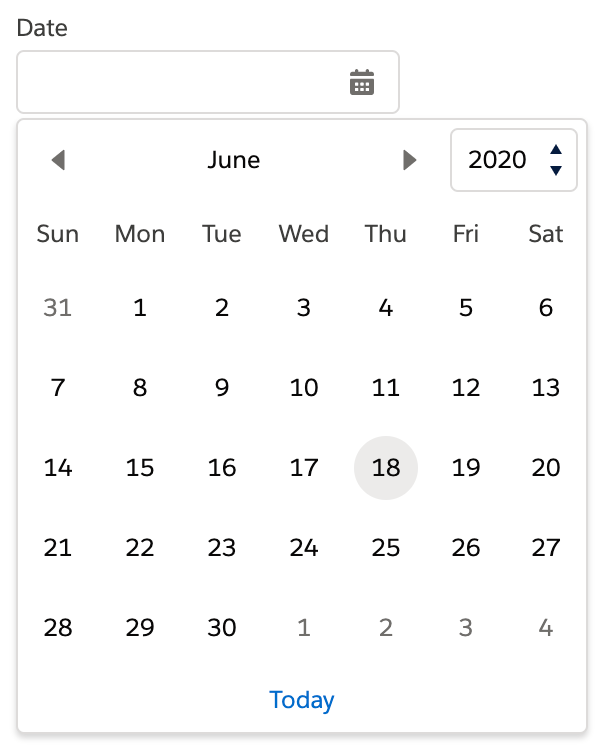
| Date-Time Picker (Popup Part): enables the user to pick date(s) and/or time(s) | role="dialog" or no special semantics | Sometimes: moving focus into a text input. Sometimes: “Invoking” text input (click, enter key). Sometimes: invoking a button. | Often: remains on activating element. Sometimes moves to current selected date. | ESC key, selecting an option. | Usually no | Anchored to activating element; highest stacking context. |
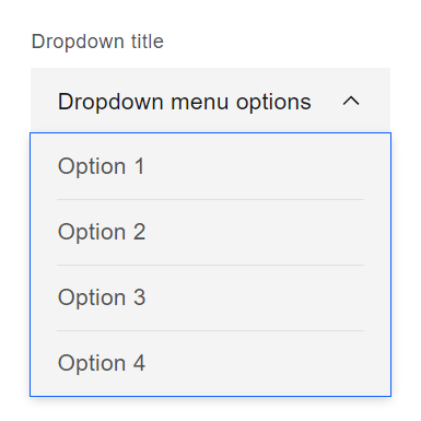
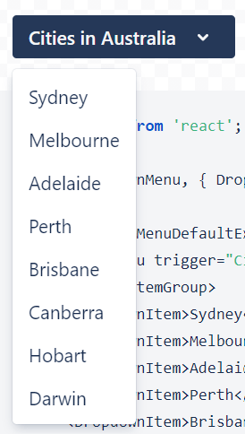
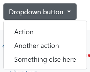
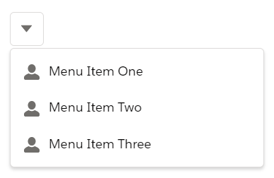
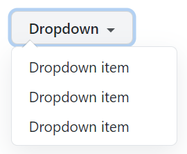
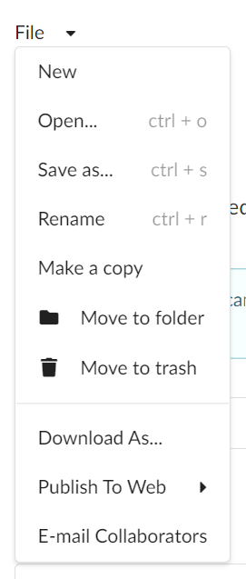
| Menu: Upon invoking some element, often a button, a popup containing menu items appears. The menu items are actions the user can take—e.g. edit, delete, favorite—vs links for navigation. Can have multiple layers of menu as nested popups. Cycling through menu items can change a value / text contents of another element in the host web app. | role="menu", with children of various menuitem roles. | Usually by invoking an activating element. Sometimes additionally by hovering. Rarely by the activating element receiving focus. | Sometimes, upon invocation, focus on the first focusable child element of the popup. Often, focus remains on activating element and must be manually moved into popup. | Light dismiss, selecting an option. | No | Anchored to activating element; highest stacking context. |
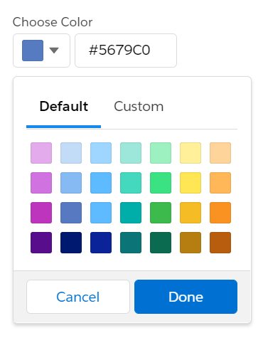
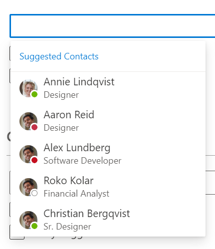
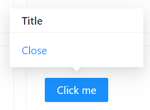
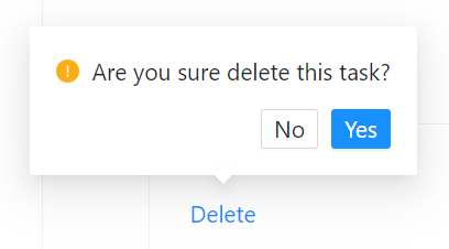
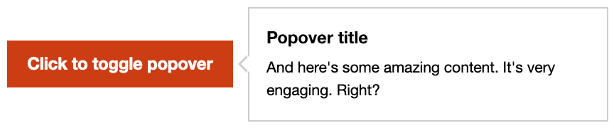
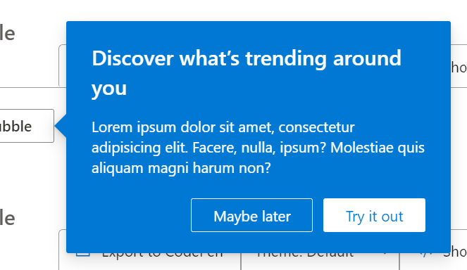
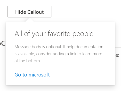
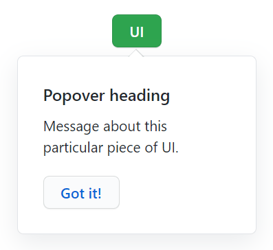
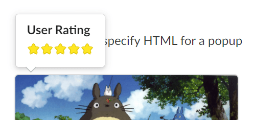
| Misc: teaching UI and other misc popups, often supporting arbitrary content. | role="dialog, role="menu", role="listbox", no role. | Invoking an activating element. | Sometimes: remains on activating element, sometimes impossible to reach focusable elements within tooltip. Sometimes: moves to the first focusable element in the popup. | Light dismiss, invoking an action. | No | Usually anchored to an activating element; highest stacking context. |
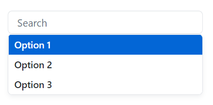
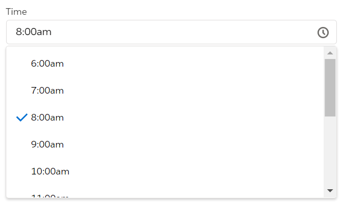
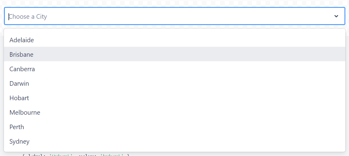
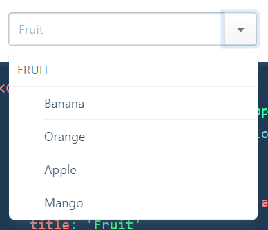
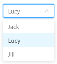
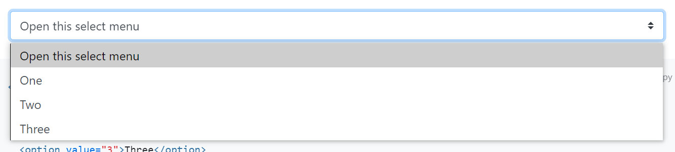
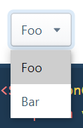
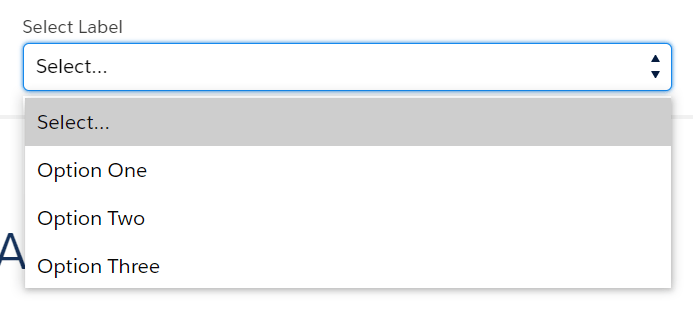
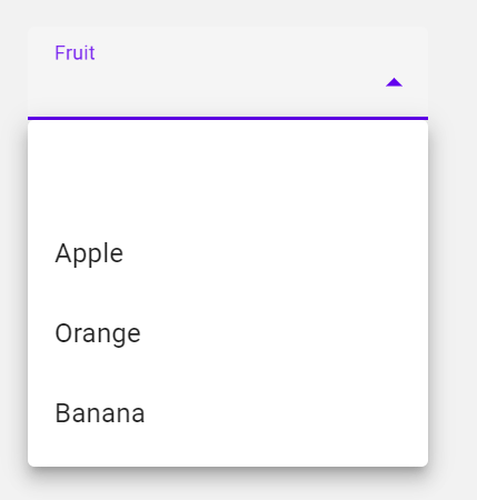
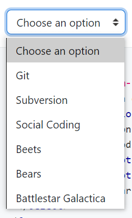
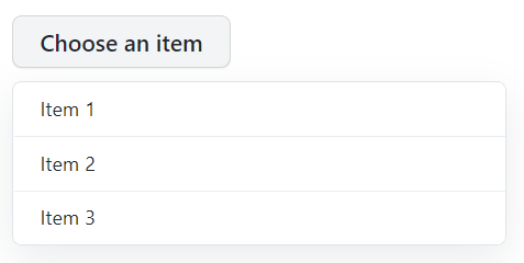
| Select (Popup Part): Enables the user to select a single text option. May literally use the native select. May include semantic groupings within options. | role="listbox" | Invoking an activating element, e.g. a button. | Sometimes: remains on activating element. Sometimes: moves to first option. Arrow keys to move between options; may or may not cycle back to first option. | Light dismiss, selecting an option. | No | Anchored to activating element; highest stacking context |
Similar components
The following top-layer UI are similar to popups, but are different enough in behavior or content model expectations that they should be considered distinctly separate components.
| Component | Why is this distinct from popup? |
|---|---|
| Alert: displays a brief, important message in a way that attracts the user’s attention without interrupting the user’s task. | Unlike popup, more than one alert may be shown at once. Alerts are transient in a different sense than popups: focus is typically not immediately sent to an alert; light dismiss will not clear them, but a timeout may. Typically, alert text is read out dynamically to screen reader users, and so it is recommended that there is little to no interactive content, as this would be included in readout if the entire alert component is a live region (e.g. has ARIA role="alert"). |
| Dialog: a part of an application that a user interacts with to perform a task, for example a dialog box, inspector, or window. | Dialogs and popups are quite similar, but there are some behavioral differences. Whereas only one popup can be displayed at a time (unless there is an ancestry chain), multiple dialogs can be shown at once. Popups are inherently transient, and dismissed upon “light dismiss” interactions. Dialogs are more persistent, and many of these are modal—interaction with the surrounding document is blocked. You might think of the distinction as this: popups are often most appropriate to use in support of the action the user is currently in the middle of, and should keep them in that context. Dialog is often most appropriate if the user should be taken to a new context where a discrete, entire task can be performed. |
| Toast: similar to an alert, but displays unintrusive, non-critical messages or notifications. Often displayed in a corner of app UI. | Same differences as “alert”, though toasts may not be live regions. Toasts are very likely to disappear on timeout. |
| Tooltip: A simple text label supporting another bit of UI. | Popups support fairly arbitrary contents. Tooltips, on the other hand, should only have text contents because they 1) can be used in calculations of the accessible name or description of the element they are attached to and 2) moving hover and/or focus away from an element typically dismisses its tooltip. If there are any interactive elements in the tooltip, they will be unreachable by some users, including keyboard-only users or some people with motor disabilities. |
Concepts