 Open UI
Popover=hint (Explainer)
- @mfreed7, @scottaohara, @aleventhal
- Last updated: January 19, 2024
- Specification
A followup proposal to the original Popover proposal, which adds several features related to building hints/tooltips.
Table of Contents
- Background
- Scope of this explainer
- Proposal: popover=hint
- Popover Stacks
- Accessibility
- ::tooltip pseudo element
- Spec PR
- Articles and References
Background
The Popover API (MDN, OpenUI Explainer) is now part of the HTML standard. It allows developers to create popovers of varying types and also easily trigger them from buttons, without using Javascript.
One very common use case for popovers that isn’t well covered by the existing Popover API is building “tooltips”. This explainer discusses a proposal (popover=hint) to assist developers in building tooltips, and other similar use cases.
What is a tooltip/toggletip
There are many great articles on tooltips, including these by Sarah Higley, Inclusive Components, Scott O’Hara, and WAI. And there is a very closely related UX element called a “toggletip”. For brevity, in this explainer, I’ll group them both and refer to them simply as “tooltips”.
It turns out, the definition of “tooltip” can be tricky. There are several definitions people tend to use:
- The “original” definition: a text-only “tip” about a “tool” button. For example, “Insert link” for this icon:
 . The web platform has a fraught implementation of this definition, via the
 titleattribute. - The “triggered by hover” definition: any pop-up window/dialog, containing any type of content, that opens when a user mouse-hovers an element.
- The “semantic” definition: A popover containing non-essential, auxiliary information about a context element.
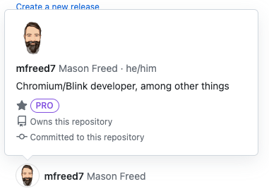
Definition #1 is too limiting, and does not capture common use cases that include non-textual content. A good example is the window that appears when you hover over a username on Github:
Definition #2 is mis-guided. Many things can be “hover-triggered” without being tooltips. A great example is a hover-triggered menu, where hovering over a sub-menu item brings up the sub-menu. Most people agree that the sub-menu is not a tooltip. It just happens to be hover-triggered.
That leaves definition #3, which is the recommended definition (see articles 1, 2, 3, 4). A tooltip should not contain directly-necessary information - that should be placed into the page content directly. It should provide auxiliary or extra information that is available only when the user wants to dig deeper into some content. And that extra information should be able to contain more than just text, since the auxiliary information might very well contain or even be an image or other non-text content.
Note, importantly, that a tooltip does not need to be triggered by hover to be a tooltip. Also note that all things that are hover-triggered are not tooltips. A tooltip is defined by its content, and not how it gets activated.
Tooltip lifecycle behaviors
When using a tooltip, there are several behaviors that come into play.
1. Triggering a tooltip
A user needs to first identify that there is a tooltip associated with a context element, and then needs to trigger that tooltip somehow. Typical ways to trigger a tooltip include:
- Hover the context element with the mouse for a length of time.
- Focus the context element with the keyboard, for a length of time.
- Long-press the context element, and choose to activate the tooltip via a context menu.
- Other UA-specific or AT-specific methods, such as gazing at the context element (detected with eye tracking).
2. Close other popovers and tooltips
Once a tooltip has been triggered, the popover containing the tooltip needs to be shown. When this happens, there may already be other unrelated popovers that are showing:
- Selection pickers (e.g. from a
<selectlist>or a color picker). - Action menus (e.g. the “File” menu in an editing app).
- Other tooltips for different context elements.
Some or all of these unrelated popovers might need to be closed, to avoid user confusion.
3. Dismissing a tooltip
Once a tooltip is open, there are several ways the user can indicate that they are done with that content, and the tooltip should be closed:
- Press the ESC key.
- Mouse-click or touchscreen-tap somewhere else, outside the tooltip (“light-dismiss”).
- When mouse-hover-triggered, move the mouse outside both the tooltip and the context element for a length of time.
- When keyboard-focus-triggered, move focus outside both the tooltip and the context element for a length of time.
- Other UA-specific or AT-specific methods such as gazing away from the context element.
Scope of this explainer
As described above, there are many behaviors associated with tooltips.
This explainer is only interested in one thing: providing a mechanism to achieve the behaviors in section 2 above, related to closing other popovers and tooltips..
This explainer is NOT interested in sections 1 or 3, which related to triggering or dismissing the tooltip. Those behaviors are addressed by a separate “Invokers” proposal:
- https://open-ui.org/components/interest-invokers.explainer. See also this related spec issue.
The Interest Invokers & Invokers proposals cover hover/focus/etc triggering all kinds of things, including popovers, dialogs and more. They fully handle the behaviors described in sections 1 and 3. Since those proposals are very general, and include many non-popover use cases, it makes sense to discuss them separately.
Note also that this proposal is orthogonal to the invokers and interest invokers proposals. The behaviors described here can function on their own, via the existing popovertarget=idref mechanism, or even via Javascript. Of course, very much like the Anchor Positioning feature, hint popovers will become even more powerful once the invokers mechanism has landed. But these two features do not need to be dependent on each other, or land together.
Proposal: popover=hint
This proposal is to add one more value to the popover attribute, to enable the specific behaviors associated with tooltips and “hint” style UI. The proposal is to allow the value hint (e.g. popover=hint), which triggers differences in the behaviors associated with opening, closing, and light dismissing that popover. Since the content in a tooltip is “secondary” or “auxiliary”, elements with popover=hint should defer to other popover types.
When a hint is shown, it behaves differently from other popover types such as popover=auto and popover=manual in a few ways:
popover=auto | popover=hint | popover=manual | |
|---|---|---|---|
| Light dismiss | Yes | Yes | No |
| Force-hides: | Unrelated autos and hints | Other hints | Nothing |
| Nesting: | Yes | Special | N/A - no light dismiss |
First, hints should always be light dismissible. They are transient, supplementary information, so they should not require affirmative action to close them. Clicking or tapping outside or hitting the ESC key (or any close request) will close a hint.
The second row (“Force-hides”) shows that tooltip content is “secondary” to other content, so hints do not hide other non-hint popovers. An example use case for this is that there is a <select> picker open, and the user is selecting from the available options. While doing that, the user mouse-hovers another element on the page to see a tooltip that might inform them about which option to pick. When the tooltip is shown, the select list picker should not be closed. In essence, the hint is “secondary” and even more transient than the picker, so it shouldn’t take precedence. However, if the user subsequently hovers/focuses a second unrelated element and another tooltip is shown, the first tooltip should be closed. It would be confusing to have two unrelated hints open at a time. So hints should close other unrelated hints.
The third row (“Nesting”) is more nuanced and interesting. (See this issue and this issue for more discussion.) The next section explores this behavior in more detail.
Popover Stacks
In most cases, tooltips are never nested - they are single bits of auxiliary information about something, and they are not related to one another. However, there are examples in which one tooltip is fairly “rich”, and contains additional elements that have tooltips of their own. (One example of this use case comes from Github, as seen in the “rich tooltip” example above.) In that case, the “contained” tooltip should not dismiss the “containing” tooltip. This leads to the need for a separate “hint stack” which is separate from the “auto stack” already present for popover=auto popovers. Further, it should also be possible to nest a popover=hint within a popover=auto, since a very similar use case would be a popover=auto that contains an element that triggers a popover=hint. If the containing popover=auto and its contained popover=hint are both open, and the user hovers an unrelated popover=hint, that action should not close either of the first two, since those are rooted in a popover=auto.
Given the above use cases, a required set of behaviors emerges:
- There are two stacks of popovers, one called the “auto stack” and one called the “hint stack”.
- A
popover=autopopover always gets added to the “auto stack”, as today. - If a
popover=hintis nested (in the normal popover sense of nesting) inside an openpopover=auto, then thepopover=hintshould be added to the “auto stack”, since it’s nested within an auto popover. Note that this means the “auto stack” can contain bothpopover=autoandpopover=hintpopovers. - If a
popover=hintis nested within anotherpopover=hint, or if it is not nested at all, then it should be added to the “hint stack”. It is unrelated to otherpopover=autopopovers. - A
popover=autocan never be nested inside apopover=hint.
Accessibility
A key distinction between types of hints is whether it may be important for a user to explore or interact with the hint. Consensus on these types of hints/tooltips can help with the resolution of ARIA#979: Clarify the use of role=tooltip.
- A plain hint contains only elements with a computed role of generic, text and images.
- A rich hint contains other elements, such as links, form controls, lists or tables. These are hints that a screen reader user may need to interact with or explore.
Why differentiate between rich and plain hints?
For a screen reader user, there already exists simple settings and commands to read accessible descriptions, which are just an additional piece of text associated with an object, such as used by a title or aria-description attribute. When a hint is just used for a prettier tooltip, a screen reader can reuse this simple mechanism and act like a title was present. There is no need for the user to navigate to it.
However, when a hint is used for something more complex, such as a dialog that appears on hover, or a data table, then the user needs to be able to learn it’s there and navigate to it, so that they can use additional screen reader commands to interact with it.
Invoking elements are buttons, not hover-triggered things
As noted in the Scope of this explainer section above, this explainer is only about the popover=hint behaviors, and has nothing to do with the hover- or “interest-” triggering of popovers. (That is detailed in the interest invokers explainer.) Therefore, in the sections below, note that “invoking element” refers to an element such as <button popovertarget=foo> which is triggered by activating the button, not hovering it.
A11y API support
For the best screen reading experience, the implementation will need to expose different properties for a plain hint vs a rich hint (classification described above).
Plain hints: the browser will expose the flattened text string comprised of the hint’s text and text alternative content via the invoking element. The actual popover target element and its descendants can be invisible/ignored in the AX tree. Note: this would be similar to how
titleattribute tooltips are treated today.- If the invoking element lacks an accessible name, use the computed text of the hint as the element’s accessible name.
- If the hint is not used as the accessible name, then the hint would be treated as the accessible description of the invoking element. A described by relation would point from the trigger to the hint element.
Rich hints:
- Add
aria-expandedon the triggering element: the same treatment as forpopover=auto. - Minimum role of
tooltipon the target — see spec PR describing minimum role. - Add
aria-detailspointing from the trigger to the popover: the same treatment as forpopover=auto. This allows screen readers to announce the presence of the popover and a command for navigating to it.
- Add
::tooltip pseudo element
CSSWG Issue 8930 discusses the addition of a ::tooltip (or similarly named) pseudo element that could be used to generate tooltips via CSS, and style them. These are intended (though see the discussion) to be Plain Hints (as described above). The ::tooltip proposal may be complimentary to this explainer’s feature proposals, or it might replace some of them.
Spec PR
There is a WHATWG HTML spec PR open to implement the changes described in this explainer.