 Open UI
Alert
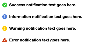
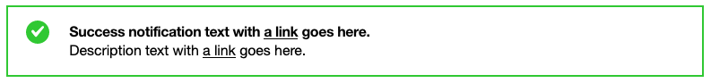
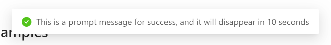
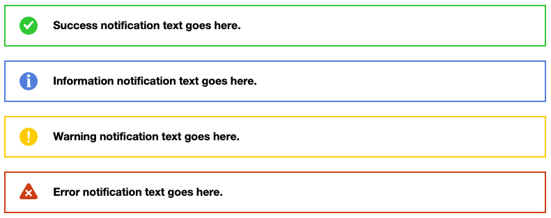
An alert is an element that displays a brief, important message in a way that attracts the user’s attention without interrupting the user’s task. Alerts are typically intended by read out dynamically by a screen reader.
Names
- Alert - Ant Design, Bootstrap, Evergreen, KoliBri, Lightning Design System, Stardust UI, WAI-ARIA
- Message - Ant Design
- Alerts - Boosted
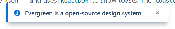
- Toaster - Evergreen
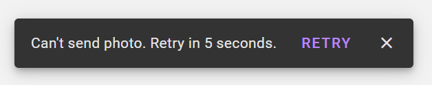
- Snackbar - Material Components Web
Concepts

No images for the following design systems:
- KoliBri
No images for the following design systems:
- KoliBri
No images for the following design systems:
- KoliBri
No images for the following design systems:
- KoliBri
No images for the following design systems:
- KoliBri
No images for the following design systems:
- KoliBri
message
basic
toaster
alert
snackbar
message
toaster

alert
snackbar