 Open UI
Checkbox Findings
What is a checkbox?
A checkbox is a control that allows the user to select a binary “checked” state, either checked or unchecked. They may also support a second binary “indeterminate” state.
Checkbox vs toggle
Checkboxes should usually be grouped together in a set, and the user can select zero, one, or any number of items within that list. If only one checkbox is used, it is the same thing as using a toggle or switch component. Both checkboxes and switches can support an indeterminate state.
Checkboxes should not be used when only one item in the list can be selected.
General appearances
Usually a label follows the checkbox, which should clearly describe the state when the box is checked.
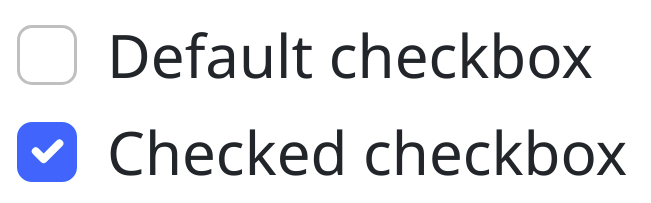
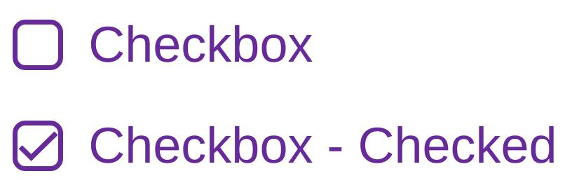
Generally a checkbox is square, but it may have rounded corners. When checked, the square box can fill with any color with a check appearing in a contrasting foreground color.
Alternatively, when checked, the box background can remain the same and a foreground check element may appear.
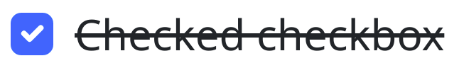
The style of the label can also change when the checkbox is checked.
Indeterminate checkboxes
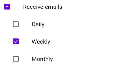
When a checkbox’s value is neither true nor false, it is indeterminate. An indeterminate checkbox may be gray, or shown with a different mark inside the checkbox.
Indeterminate checkboxes are often used in a hierarchy of checkboxes, when not all children are checked, the parent remains indeterminate.
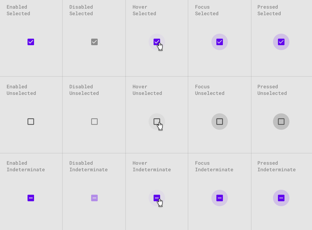
Checkbox state
A checkbox visually changes depending on the element state: focused, disabled, hover, or active. This can mean adding a shadow, border, or changing color of the box and check. The label can also change style during each state.
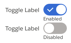
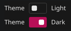
Switch (toggle)
A switch is usually larger and has more visual weight than a checkbox. The toggle often also has a primary label describing the state, and a secondary label describing the selected state.
Like a checkbox, a switch can also have unique styles per element state: focused, disabled, hover, or active.
Animation
A checkbox or switch may have animations on transitions between each element state:
Note: There should be no animation if disabled in the browser or system preferences.
Common behaviors
Selecting
Clicking the label or the checkbox should toggle the component. Being able to select the label is important, because the checkbox itself can be quite small and difficult to select on high resolution screens. Clicking the label or checkbox a subsequent time, should uncheck the checkbox.
Disabled
A disabled checkbox should not change state when clicked.
Accessibility (keyboard, AT support, etc)
- I should be able to navigate and select by keyboard.
- Clicking or tapping the label of the checkbox should toggle the component state.
- As a user, I expect that there will be no animation in case I disabled animations from system preferences.
- As a user, I should see a clear focus style.
- As a user, In multiple checkboxes, I should hear the question or title related to them.
A survey of checkboxes in the wild
It is very common for developers to build custom checkbox implementations that closely match a company’s brand. In order to understand how checkboxes are used across the web, we surveyed the public web sites of Interbrand’s top 100 brands. This list is useful because it includes brands with websites that are Alexa ranked from the top 10 to the top 500,000. We analyzed these custom checkbox implementations for the following issues:
- Does the checkbox have a visible focus state? When building a custom checkbox, it is easy to implement it in a way that removes any focus indicator.
- Is the user able to select the checkbox by also clicking on the label? Accessibility is reduced when only the checkbox, not the label, is interactable.
- Does the checkbox have an aria compatible computed name? Without a computed name, a screen reader will not know how to identify the checkbox.
Results
| All | Top 100 | Top 100-500 | Top 500-5k | Top 5k-50k | Top 50k - Million | |
|---|---|---|---|---|---|---|
| Invisible Focus State | 16.13% | 20.00% | 10.00% | 13.79% | 23.08% | 6.67% |
| Non-interactable Label | 30.11% | 13.33% | 20.00% | 31.03% | 34.62% | 40.00% |
| No Computed Name | 59.14% | 13.33% | 10.00% | 20.69% | 19.23% | 20.00% |
| Has any issue | 44.09% | 26.67% | 40.00% | 48.28% | 50.00% | 46.67% |
The main takeaway from these numbers is that the industry massively fails to build custom checkboxes correctly. These are the biggest brands in the world. The survey was not exhaustive either. For each brand, we spent 5-10 minutes finding and accessing checkbox implementations. Undoubtedly an exhaustive search would discover many more issues.
Sources
- https://www.a11ymatters.com/pattern/checkbox/
- https://developer.mozilla.org/en-US/docs/Web/Accessibility/ARIA/Roles/checkbox_role
- https://material.io/components/checkboxes
- https://developer.apple.com/design/human-interface-guidelines/macos/buttons/checkboxes/
- https://www.carbondesignsystem.com/components/checkbox/usage/