 Open UI
 Popup Element (Abandoned)
This proposal first appeared on Microsoft Edge explainers. Open UI has taken up <popup> and related APIs as work items for incubation. Further development of these ideas will be driven in a draft specification within Open UI. The following represents the state of the original proposal as of March 18, 2021.
Authors:
- Ionel Popescu (Microsoft)
- Melanie Richards (Microsoft)
- Dan Clark (Microsoft)
- Bo Cupp (Microsoft)
- Mason Freed (Google)
- Yu Han (Google)
- Joey Arhar (Google)
- Greg Whitworth (Salesforce)
Note: This is an outdated proposal!
Please see the updated version here.
Introduction
When building a web application, there are many cases in which an author needs to create transient user interface (UI) elements that are displayed on top of all other web app UI. These include user-interactive elements like action menus, form element suggestions, content pickers, and teaching UI. These paradigms will be collectively referred to as popups.
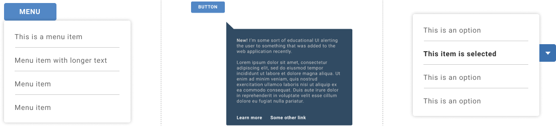
Examples of popups may include action menus, teaching UI, or the listbox portion of a <select> control
For many such use cases, it is incumbent upon the author to handle the popup’s styling, positioning and z-index stacking, focus management, keyboard interactions, and accessibility semantics. Because no platform-native solutions exist to comfortably handle all these use cases, individual authors and framework developers must continuously re-write the same classes of controls. This results in duplicative work for the web development community, and inconsistent experiences for users of these web applications.
The web platform can be extended such that authors can get popup interactions and styling “for free”, but have enough flexibility to support their individual use cases.
Goals
Authors can efficiently create popups which:
- Can contain arbitrary content
- Can be fully styled, including properties which require compositing with other layers of the host web application (e.g. the
box-shadoworbackdrop-filterCSS properties) - Can be sized and positioned to the author’s discretion
- Are rendered on top of all other content in the host web application
- Include an appropriate user input management experience “out of the box”, with flexibility to modify behaviors such as initial focus
- Are accessible by default, with the ability to further extend semantics/behaviors as needed for the author’s specific use case
Non-Goals
Addressing all top-layer UI elements
There are many different types of elements that are meant to be displayed in the top layer of a web application, but not all may be popups. We propose that all popups share “light dismiss” behaviors. Other elements which are aesthetically similar to popups, but do not light dismiss, may be better addressed with the <dialog> element or other new purpose-built elements. Such examples include: alerts, toasts, custom tooltips, and miscellaneous, persistent popover UI.
Proposed Solution
We propose a new HTML element called popup. This new element can be used for any transient UI that “pops up” over all other web app UI. A popup may be its own standalone element (such as a teaching bubble) or it may be part of a larger composited component (such as a combobox).
popup will include:
- A few options to invoke/show the
popup:- A
popupattribute, applied to whichever elements should invoke a given popup (if applicable). - An optional
openattribute, applied to thepopupto express that it should be shown. - A
show()JavaScript method, for invoking thepopup.
- A
- When visible, a default set of behaviors as well as a default positioning scheme.
- Logic for an optional
autofocusattribute which enables moving focus to thepopupor to a descendent. - An optional
delegatesfocusattribute, for passing focus to descendants. - An optional
anchorattribute, which both relates thepopupto an activating element and can be used in a separately-proposed, CSS-based anchor positioning scheme. - A couple means to dismiss the
popup:- Behaviors tied to the aforementioned
popupattribute. - Removing the
openattribute frompopup. - A
hide()method for hiding thepopup. - Light dismiss behaviors.
- Behaviors tied to the aforementioned
Showing Popups
Option A: the popup attribute
One use case for a popup is a popup menu triggered by a menu button:
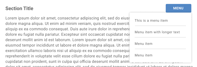
An author could produce this popup menu using the following markup:
<button id="menuButton" popup="menuPopup">Menu</button>
<popup id="menuPopup" role="menu" anchor="menuButton">
  <!-- Markup for menuitems goes here -->
</popup>
The popup attribute on the button element (referred to later in this document as the “invoking element”) takes an IDREF pointing to the relevant popup. Invoking this button will likewise invoke the popup with the matching ID.
This popup attribute will apply accessibility semantics equivalent to aria-haspopup="true" and aria-controls="menuPopup" on the button (as well as a “controlled by” reverse relationship mapping on the popup itself). This attribute is valid only on a subset of interactive elements:
buttonorinputin the button state (input type="button"). Invoking one of these elements will show the relevant popup.inputin thetext,email,phone, orurlstates. Setting focus in one of these elements will show the relevant popup. Note: we may need to explore means of suppressing this invocation on focus, for instances where the author instead wishes to show thepopupbased on text-entry logic.
Option B: the open attribute
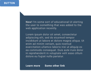
Some popups, such as teaching UI, might be shown to the user upon initial “page load”. For popups which aren’t shown as the result of a user interaction or JavaScript-controlled logic, apply the open attribute to show the popup:
<popup open>
  <p>
    <strong>New!</strong>
    I’m some sort of educational UI…
  </p>
  …
</popup>
Option C: the show() method
Suppose that an author instead wants to show their teaching UI upon some app-internal logic. Such an author could instead call show() on the popup from script:
if (upsellNewFeature) {
  document.getElementById('newFeatureUI').show()
}
What happens when a popup is shown
Until the author has used the popup attribute, open attribute, or show() method, the popup does not display (has a computed value of none for its display property). Showing a popup places the popup into a browser-managed stack of top-layer elements that allow the popup to produce a box in accordance with author-supplied styles. Initial styles from the user agent stylesheet consist of:
popup {
  display: block;
  position: fixed;
  top: 0;
  left: 0;
}
Only one “top-level” popup may be displayed at a time. When a popup is shown and placed on the stack, it will remove all popups from the stack until it encounters an “ancestral” popup, or the list is empty. In this way, the user agent will ensure that only one popup and its child popups are ever displayed at a time—even across uncoordinated code.
The following would be considered an “ancestral” popup:
- A
popupancestor of the newpopup’s invoking element (based on thepopupattribute) - A
popupancestor of the newpopup’s anchoring element (based on theanchorattribute) - A
popupancestor of the newpopupitself
Other events also remove a popup from the stack, including loss of focus, or hitting ESC (often referred to as light dimiss behaviors). Interactions with other elements like dialog, or other future types of popup-like elements, for example, showing a menu, must also remove the popups from the top-layer stack. Dismissing a popup will also remove any child popups from the stack.
popups in the stack are laid out and rendered from the bottom of the stack to the top. Each popup will paint atomically as its own stacking context.
Showing a popup via options A (popup attribute) or C (calling the show()) method will also cause the open attribute to be set on the popup.
autofocus logic
By default, focus remains on the current active element when the popup is invoked. If this element is somehow destroyed, focus moves to a focusable ancestral element.
popup is inherently focusable, but is not reachable by sequential keyboard navigation by default (equivalent to tabindex=-1). Authors can explicitly move focus to the popup by calling focus(), or implicitly to the popup or one of its descendants using the autofocus attribute.
To move focus to the popup itself when show is called—without the need to explicitly call popupElement.focus()—place the attribute directly on the popup:
<popup autofocus>...</popup>
To move focus to a descendent upon invocation, place the attribute on that descendent:
<popup>
  <button autofocus>My cool button</button>
</popup>
These autofocus rules will be processed each time show is called, as opposed to initial document load.
delegatesfocus
Some authors may need to automatically focus the popup’s first focusable descendent, and may not wish to write script to determine at runtime which element that is. In such cases the delegatesfocus attribute can be applied to the popup:
<popup delegatesfocus>
  <p>I am not a focusable element.</p>
  <p>Nor am I.</p>
  <button>I will be focused whenever the popup becomes focused.</button>
</popup>
In the markup above, the button element will receive focus any time the popup would normally receive focus. For, example when popupElement.focus() is called.
Anchoring
popup supports an anchor attribute which takes an ID reference to another element in the popup’s owner document. The anchor attribute is significant in that:
- It enables a hierarchical relationship to be established between the
popupand its anchor element separate from the DOM hierarchy. The hierarchy determines if apopupis a descendant of anotherpopup. A descendantpopupdoes not dismiss its ancestorpopups when shown. - It is also used with anchored positioning.
Anchored positioning
By default, popup has a fixed position in the top-left corner of the viewport. With many popup use cases, however, authors need to be able to pin the position of one element to another element in the document; this is the case with our popup menu. Absolute positioning schemes sometimes suffice for this purpose, but require specific DOM structures and provide no functionality for repositioning.
We will soon make an additional proposal for a CSS anchored positioning scheme, which can be applied to popup and other top-layer, interactive elements. For now, it is worth noting that a popup’s anchor element (the element it will be “pinned” to) can be expressed using a new anchor attribute on the popup:
<button id="myButton">Anchor element</button>
<popup open anchor="myButton">
  <p>
    <strong>New!</strong>
    I’m some sort of educational UI…
  </p>
  …
</popup>
Note: for many popups, the element which invokes the popup and the element the popup is anchored to will be one and the same. However, there are cases where the author may want to anchor to a child/parent of the element which invoked the popup. Similiarly, there are cases (such as this teaching UI example) where no such invoking element exists. Therefore, we do not propose collapsing invocation and anchoring responsibilities to one attribute, as they are distinct responsibilities. In cases where the anchor attribute is unset, but there is an associated invoking element, we could explore treating this as the anchor element. There would be complexities to think through if more than one element is associated to a popup via the popup attribute, or if the anchor association causes reordering of trees (refer to Open Questions).
Dismissing the popup
Removing the open attribute
Recall that authors can apply the open attribute in order to show the popup:
<popup open>
  <p>
    <strong>New!</strong>
    I’m some sort of educational UI…
  </p>
  …
</popup>
Removing the attribute will dismiss the popup.
All other following methods of dismissing the popup will automatically remove the open attribute from the popup.
The popup attribute
When the popup was shown as a result of user interaction on an element with the popup attribute…
<button id="menuButton" popup="menuPopup">Menu</button>
<popup id="menuPopup" role="menu" anchor="menuButton">
  <!-- Markup for menuitems goes here -->
</popup>
…repeating/reversing that action will dismiss the popup. In this example, invoking the button again when the popup is visible will hide the popup. Moving focus from input type="text" (so long as focus does not then move to the popup) will hide an associated popup.
The hide() method
A popup can be hidden by calling the hide() method:
// Author calls hide() according to some app logic, such as choosing a menu item
document.getElementById('menuPopup').hide()
Light dismiss
The popup may also be implicitly dismissed due to user interactions which trigger light dismissal. When dismissal occurs:
- The
popupis removed from the browser-managed, top-layer stack so that it is no longer rendered. - A non-cancellable
hideevent is fired on thepopupwhen thepopupis hidden in response to light dismissal.
An opened popup will have “light dismiss” behavior, meaning that it will be automatically hidden when:
- The user hits the escape key,
- The layout of the
popupor its anchor element is changed. - Focus moves outside of the
popup(and its invoking and anchor elements, if applicable).
A generalized definition of “light dismiss” is being developed at Open UI.
Applicability to the select control
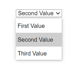
While some popups may be entire components in and of themselves, other popups may be a part of a larger whole. For example, the native select element includes a popup (sometimes rendered as a wheel) to present options to the user:
Per “Enabling Custom Control UI”, authors should be able to customize parts of a native control, including the select popup. While we anticipate discussing the anatomy of a select in depth in the Open UI venue, any solution for providing arbitrary popups will also be applied to the select’s Shadow DOM.
For example, popup may be used in the select Shadow DOM like so:
<template>
  <slot name="entire">
    <slot name="button-wrap">
      <div part="button">
        <slot name="selected-value-wrap">
          <div part="selected-value"></div>
        </slot>
      </div>
    </slot>
    <slot name="listbox-wrap">
      <popup part="listbox">
        <slot>
          <!-- All the options will end up in this unnamed slot if none of the parent slots are replaced by authors -->
        </slot>
      </popup>
    </slot>
  </slot>
</template>
If it fits their use case, an author could then entirely replace this listbox with their own popup in markup:
<select>
  <div slot="button-container" part="button" style="display: flex;">
    <div part="selected-value-wrap">Option One</div>
    <svg>... arrow down svg ..</svg>
  </div>
  <popup class="my-custom-listbox" slot="listbox-wrap" part="listbox">
    <!-- Contents of the select popup -->
    <option>Option One</option>
    <option>Option Two</option>
    <details>
      <summary>Show more options</summary>
      <option>Option Three</option>
      <option>Option Four</option>
    </details>
  </popup>
</select>
Privacy and Security Considerations
Freedom over the size and position of a popup could enable an author to spoof UI belonging to the browser or documents other than the popup’s document. For this reason the popup will be constrained as all other elements of the relevant document are, by clipping the element to the document’s layout viewport.
Alternate Solutions Considered
- Extending the
dialogelement withpopup-specific methods and new options. This option wasn’t pursued because it would result in a “mashed-up” API surface and collection of behaviors that seem better separate than together. Here are some examples of the semantic differences between the two elements to illustrate the point:popups have lightweight UI that dismises automatically when the user interacts with other UI, or when a task is completed within thepopup(such as selecting an option).dialogsare more persistent and are generally dismissed explicitly by the user.- Only one
popupcan be shown at a time. - More than one
dialogcan be presented at a time. dialogcan be modal, such that user interaction with other UX elements is prevented.- A
dialogwill dismiss apopupwhen shown but the converse isn’t true.
- Introducing a
typeattribute forpopup, which would provide a set of default styles, user input behaviors, and accessibility semantics for various classes of popups. However, with the availability of the proposed HTML attributes and CSS property values, this approach did not provide much added authoring value past platform-managed accessibility semantics to the parent popup. Because this approach did not provide accessibility semantics or input behaviors for popup descendents, the authoring story was unclear in cases where the type of popup (e.g.type="menu") must contain particular descendents whose semantics could only be managed through ARIA (role="menuitem") unless a new mechanism was proposed.
Open questions
-
Collision with CSS contain. It’s worth noting that using the
containCSS property on an ancestor ofpopupwill preventpopupfrom being positioned and painted correctly. How common is this use case? How might the platform resolve this unintentional effect? -
Could we require popups to use the DOM hierarchy for event propagation and establishing hierarchical popup relationships? Elements used for popup UI today are frequently appended to the end of the DOM to ensure they appear on top of other UI. With the new capabilities of the
popupelement, that isn’t necessary, yet we still assume in this proposal that DOM positioning of thepopupneeds to be separate from the anchor. One reason why that might still be needed is for anchor elements that can’t accept apopupdescendant, for example, image or input elements or custom-elements that expect a particular content model. Eliminating this requirement would also eliminate the complexity to modify the event propagation path based on the anchor attribute, and would make hierarchical relationships between popups clear just by observing the DOM hierarchy. -
Should one of the attributes hoist up a
popupin trees (e.g. accessibility trees)? Today, it is common practice to include popup UI as a direct child of the root node. This practice is a workaround for top-layer positioning issues, and it is our hope that this proposal renders this practice obsolete. However, there might still be cases where an author includes apopupin a separate point in the DOM to its anchor/invoking element(s). We may want to explore reordering trees such thatpopupis moved into the proper context. Should thepopupattribute and/oranchorattribute cause this reordering? What happens if both these attributes are present but refer to different elements? What happens if multiplepopupattributes refer to the samepopupelement? -
Show/hide or show/close? This proposal introduces a symmetrical
show/hidemethod pair on the proposedpopupelement.dialog, however, sets a precedent for ashowandclosemethod pairing. That seemed less intuitive, but perhaps the existing pattern should be followed. Alternatively, the platform could introducehideondialogand considerclosedeprecated.
Areas for exploration
-
Focus trapping: the
inertattribute enables authors to mark portions of a document as inert, such that user input events are ignored. Inverting this model, new primitives could enable focus trapping with parts of a document, e.g. apopup. New focus trapping primitives could be useful in cases where the tab cycle should be constrained to thepopup, but the rest of the document would receive other types of user input. -
Animating state transitions: applying animations and transitions to interactive elements’ show/hide states can be difficult. For example, to apply a CSS transition the element must first produce an initial box before its properties can be transitioned to new values. That requires a two step process to first show the element, and in a subsequent frame, initiate a transition by applying a class. Likewise, since the browser manages the visibility of the popup for light dismiss behaviors, it is impossible to apply a close animation. To address this issue perhaps the answer is to invent a new CSS animation primitive that is triggered when an element stops producing a box.
Appendix
The hidden attribute
This proposal specifies that, similarly to the dialog element, the open attribute can be used to show a popup. Currently, authors are advised to add a hidden attribute to dialog when hiding it, as there are some quirks with removing the open attribute. Rather than porting over this behavior to popup, it would be ideal to adjust the behavior on dialog. As a result and to provide simpler authoring, we are proposing that authors solely remove/add the open attribute in order to toggle visibility of a popup, as opposed to introducing the hidden attribute to this new element.
Anchoring and event bubbling
In a previous version of this document, we proposed that the hierarchy created by the anchor attribute relationship affects the event propagation path. With the introduction of a separate popup attribute which creates an invocation relationship, it is less clear whether event bubbling should be changed as a result of the popup attribute and/or the anchor attribute.
This behavior as previously proposed adds complexity to the platform, and it is not clear whether there is enough value to authors for the platform to take on that complexity. We welcome feedback on this point and preserve the previous proposal here.
Example of event bubbling
In the markup below, a table with many rows is rendered, each of which displays a custom popup filled with commands when right-clicked. The popup is defined once and its anchor attribute is adjusted so that it is shown aligned with the table row when the contextmenu event is received.
After a command is selected from the menu, the menu dispatches a custom command event which is then handled by the table row. The table row receives the event even though it isn’t a DOM ancester of the popup. This is because the event target parent of a popup is its anchor element.
<table id="work-table">
  <tr data-type="task">...</tr>
  <tr data-type="bug">...</tr>
  <tr data-type="task">...</tr>
  ...
</table>
<popup id="bug-commands">
  <button id="command1" onclick="dispatchCommandEvent(event)">command 1</button>
  <button id="command2" onclick="dispatchCommandEvent(event)">command 2</button>
  ...
</popup>
<script type="module">
  class CommandEvent extends CustomEvent {
      constructor(name) {
          super("command", { detail: name })
      }
  }

  function dispatchCommandEvent(e) {
      e.stopPropagation()
      e.currentTarget.dispatchEvent(new CommandEvent(e.currentTarget.id))
  }

  let bugCommands = document.querySelector("#bug-commands")
  let bugs = document.querySelectorAll("[data-type=bug]")
  for (let bug of bugs) {
      bug.addEventListener("command", handleBugCommand)
      bug.addEventListener("contextmenu", showBugCommands)
  }

  function handleBugCommand(e) {
      ...
  }

  function showBugCommands(e) {
      bugCommands.anchor = e.currentTarget
      bugCommands.show()

      e.preventDefault()
  }
</script>
Note: if event bubbling remains unchanged by the anchor attribute, authors in this case would need to query for the popup’s anchor element and dispatch the event from that element. So, e.currentTarget.dispatchEvent(new CommandEvent(e.currentTarget.id)) becomes bugCommands.anchor.dispatchEvent(new CommandEvent(e.currentTarget.id)).