 Open UI
Customizable Select Element (Explainer)
Table of Contents
- Background
- Opting in to the new behavior
- Testing out the customizable select element
- HTML parser changes
- Use cases
- Button behavior
- The selectedcontent element
- Anatomy of the customizable select element
- Styling
- Additional examples
- Keyboard Behavior
multipleandsizeattributes- Design decisions
Background
The <select> element does not provide enough customization for web developers, which leads them to implement their own. These implementations can lead to reduced performance, reliability, and accessibility compared to the native form control elements. More on that is in Custom Control UI.
The 2020 MDN browser compatibility report had feedback that form controls are neither interoperable nor customizable. Customizable <select> will be fully interoperable and customizable.
Opting in to the new behavior
The <select> element will continue to behave as it currently does unless it has the appearance:base-select CSS property. Based on standardization discussions, appearance:base-select must also be applied to the select::picker(select) pseudo-element in order to opt in the picker popup element. Previously proposed opt-ins included a new tag name, an additional HTML attribute, and the presence of a child <button> or <datalist>.
Here is a basic <select> element with the appropriate CSS to opt in to customizable <select>:
<style>
select, ::picker(select) {
  appearance: base-select;
}
</style>
<select>
  <option>one</option>
  <option>two</option>
</select>
Testing out the customizable select element
Customizable <select> is currently implemented behind a flag in Chromium. To use it, enable the Experimental Web Platform features flag in about:flags. Using chrome canary is recommended to get the latest state of the API.
If you encounter bugs or limitations with the design of the control, please send your feedback by creating issues on the open-ui GitHub repository. Here is a list of open select bugs in open-ui.
HTML parser changes
The current behavior in the HTML parser for <select> is to remove all tags which aren’t <option> or <optgroup>. We will change the HTML parser to allow almost all tags as descendants of <select>. Adding <button> as a child of <select> allows authors to replace the in-page button which opens the popup, and all other tags are slotted into the popover element containing the options.
Here is a basic example which uses the parser changes:
<style>
select, ::picker(select) {
  appearance: base-select;
}
</style>
<select>
  <button>
    <selectedcontent></selectedcontent>
  </button>
  <option><img src="..." alt="">one</option>
  <option><img src="..." alt="">two</option>
</select>
Use cases
Customizing basic styles
This example changes the fonts and colors of various parts of the button and listbox parts of the select element.
<select>
  <option>one</option>
  <option>two</option>
</select>
<style>
select, ::picker(select) {
  appearance: base-select;
}
select {
  font-family: monospace;
  font-size: 12px;
}
</style>
Rich content in <option>s
This example adds “rich content” inside option elements in the form of country flags. This is a common pattern on the web which isn’t possible in the existing <select> element because <select>’s <option>s only render text content.
<select>
  <option>
    <img src="usa.jpg" alt="">
    USA
  </option>
  <option>
    <img src="germany.jpg" alt="">
    Germany
  </option>
  <option>
    <img src="spain.jpg" alt="">
    Spain
  </option>
</select>
<style>
select, ::picker(select) {
  appearance: base-select;
}
</style>
Replacing the button
This example replaces the button which opens the listbox with an author provided <button> element.
<select>
  <button>
    selected option: <selectedcontent></selectedcontent>
  </button>
  <option>one</option>
  <option>two</option>
</select>
<style>
select, ::picker(select) {
  appearance: base-select;
}
</style>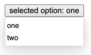
Why a <button>?
To replace the select’s built-in button, a native <button> element is used. That tells the browser that everything inside the <button> should be included in the in-page display of the <select> element. I.e. it’s just a simple placeholder/container. Normal button activities and attributes, e.g. form submission, are routed to the <select> to handle.
To ensure the behavior described above, the nested <button> is rendered inert. It is also set to display:contents by the UA stylesheet, so that there aren’t two sets of box decorations. The button and it’s descendants do not participate in the a11y tree; therefore, any attributes on the button or descendants have no effect on a11y.
Rendering the <option> differently in the button
This example uses the customizable <select> element with custom CSS to target it which renders the option differently in the listbox vs in the button. The “description” text of each <option> has an <span aria-hidden=true> to both reduce the duplication of announcing the emoji’s text alternative, and the visible text. Hiding the text from the accessibility tree also ensures the selected option will be announced the same whether its copied into the <selectedcontent> or being rendered in the dropdown. E.g., “red heart”.
<select>
  <button>
    <selectedcontent></selectedcontent>
  </button>
  <option>
    ❤️ <span aria-hidden=true class=description>heart</span>
  </option>
  <option>
    🙂 <span aria-hidden=true class=description>smile</span>
  </option>
</select>
<style>
selectedcontent .description {
  display: none;
}
select, ::picker(select) {
  appearance: base-select;
}
</style>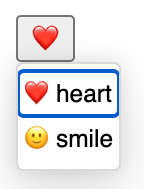
Putting custom content in the listbox
This example has a complex structure wrapping the <option>s which is all slotted into the popover element.
<select>
  <div class=container>
    <div>
      <optgroup label="1-2">
        <option>one</option>
        <option>two</option>
      </optgroup>
    </div>
    <div>
      <optgroup label="3-4">
        <option>three</option>
        <option>four</option>
      </optgroup>
    </div>
    <div>
      <optgroup label="5-6">
        <option>five</option>
        <option>six</option>
      </optgroup>
    </div>
    <div>
      <optgroup label="7-8">
        <option>seven</option>
        <option>eight</option>
      </optgroup>
    </div>
  </div>
</select>
<style>
.container {
  display: grid;
  grid-template-rows: auto auto;
  grid-template-columns: 50px 50px;
  grid-column-gap: 10px;
  grid-row-gap: 10px;
}
.container > div {
  background-color: lightgray;
}
select, ::picker(select) {
  appearance: base-select;
}
</style>
Here is another example with custom content in the listbox: codepen
Animations
This example uses view transitions to animate the opening and closing of the listbox. Link to codepen

Button behavior
The first child <button> of a <select> will be slotted into the <select>’s UA ShadowRoot and will open the popup list of options.
The <selectedcontent> element
The <selectedcontent> element enables developers to declaratively clone the content of the selected <option> element to the button and to style it distinctly from the <option>. This use case is shown in the rendering the option differently in the button example.
When the <selectedcontent> element is placed inside of a <select>’s <button>, then the browser will replace its DOM contents with the result of calling cloneNode() on the currently selected <option> element. Whenever the user selects a different <option>, the browser will update the contents of <selectedcontent> by internally calling cloneNode() again. If the DOM contents of the currently selected <option> are modified, then the browser will not re-clone into <selectedcontent>.
Since the contents of the <selectedcontent> element are maintained by the browser, authors should not put any HTML/DOM content inside of <selectedcontent>.
The split button use case
Split buttons, like this one from Fluent UI and this one from PrimeNG, are a use case that was discussed for customizable select. Customizable select does not match the a11y properties and keyboard functionality of split buttons, so it is not recommended to use customizable select to implement this use case.
The selectedcontentelement attribute
<select> will support the selectedcontentelement attribute, which is an IDref which points to a single <selectedcontent> element to update. This allows the <selectedcontent> to exist outside of <select> in order to support the split other use cases.
Anatomy of the customizable select element
Because the various parts of the select element can be styled, it’s important to understand the anatomy of this UI control.
<select>- The root element that contains the button and listbox.- button (slot) - The portion of the element which is rendered in the position of the button which opens the listbox. It should contain a button to open the listbox.
<button>- The button which opens the listbox when clicked.<selectedcontent>- The element which contains the text of the currently selected option. Every time that the user selects an option, the browser will replace the children of this element with the result of callingcloneNode()on the newly selected<option>.<datalist>- The wrapper that contains the<option>(s) and<optgroup>(s).<optgroup>- Optional element which groups<option>(s) together with a label.<legend>- Used to provide a label to an<optgroup>element. It must be the first child of the<optgroup>.<option>- Can have one or more and represents the potential values that can be chosen by the user.
Styling
Customizable <select> provides a variety of tools to help with styling, including pseudo-selectors for different states and pseudo-elements for different parts.
select::picker(select)
This pseudo-element targets the popover element representing the popup list of options in the UA ShadowRoot of the <select> element. Putting appearance:base-select on this pseudo-element is necessary in order to opt-in to using the popover. You can put additional styles on it to control popover animations, border styling, and more.
select:open and select:closed pseudo-selectors
The select element supports the :open and :closed pseudo selectors as specified by CSS here: https://drafts.csswg.org/selectors/#open-state
When the select’s listbox is showing, the select element will match :open, and when it is not showing, it will match :closed. Here is an example which makes the button red when the listbox is closed and green when it is open:
<select>
  <button id=custombutton>
    <selectedcontent></selectedcontent>
  </button>
  <option>one</option>
  <option>two</option>
</select>
<style>
select:open #custombutton {
  background-color: green;
}
select:closed #custombutton {
  background-color: red;
}
</style>
UA Stylesheet
The UA stylesheet for customizable select is currently under discussion in the CSSWG here. Here is what we have so far:
select {
  border: 1px solid currentColor;
  background-color: color-mix(in lab, currentColor 10%, transparent);
  color: inherit;
  font: inherit;
  padding: 0.25em .5em;
  text-box: trim-both;

  border-radius: 0.25em;
  display: inline-block;
  box-sizing: border-box;
  min-block-size: max(24px, 1.2em);
  min-inline-size: 24px;
  white-space: normal;
}

select:enabled:hover {
  background-color: color-mix(in lab, currentColor 20%, transparent);
}

select:enabled:active  {
  background-color: color-mix(in lab, currentColor 30%, transparent);
}

select::picker(select) {
  box-shadow: 0px 12.8px 28.8px rgba(0, 0, 0, 0.13), 0px 0px 9.2px rgba(0, 0, 0, 0.11);
  box-sizing: border-box;
  overflow: auto;
  border: 1px solid rgba(0, 0, 0, 0.15);
  border-radius: 0.25em;
  padding-block: 0.25em;
  padding-inline: 0;
  background-color: Field;
  margin: 0;
  inset: auto;
  min-inline-size: anchor-size(self-inline);
  min-block-size: 1lh;
  position-area: block-end span-inline-end;
  position-try-fallbacks:
    block-start span-inline-end,
    block-end span-inline-start,
    block-start span-inline-start;
}

select option {
  min-inline-size: 24px;
  min-block-size: 24px;
  align-content: center;
  display: block;
  padding-block-start: 0;
  padding-block-end: 1px;
  padding-inline: 2px;
  white-space: nowrap;
}

select option:hover {
  background-color: SelectedItem;
  color: SelectedItemText;
}

select option::before {
  content: '\2713' / '';
}
select option:not(:checked)::before {
  visibility: hidden;
}

select::after {
  padding-inline-start: 0.5em;
  display: block;
  content: counter(fake-counter-name, disclosure-open);
}
select:not(:open)::after {
  content: counter(fake-counter-name, disclosure-closed);
}

select optgroup {
  padding-inline: 2px;
}

select optgroup option {
  padding-inline-start: 20px;
}
Additional examples
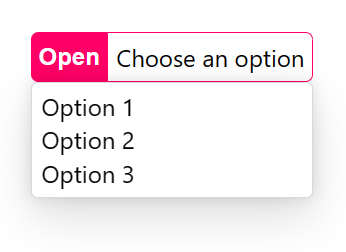
Here is an example which has a custom button with custom CSS:
<style>
  .my-custom-select button {
    display: flex;
    align-content: center;
  }
  .my-custom-select .open {
    padding: 5px;
    border: none;
    background: #f06;
    border-radius: 5px 0 0 5px;
    color: white;
    font-weight: bold;
  }
  .my-custom-select .label {
    padding: 5px;
    border: 1px solid #f06;
    border-radius: 0 5px 5px 0;
  }
  select, ::picker(select) {
    appearance: base-select;
  }
</style>
<select class="my-custom-select">
  <button>
    <span class="open">Open</span>
    <span class="label">Choose an option</span>
  </button>
  <option>Option 1</option>
  <option>Option 2</option>
  <option>Option 3</option>
</select>
The above code snippet results in the following style:
Here is an example which has a custom listbox with custom CSS:
<style>
  .my-custom-select datalist {
    width: 300px;
    display: grid;
    grid-template-columns: repeat(auto-fit, minmax(100px, 1fr));
    gap: 10px;
    padding: 10px;
    box-shadow: none;
    margin: 10px 0;
    border: 1px solid;
    background: #f7f7f7;
  }
  select, ::picker(select) {
    appearance: base-select;
  }
</style>
<select class="my-custom-select">
  <datalist>
    <option>Option 1</option>
    <option>Option 2</option>
    <option>Option 3</option>
    <option>Option 4</option>
    <option>Option 5</option>
  </datalist>
</select>
The above code snippet results in the following style:

Extending the markup
Not only can you replace the default parts with your own, you can also extend the control’s markup by adding new elements. This can be useful to augment the listbox or button with extra information, or to add new functionality.
Consider the following example:
<style>
  .my-custom-select button {
    display: flex;
    align-items: center;
    gap: 1rem;
    border: none;
    background-color: transparent;
  }
  .my-custom-select .icon {
    border: none;
    margin: 0;
    padding: 0;
    width: 2rem;
    height: 2rem;
    border-radius: 50%;
    display: grid;
    place-content: center;
    background-color: buttonface;
  }
  .my-custom-select .icon::before {
    content: '\25BC';
  }
  .my-custom-select datalist {
    padding: 0;
  }
  .my-custom-select .section {
    padding: 1rem 0 0;
    background: radial-gradient(ellipse 60% 50px at center top, #000a 0%, transparent 130%);
  }
  .my-custom-select h3 {
    margin: 0 0 1rem 0;
    text-align: center;
    color: white;
  }
  .my-custom-select option {
    text-align: center;
    padding: 0.5rem;
  }
  select, ::picker(select) {
    appearance: base-select;
  }
</style>
<label for=plant>Choose a plant</label>
<select id=plant class="my-custom-select">
  <button>
    <selectedcontent></selectedcontent>
    <span class=icon></span>
  </button>
  <datalist>
    <div class="section">
      <h3>Flowers</h3>
      <option>Rose</option>
      <option>Lily</option>
      <option>Orchid</option>
      <option>Tulip</option>
    </div>
    <div class="section">
      <h3>Trees</h3>
      <option>Weeping willow</option>
      <option>Dragon tree</option>
      <option>Giant sequoia</option>
    </div>
  </datalist>
</select>
Using custom markup to wrap the list of options, the above example creates sections with their own styles and content as seen below:

Demo page
You can find multiple examples of customizable select at these sites:
Keyboard Behavior
When a custom <datalist> element is provided, the <select> element has unified keyboard behavior. The new behavior is inspired by both the existing <select> element and the Aria Authoring Practices Guide Combobox Pattern. This behavior was decided in issue 386 and issue 433.
When the listbox is closed and the button is focused:
- Spacebar opens the listbox.
- Enter submits the form associated with the select if one exists. Otherwise, enter does nothing.
- The up, down, left, and right arrow keys all open the listbox without changing the selected value.
When the listbox is open:
- Escape closes the listbox without changing the selected value.
- Spacebar is used for typeahead.
- Enter changes the selected value to the currently focused option and closes the listbox.
- The up arrow key moves focus backwards in the list of options.
- The down arrow key moves focus forwards in the list of options.
- The left and right arrow keys do nothing.
multiple and size attributes
The HTML parser will not allow <button> or <datalist> children when the multiple or size attributes are present on <select>. This will ensure that the old rendering behavior of multiple and size is used. If the author adds a <datalist> or <button> via script to a <select multiple> or <select size>, the old rendering will still be used. In the future, we would like to upgrade <select multiple> to become customizable, at which time we will change the HTML parser again to allow <button> and <datalist> children. This also allows feature detection to know whether <select multiple> improvements are ready to be used. More detail in this issue.
Checkmark
A checkmark is included next to the option elements by default in order to visually indicate which option is currently selected. This improves accessibility/usability because selection doesn’t follow focus. You can opt out of rendering the checkmark with the following css:
option::before {
  display: none;
}
Design decisions
- Why reuse
<select>instead of creating a new element - Why not use the
slotorbehaviorattributes - Why not support the
sizeattribute - Why support
:checkedinstead of:selected - Why allow interactive content in
<listbox>but with strong warnings - Why not make selection follow focus
- Why not allow select or datalist in size/multiple select
- Why add the
<selectedoption>element <selectedoption>name bikeshedding- Why opt-in with CSS
- Why include a checkmark next to options by default
- Why
<button type=popover>(overturned byselectedoptionelement) - Why
selectedoptionelement - Why require
appearance:base-selecton bothselectandselect::picker(select) - Why not observe mutations in selected
<option> - Renaming
<selectedoption>to<selectedcontent>