 Open UI
Tabs Parts & Concepts
This was created to begin to investigate how we can standardize (in both the OpenUI senses) a “tabs” control and/or supporting APIs that would empower their creation.
Survey
We began by surveying the landscape of “tabs” in components and design systems. While we surveyed all of the systems common in Open UI research, we also included some others, both current web libraries/systems. In discussion and notes this even includes some OS level toolkits and design guidelines in a few places for completeness. Part of the rationale here was to help us avoid certain kinds of bias as there is a long history of components that would have fit into such a survey, many of which were more popular and common than ones we are looking at today: YUI, ExtJS, Dojo, Bootstrap and jQuery UI for example are all “easy” examples to point to which had popular “tabs” components and are not directly included in our research. Instead what we tried to do was consider where such a difference from what we were seeing in our smaller sample was potentially interesting, and then try to see if there was a reason or way to include or note it.
This section simply documents what our research found.
Challenges
Defining “tabs” scope
The first challenge was that nailing down an overview of what “tabs” currently widely support is trickier than one might imagine. Systems disagree on what they even call components or patterns which different persons might identify as “tabs” depending on whether this perspective is informed based on APIs and programming, a user experiencing something, design, and so on.
Implementations and systems can vary quite a bit, even having several “tab-like” components which share common base classes or mixins but are actually discrete components or patterns with different features and recommendations on their use. Some are even just the tablist aspect itself with no sense of the whole joint component and relationship to content, leaving this to authors.
Examples where this refers to a full component:
- Atlaskit
- Carbon Design System
- Lightning Components?
- WAI-ARIA
- Shoelace
- Origami
- Redhat
- Fast
- Semantic UI
Examples where this refers to an only Tab List / Tab Bar (see Parts and Terminology):
- Material
- Vaadin
Examples where there is only an exclusively activatable stack of content sections
- semantic-ui
Sometimes there are underlying common implementations of parts that are shared, and sometimes there are several components that can be integrated or composed into others. Atlaskit, for example has three different ‘kinds’ of tabs, and one of those is just the bar, and semantic ui creates an exclusive ‘stack’ of content sections which can be used to make card stacks and tabs and so on.
In this survey we tried to lean hardest on surveying the things that could apply to “tabs” in a semi abstract sense. We included things that implement the most common ideas and did not exclude things simply because a particular system called them something else or because they went beyond in a non-exclusive seeming way…
API and User Experience
Given somewhat radical differences in programming models, libraries, features and so on it is considerably difficult to evaluate for very specific common API surfaces. As most of these are part of a larger ‘kit’ which is in turn often bought into a larger paradigm (react vs HTML vs OS toolkits, etc) it is also difficult to disentangle why those components are used or which qualities of their API are preferred versus tolerated as part of the convenience of larger choices. As such, this document focuses primarily on the parts and experiences themselves, except to note where specific API choices are made to allow more or specifically limit choices.
Parts and Terminology
Given the challenges above and variance above in what different systems consider tabs in significant ways, terminology becomes very overloaded and the language of discussing this problem space can quickly get very tricky. In order to keep things as clear as possible this document will attempt to label and refer to the to the most common identifying parts of the fundamental anatomy of a conceptual control with the following terms, borrowing heavily from ARIA where appropriate (though, as two words for readability) and extending where obvious concepts exist, but no standard and non-overloaded term does:
- Tab Set - Refers to the whole component. ARIA defines no corresponding role for the entire composite component.
- Tab Section - A conceptual “whole tab”. It is the combination of a linked Tab Label and Tab Panel. Given the tree and layering nature of this component, in many systems it is constructed of disjoint parts (elements, in web terms) and thus isn’t itself given a common name and by nature cannot have a mapped role in ARIA. However, in order to refer to the whole unit, having a term is necessary. Naturally, in discussion, people will tend to refer to it as a “tab” as well which only exacerbates the confusion, thus a discrete name is desirable here.
- Tab Bar - A conceptual container for the Tab List and potentially related controls in some common visualizations, but potentially not all. ARIA contains no corresponding role for this particular distinction as it has no semantic meaning itself.
- Tab List - A structural container of a group of Tab Label that owns each Tab Panel. This corresponds to the element given a
tablistrole in ARIA. - Tab Label - An individual label belonging to the Tab List and identifying the Tab Section/associating the Tab Panel. This corresponds to the
tabARIA role, however, for clarity we prefer to avoid confusion - Tab Panel - The content part of a Tab Section, which is labelled by the Tab Label. This corresponds to the ARIA role of
tabpanel
TODO: a schematic here might be helpful...
Each of the sections below contain specific details about aspects of tabsets surveyed
Tab Labels:
Tab Labels identify the contents of a Tab Panel, creating a conceptual Tab Section. They are semantically, and interactively linked.
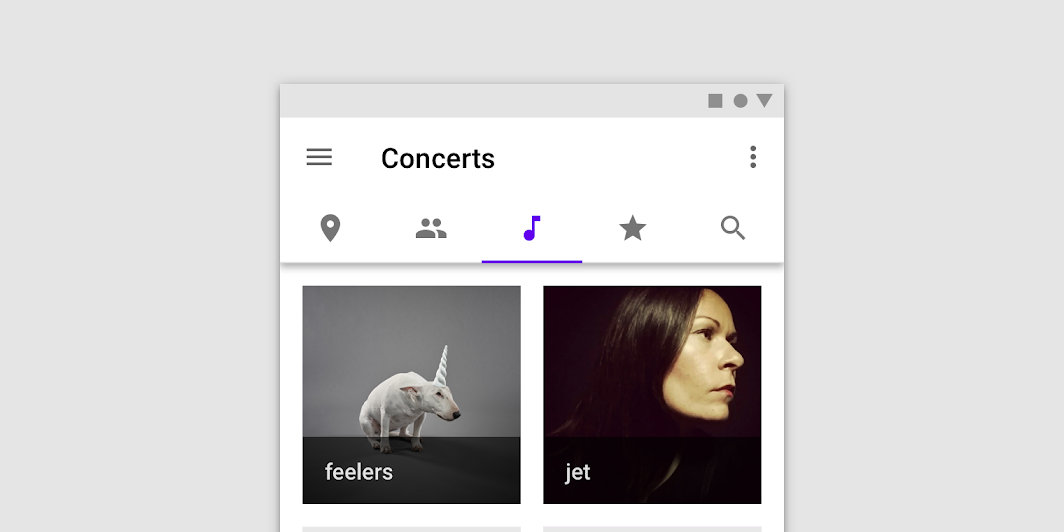
The most fundamental aspect of a Tab Label is text, though some systems support additional content inside the label (and some actively prevent it via API design). The most common variant includes an icon, though support is very mixed on how this is supported (or prevented). There are also implications of these choices on things like internationalization and accessibility which are covered later.
Tab Labels with Icons support
| System | Screenshot/Notes |
|---|---|
| Atlaskit | Not explicitly supported, the API for providing a label is a string. |
| Ant Design |  |
| Carbon Design | Not explicitly supported |
| Fast | Not explicitly supported |
| Lightning Components | 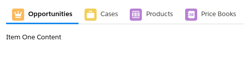 |
| Material | 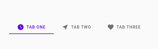 |
| Oragami | Not specifically supported, but markup based and seems to support embedding custom content |
| Semantic UI | Not explicitly supported (‘menus’ separate from the component they call ‘tabs’ which is more of a set of mutually exclusive selectable sections, but looks like these menus can contain embedded custom content) |
| Shoelace | (not specifically supported, but seems to support embedding custom content) |
| Vaadin | (not specifically supported, but explicitly supports embedding custom content) |
Some systems which support icons allow for tabs that contain only icons, others do not. Material is an example of the former. Note that in these cases, it is important that non-visible text alternatives must be provided for a11y, though most systems don’t specifically require it.
Most design systems recommend homogeneity in the same Tab Bar (that is, against mixing modes of combination of text/icon). Some actively enforce this, via API, some don’t.
Directionality/Mirroring
There are some well established expectations with regard to internationalization for certain parts of Tab Sets. In right-to-left languages, for example, generally speaking some kind of RTL mirroring applies - however, it will work differently depending on a number of other factors. Some of these are very well established, others less so. For example, when tabs are grouped in the in the horizontal top position, in RTL the order of the tabs is reversed, and the icon/text flip too. Keyboard controls, however, continue to maintain spatial order (that is, pressing ‘left arrow’ will move selection to the tab displayed to the left of the currently selected and so on. First and last shortcuts will be impacted as per the directionality. As systems add additional elements or orientations this becomes slightly less clear.
If the component offers some additional affordance for overflow (see overflow), for example, this may or may not have effects (paging or next/back buttons would work spatially, while a dropdown should appear to the left but options would be in …document order?).

Mirroring should work similarly in horizontal bottom positioning. However, if left and right positioned tabs are supported, they will reverse the order of their alignment and their icon/text relationship, but not the order of the tabs themselves.
Icon Alignment
Some systems also support an explicit mode for aligning the icon on its own line at the top, above the text

Material design with icon and text in horizontal top position and icons to the top, in both directions.
Note that as top icons are in the block direction, they are generally unchanged during RTL mode mirroring.
Tab List Position:
Grouped Tab Lists (headings/buttons)
The most common, traditional definitions of Tab Sets involve the Tab List being visually grouped together. Over the years this definition has expanded from a simple ‘grouped along the top edge of the content’ to considerably more variable ideas. Some of the positioning schemes for grouped Tab Lists allow authors to express the alignment of the group, such that tabs appear grouped at the left, in the center, or on the right (though, how this should work with mirroring is an area that is less well defined).
This section looks at common orientations of the grouped tabs and support for this feature in different systems. Because of unevenness and confusion around how these work with writing modes, we are listing them in the cardinal directions and including a logical direction alternative in parens.
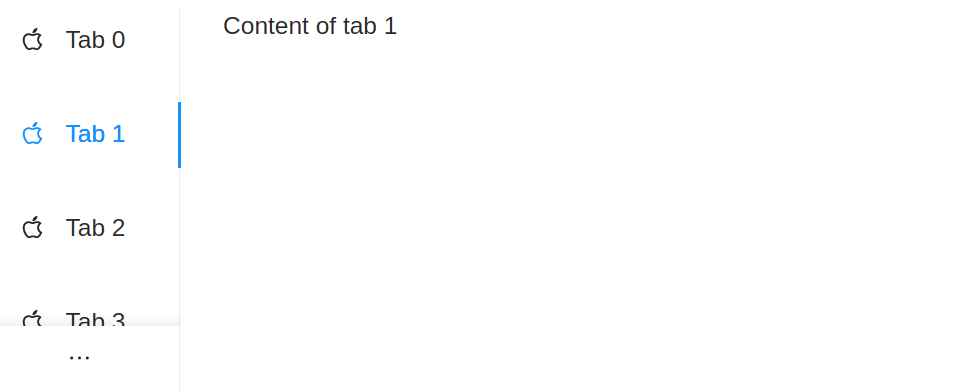
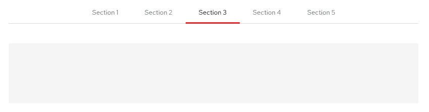
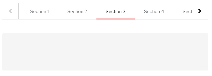
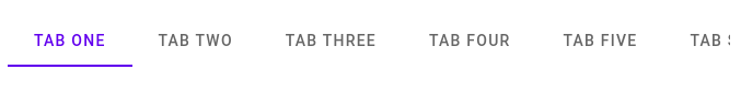
Horizontal Top (block-start)
All implementations support this view, somehow (in some cases only the Tab Bar is provided). It is the original view, most vanilla associated with the mental image of tabs with the group aligned to the top edge of content. Where they diverge slightly is largely in regard to how they handle overflow (see behaviors > overflow in this document). Note: Some can switch any (automatically or via attribute) to ungrouped/inline.
| System | Screenshot/Notes |
|---|---|
| Ant design | |
| Atlaskit | 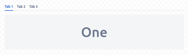 |
| Carbon Design | 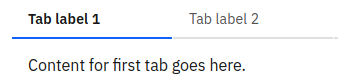 |
| Fast |  |
| Lightning Components |  |
| Material (TabBar) |  |
| Origami | 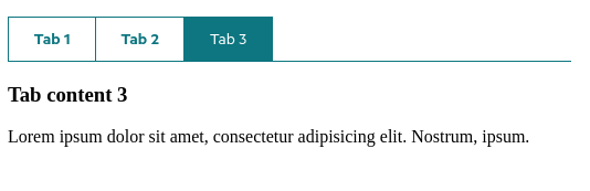 |
| Semantic-UI | It seems the component that is called tabs here is actually a mutally exclusive selection of items for content - a tab list is wholly separate a concern here, an exercise left to authors as a menu - but it seems it could be said to loosely support this |
| Shoelace | 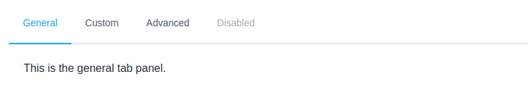 |
| Vaadin | 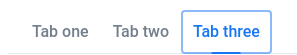 |
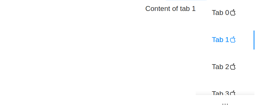
Vertical Left (inline-start)
Many tabs implementations also support tabs grouped along the left edge of the content. Note: Some, like ant design, automatically switch these to top aligned on mobile devices. Others can switch any (automatically or via attribute) to ungrouped/inline.
| System | Screenshot/Notes |
|---|---|
| Ant design | 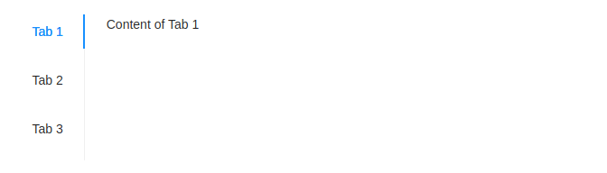 |
| Atlaskit | Not supported |
| Carbon | Not supported |
| Fast | 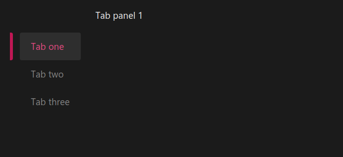 |
| Lightning Components | 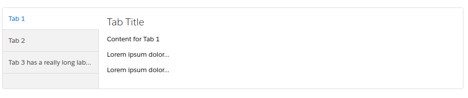 |
| Material | Not supported |
| Origami | Not supported |
| Redhat | 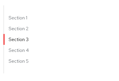 |
| semantic-ui | It seems the Tab List is wholly separate a concern here, an exercise left to authors generally triggered by a menu, so.. unclear? |
| Shoelace | 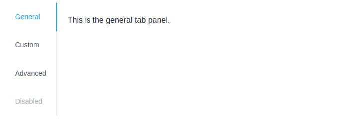 |
| Vaadin | 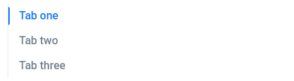 |
Vertical Right (inline-end)
Some tabs implementations support tabs grouped along the right edge of the content, though, again - how this works with internationalization is not entirely clear. Note that the accessibility characteristics of this seem unchanged. Note: Some, like ant design, automatically switch these to top aligned on mobile devices. Others can switch any (automatically or via attribute) to ungrouped/inline.
| System | Screenshot/Notes |
|---|---|
| Ant design | 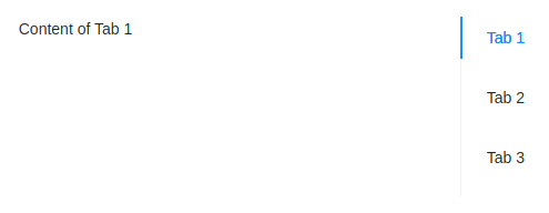 |
| Atlaskit | Not supported |
| Carbon | Not supported |
| Fast | (only supports vertical + direction which isn’t the same exactly but is maybe better) |
| Lightning Components | Not supported |
| Material | Not supported |
| Origami | Not supported |
| Redhat | |
| semantic-ui | It seems the Tab List is wholly separate a concern here, an exercise left to authors generally triggered by a menu, so.. unclear? |
| Shoelace | TODO: missing screenshot from https://shoelace.style/components/tab-group |
| Vaadin | |
Horizontal Bottom (block-end)
Some tabs implementations support tabs grouped along the right edge of the content, though, again - how this works with internationalization is not entirely clear. Note that the accessibility characteristics of this seem unchanged.
| System | Screenshot/Notes |
|---|---|
| Ant design | |
| Atlaskit | Not supported |
| Carbon Design | Not supported |
| Fast | Not supported? |
| Lightning Components | Not supported |
| Material | (technically perhaps partially supported by the fact that it is separated from content, but the guidelines suggest don’t) |
| Origami | Not supported |
| semantic-ui | It seems the Tab List is wholly separate a concern here, an exercise left to authors generally triggered by a menu, so.. unclear? |
| Shoelace | 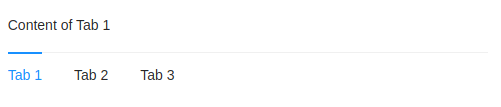 |
| Vaadin | (bar only, though technically perhaps partially supported by the fact that it is separated from content) |
Note: Some can switch any (automatically or via attribute) to ungrouped/inline.
Additional/new types
Just as over time we have expanded many common definitions to include labels grouped on any of four sides, it is reasonable to expect that new ideas will continue to explore new visualizations of which require similar qualities in terms of necessarily semantic parts, required interactions, events, etc.
These components, which fit the description we have provided, are developing and not uncommon thanks to pressures from things like web interfaces providing for IoT, video games and even the needs of simple responsive design. Given that we are looking at components in systems with diverse names and qualities it is difficult to discuss if or how these aspects are considered, the support and qualities (including naming) vary significantly from no consideration of these uses to responsive components that respond and switch their types fluidly. As such, we have simply provided examples and explanations of these types for consideration.
Ungrouped Vertical (block sections)
Responsive design, particularly, has changed the way we consider, approach and name some things. Grouped tabs can be re-visualized vertically and un-grouped and with content interwoven without changing anything about state, semantics, functionality, etc.
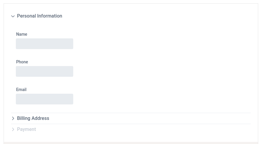
Vaadin’s accordion is a semantic and feature match as described: An element must be selected, it is an exclusive choice
RedHat is a another example of a component which, below a certain breakpoint will “become” vertical, though their vertical tabs remain grouped and they adapt by changing the overflow affordances.
Ungrouped Horizontal (inline sections)
Grouped tabs can be re-visualized horizontally and un-grouped and with content interwoven without changing anything about state, semantics, functionality, etc. These are currently more popular in video games and IOT with more predictable and fixed viewport sizes.
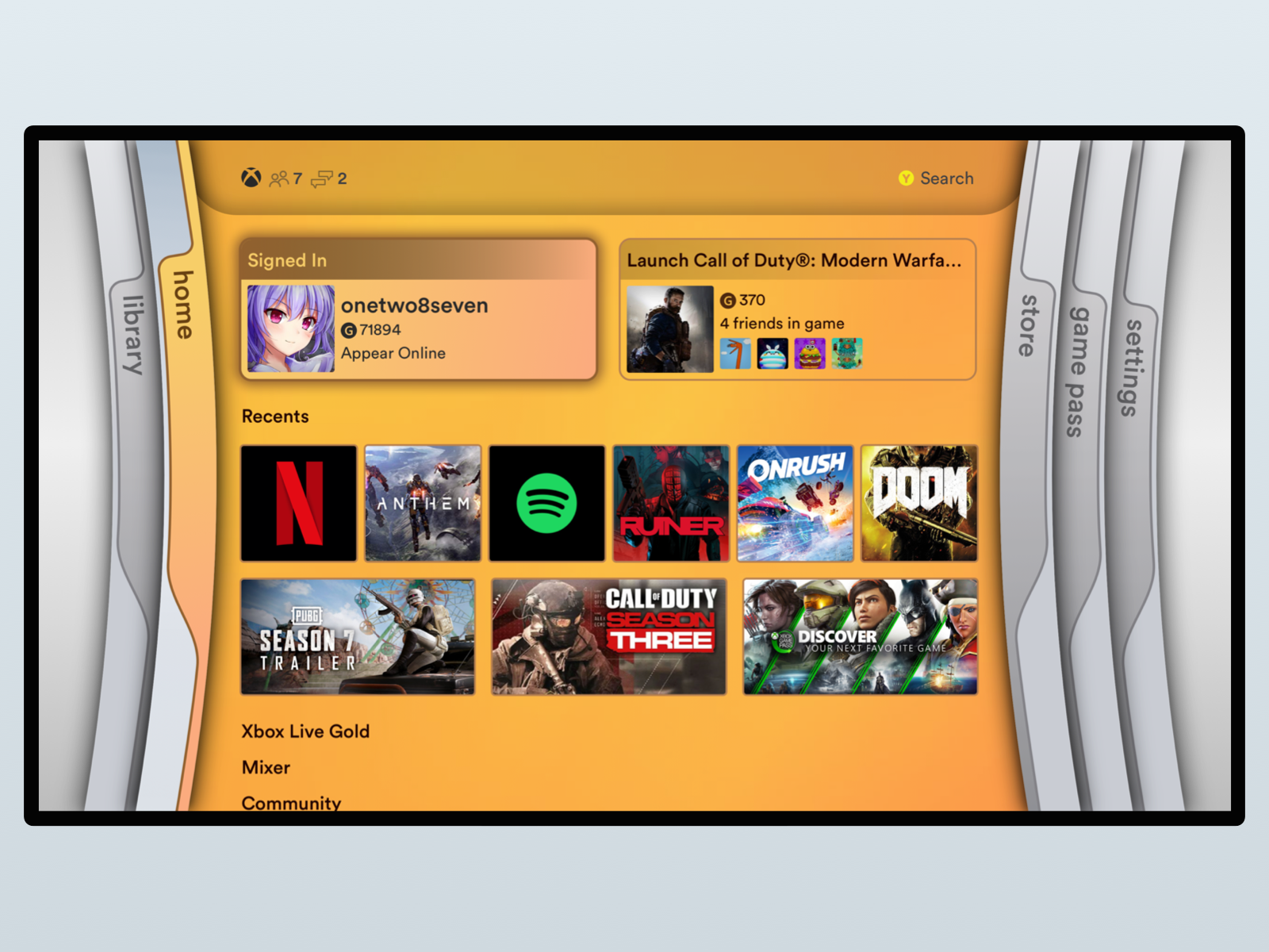
An example of an X-Box control which is a semantic and feature match as described: An element must be selected, it is an exclusive choice.
Radial
Grouped tabs can be re-visualized along a curve without changing anything about state, semantics, functionality, etc. These are currently more popular in video games and IOT.

An example of a video game control which is a semantic and feature match as described: An element must be selected, it is an exclusive choice.
Tab List alignment:
Some systems attempt to simply support some kind of center alignment of the grouping of horizontal tabs. Some systems also advise not trying to change whatever styling boundaries on this it places by default.
Examples:

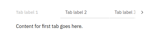
Tab List Overflow
While basic concepts of rendering the various parts in each of the discussed Tab List positions there is anything but clarity around what to do when there are too many Tab Labels to fit on the screen in the current direction Some systems, clip tabs increasingly smaller and force fit. Others, like Ant Design try to make sure the text of tabs is visible and provide new affordances and offer a drop down, but this is rare. Others offer before and after interactive arrow affordances which appear or disappear as needed. This is also rare, however, in some cases this advances a single tab, and in others it merely scrolls forward or backward a visible ‘page’ of tabs. Others force tabs to wrap and stack, while still others simply overflow and allow clipping and allow the user scroll via keyboard focus or drag without scrollbars. These also differ in terms of scroll snapping.
Below are a sampling of differences.

Ant design, showing how it handles overflow in both horizontal and vertical grouped directions
Carbon design adds next/previous interactive buttons in the horizontal grouped direction (doesn’t support a vertical grouped direction)
Fast does not currently explicitly support anything in particular here, but they are working on it.
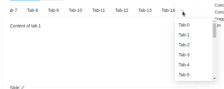
Lightning components adds a trailing interactive “more” dropdown (containing the entire list) in the horizontal grouped direction, and allows both the Tab List and the Tab Panel to take up 100% of the screen, providing a horizontal scroll between them in the vertical grouped direction.
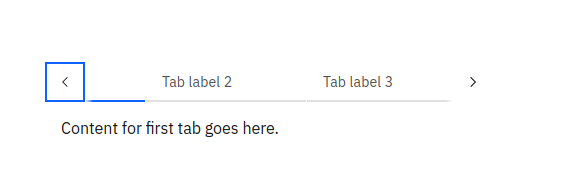
Redhat adds interactive next and previous scroll buttons (only handles overflows in horizontal group)
Material clips the Tab List container allows movement of focus or touch scrolling but offers no additional affordances or interactive elements. It only has a horizontal grouped version.


Vaadin overflows the TabList with a vertical scroll bar when grouped vertically, and with interactive next/previous buttons which advance the clipped scroll area by one page when grouped vertically.
Visual transitions
A rarely occurring enhancement, but not entirely uncommon and seemingly growing in popularity is providing a visual transition effect between the finite states of tabs. It it worth considering a feature on its own in the sense that there are several implementations which are built in such a way that this is not possible to achieve.
Material provides one example which employs both an activation animation of the background and a sliding focus indicator that animates a ‘movement’ of the indicator between the old and new states rather than simply snapping indicators on and off
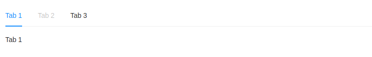
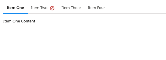
Disabled Tabs
A few systems allow the “disabling” of individual tab labels. While this is not extremely common, it is not entirely rare either. Some particularly interesting things to note here are:
- The accessibility characteristics of this are not well established or agreed upon
- There is a slight conflict here in that many design guidelines recommendations for when to use a Tab Set (whatever it is called) describe a quality that tabs should not be statefully related, and most of the use cases for this quality seem to have that as a prerequisite (wizard-like sequential forms scenarios, for example).
Dismiss / Close / Delete / Remove
Some Tab Sets allow programatic and sometimes user-triggered items that are “dismissible” or, as referred to in ARIA practices as “deletable” or, sometimes “closable” or “removable”.
Note that while this optional feature is mentioned in ARIA Practices and keyboard affordances are well-specified, there seem to be disagreements in implementations about whether a semantic/visual affordance belongs in the sequential focus order.
Note that if tabsets are ‘dismissable’ they can also be ‘entirely dismissable’ (the entire control disappears) or they have to deal with what happens when only one tab remains. It seems the choice to support this, not support it, or how to deal with whether they are individually, as a whole, or only as long as more than one remains varies quite a bit, though realistically without 2 (that are not disabled) it gets more difficult to really call them “tabs”, thus many design systems at least recommend, if not require minimum of two. In many windowing toolkits, “dismissable” cases are dealt with extensions to a common interface and not called ‘tabs’, or ‘tabs’ has a narrower definition in one direction or the other.
This might be thought of to go hand in hand with the ability to add a tab, and while not uncommon in programmatic APIs, it is considerably more rare from a user interface point of view and there aren’t plentiful ideas in practice from libraries to draw from.
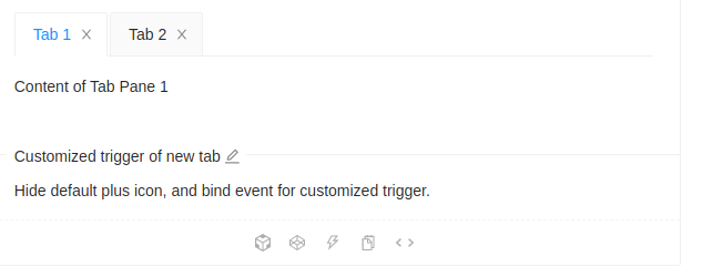
An example of dismissible tabs from Ant design (also shows the ability to add a trigger to add a new tab, but this is hard to investigate more here)
Context menu
While exceptionally rare in our survey of components, the idea that individual tab labels can include a context menu was common enough that keyboard shortcuts for this it is included in ARIA Practices. Several components accept rich content in tab labels (more than strings) and so in theory might be said to allow rather than support this, however it has some interesting challenges. Like dismiss buttons there are some accessibility characteristic of this that are not entirely clearly specified and popular web based implementations are uncommon enough that it was not easy to find good discussion abut how, for example, a visual affordance should affect sequential focus or how these swap/mirror in RTL. How this winds up working out with other potential extra (rare) tab label elements would require some additional investigation.

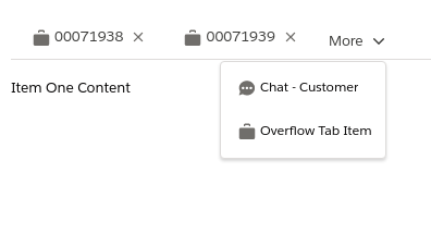
Examples of components explicitly supporting a context menu as part of the API are rare, but do exist. Lightning components includes one in which a context dropdown is provided in the label after optional state indicators but before an optional dismiss button
Draggable / Reorderable
Some Tab Sets allow users to drag Tab Labels and reorder them in the Tab List (note this is in part based on the common guidance that there is no stateful relationship or order importance of the tabs - see disabled tab labels). This is fairly rare on the web, but some allow it. Some also allow tabs to be dragged into and out of their tab lists, though outside of browsers themselves this appears to be very rare.
Very rare features
Extra Elements
Some tabsets allow you to embed extra interactive elements into the grouped tablist (or maybe it is surrounding it visually?). This is certainly not universal or uniform and the interaction patterns and a11y are not well established as a generic mechanism. It may be the intent that these are intended to allow some of the extended things that other implementations attempt to provide.
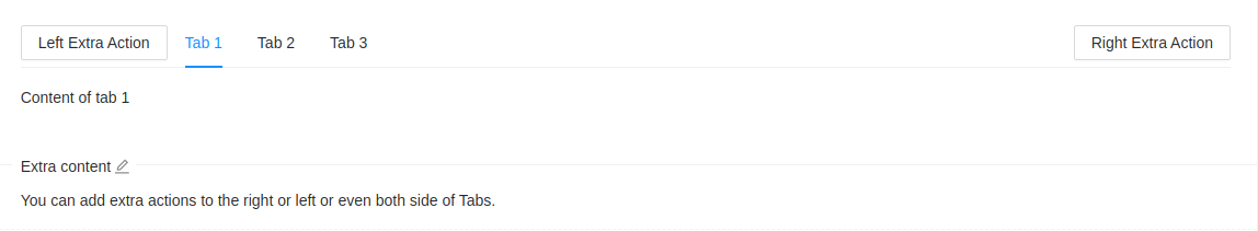
Ant design is an example of a system which provides buttons for “extra actions” to before and after the Tab List inside the group. Note that while it calls the “left” and “right”, these are actually “before” and “after” as they have this effect in vertical arrangements as well.
Tab state indicators
While many APIs would allow complex content in a tab label, at least Lightning Component provide a specific “state indicator” built into the component itself indicating that this tab needs attention. It is interesting to consider whether there are implications on swap/mirroring in RTL of either approach. It is also worth considering how this relates to the question of statefulness in this component, where precisely that line is drawn (this is arguably a contained state that doesn’t affect others), as well as how such information is communicated accessibly.
An illustration of Lightning’s status indicators which, in LTR show an icon for conveying that a tab panel is in a loading, or error state, for example, after the label text.
A note on lazy (or ajax) Tab Sets
Some components build into their implementations an idea of content which is lazily loaded and introduce a state for this that the component can manage efficiently, and potentially containing some concept similar to ‘onload’ allowing script to be included and run, but only once. Mostly this is something at the API rather than the user facing interface level but it is somewhat related to Tab State Indicators and in some cases will provide a default (or customizable) loading animation or text during this period.
See https://semantic-ui.com/modules/tab.html#retreiving-remote-content as an example
Tab status indicators
While many APIs would allow complex content in a tab label, at least Lightning Component provide a specific “state indicator” built into the component itself indicating the “status” of this tab with some additional information. Examples of the intent and meaning of “status” help differentiate it from “state”: unsaved, noisy, unread, for example. This is exceptionally rare and most of the comments related to Tab state apply equally here.
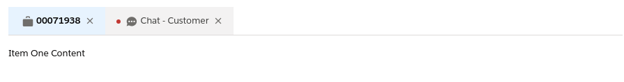
An illustration of Lightning’s status indicators which, in LTR show an icon for conveying a tab panel’s “status”, which is shown before a possible icon and the Tab Label’s text.
Routing/Auto-show
Some tabs implementations include a mechanism for linking to content within a particular tab in order that it can be shown. This is similar to requests in the native Web Platform to allow links that point to content inside of details elements to automatically ensure that their state is exapanded properly and the content scrolled to correctly.