 Open UI
 Declarative Overscroll Actions (Explainer)
Introduction
The web platform allows for sophisticated scrolling experiences, but it currently lacks a semantic way to utilize “overscroll” space (the area beyond the scroll boundary).
Common UI patterns like drawer-menus (swiping past the edge to reveal a menu) or swipe-to-action (swiping a list item to reveal delete buttons) currently rely on complex nested scrollers or JavaScript gesture polyfills. These workarounds are difficult to implement, computationally expensive, and often fail to provide accessible alternatives for non-touch users.
Proposal
We propose a set of HTML attributes that declaratively bind an element (the “overscroll content”) to the scroll boundary of a container.
Crucially, this binding is defined on an activatable element (like a
<button>). This ensures that every gesture-based action has a guaranteed,
accessible fallback interaction (click/Enter) without extra developer effort.
Goals
- No JavaScript: Enable swipe-to-reveal and pull-to-refresh gesture-based interactions using only HTML and CSS.
- Accessibility by Default: Enforce the existence of a semantic button to toggle the view, ensuring keyboard and assistive technology support.
- Performance: Offload gesture physics and animation to the browser’s compositor thread (via scroll timelines).
The API
There are two parts to the API:
First, the container needs to be identified as supporting overscroll areas. This
is done by specifying overscrollcontainer attribute on the container.
Second, we introduce a new command value, toggle-overscroll, to bind a
trigger button to both the container (the scroll port) and the content (the
element hidden in the overscroll area).
<div id="container" overscrollcontainer>
    <menubar id="menu">
        <menuitem>Home</menuitem>
        <menuitem>Settings</menuitem>
    </menubar>
    Some content.
</div>

<button commandfor="menu" command="toggle-overscroll" id=btn>
  Toggle Menu
</button>
Behavior
- Positioning: the
#menuis effectively absolutely positioned within the “overscroll” area of the overscroll container. - Chaining: When a user scrolls
#containerto its limit, the scroll chains to the#menu, pulling it into view. - Activation: As an alternative to scroll gestures, activating the
<button>will perform ascrollIntoView-like action on the#menu. Activating it again scrolls#menuback out of view.
(Here is a simple demo implementation on Github.io. This demo does not require any browser features.)
Terminology
In this explainer, we’ll use the following terminology:
- “overscroll container”: the scrolling container with the
overscrollcontainerattribute.#containerin the above code snippet. - “overscroll area”: the element (and its descendants) within the overscroll
container that gets rendered as overscrolled content.
#menuin the above code snippet. - “overscroll invoker”: the command invoker with
command=toggle-overscrollpointing to the overscroll area.#btnin the above code snippet.
Nesting and Structure
- Overscroll invoker: The
<button>does not need to be a descendant of the container. It can live anywhere in the tree scope, subject to the normal rules for command invoker relationships. - Overscroll area: The overscroll area element (
#menu) must be a descendant of the overscroll container, but it does not have to be a direct child. It can also have other “normal” scrollable content before or after it. Crucially, the overscroll area behaves as if it is a layout child of the scroller, allowing it to escape containing blocks and clips of intermediate ancestors. This behaves in a very similar fashion to how popovers escape ancestors.
Chaining and Ordering
A scroller can have multiple overscroll areas (e.g., one on each side). The
::overscroll-area-parent manages these as siblings.
- LIFO Order: Chaining follows a “last-in, first-out” order. The last overscroll area in DOM order within the overscroll container is chained, and scrolls, first.
- Chaining Path: When the innermost scroller reaches its limit, it chains to the next overscroll area, and so on.
Overlay Mode
By default, overscroll pushes the container’s content. The
overscrollcontainer="overlay" mode changes this so that the overscroll
content slides over the container, similar to position: sticky.
<div id="container" overscrollcontainer="overlay">
  ...
</div>
Note that this is a value of the overscrollcontainer attribute on the overall
scroller, for simplicity of API design. It therefore affects all overscroll
areas within that container. If use cases arise that require different
overflowing elements to have different overlay modes, we can revisit this. But
that does not seem to be a common use case today on the web.
Events
To allow developers to hook into the lifecycle of the gesture (e.g., for refresh logic or haptics), we expose the following events on the host container:
| Event Name | Description |
|---|---|
overscrollstart | Fired when the scroll boundary is breached and chaining begins. |
overscrollchanging | Fired when the gesture sufficiently drags overscroll to snap it to an open area (similar to scrollsnapchanging). |
overscrollend | Fired when the gesture completes and the state has changed. |
overscrollcancel | Fired when the gesture ends but snaps back to the original state. |
Use case examples
Drawer menu
A hidden navigation panel that typically slides in from the edge of the screen when triggered by a button, such as a hamburger menu icon. It allows users to access site-wide navigation, settings, or profile information without permanently cluttering the primary view.
Behaviors:
- Light dismissable: yes
- Modal: yes
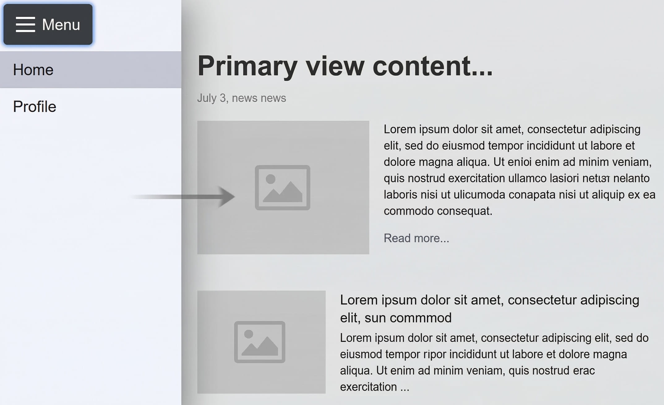
<button commandfor="drawer-menu" command="toggle-overscroll">
  ☰ Menu
</button>
<div id="app-layout" overscrollcontainer="overlay">
  <dialog id="drawer-menu" closedby="any">
    <nav>
      <li><a href="/">Home</a></li>
      <li><a href="/profile">Profile</a></li>
    </nav>
  </dialog>
  <main>Primary view content...</main>
</div>
Swipe to reveal
An interaction pattern where a user swipes horizontally on a specific list item or card to expose hidden secondary actions, like delete, archive, or edit. It is frequently used in touch-based and mobile interfaces to efficiently manage screen real estate while keeping quick actions accessible.
Behaviors:
- Light dismissable: yes
- Modal: no
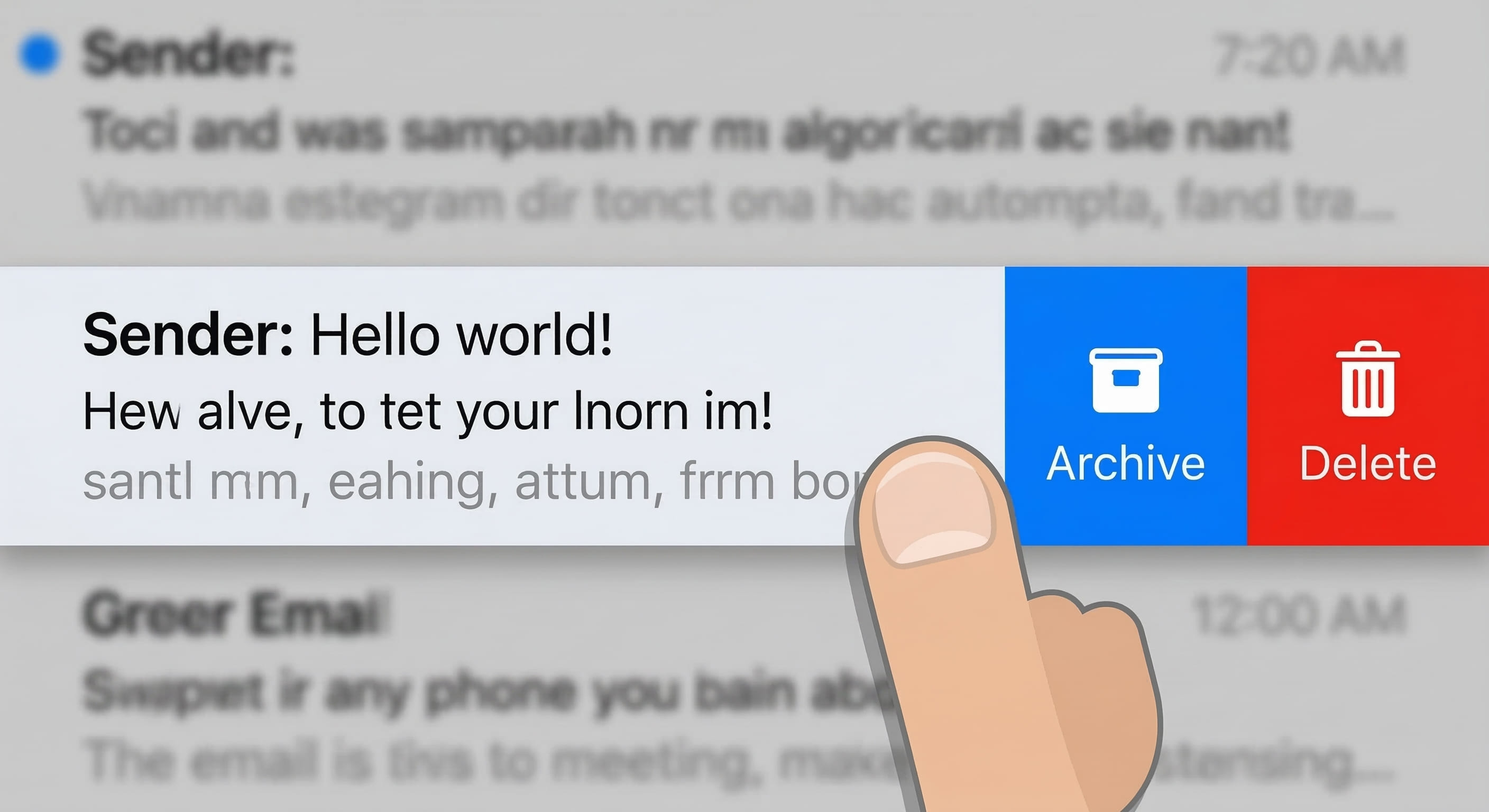
Example code:
<!-- A single list item acting as its own overscroll container -->
<div id="message-item" overscrollcontainer>
  <div class="primary-content">
    Sender: Hello world!
  </div>
  <menubar id="message-actions">
    <menuitem>Archive</menuitem>
    <menuitem>Delete</menuitem>
  </menubar>
</div>
Swipe to dismiss
A gesture-based interaction where a user slides an element—such as a notification, toast message, or temporary card—horizontally or vertically off the screen to remove or close it. This pattern provides an intuitive, fluid way to clear transient information or dismiss temporary views without requiring a click/tap on a close button.
Behaviors:
- Light dismissable: yes
- Modal: no
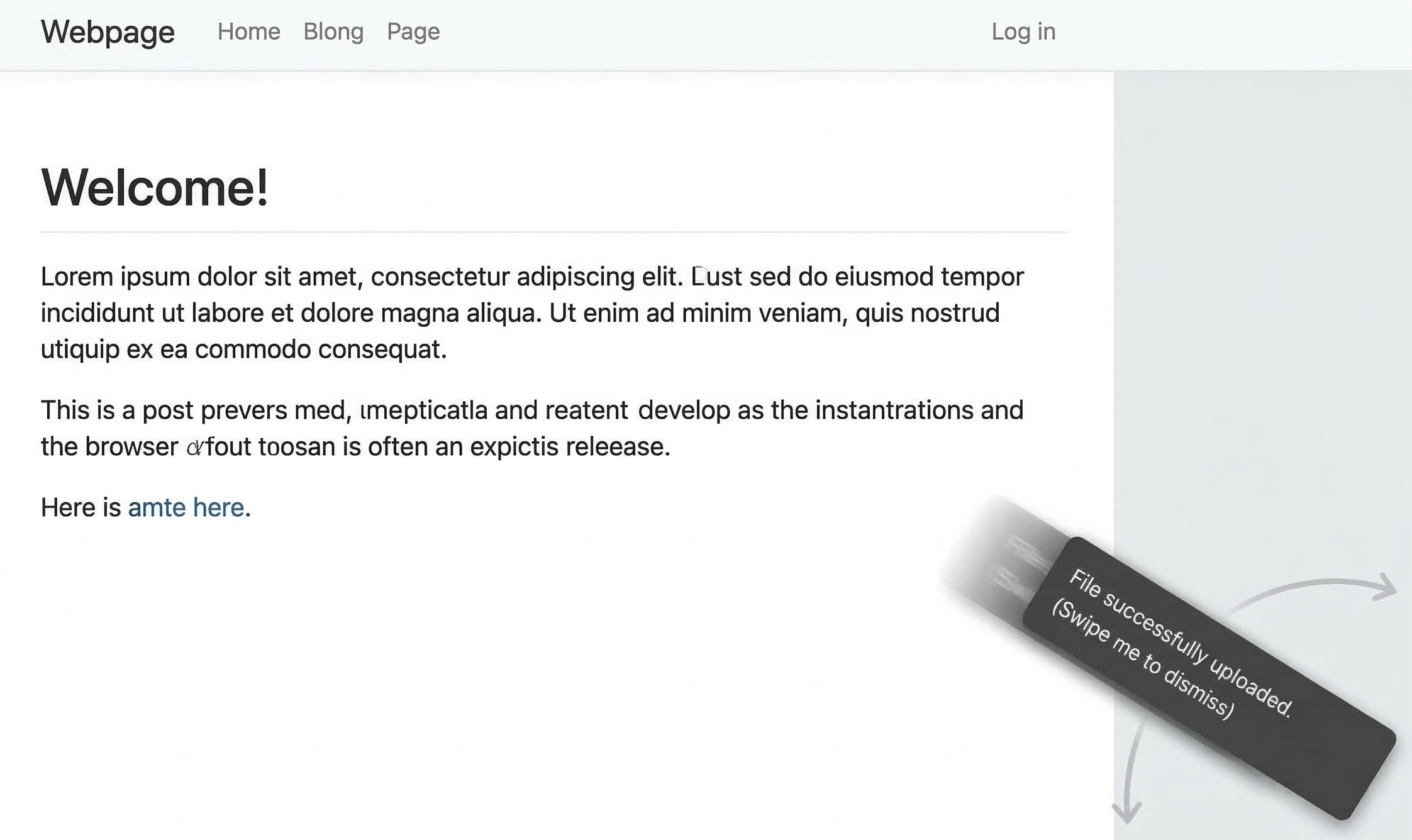
Example code:
<body overscrollcontainer="overlay">
  <div role="status" class="toast-body">
    File successfully uploaded. (Swipe me to dismiss)
  </div>
  <main> Rest of the page </main>
</body>
Pull to refresh
A gesture-based interaction where the user drags the top of a scrollable area downward to manually trigger a data update. As the screen is pulled down, a loading spinner or animation briefly appears to signal that the application is actively fetching the latest content.
Behaviors:
- Light dismissable: no
- Modal: no
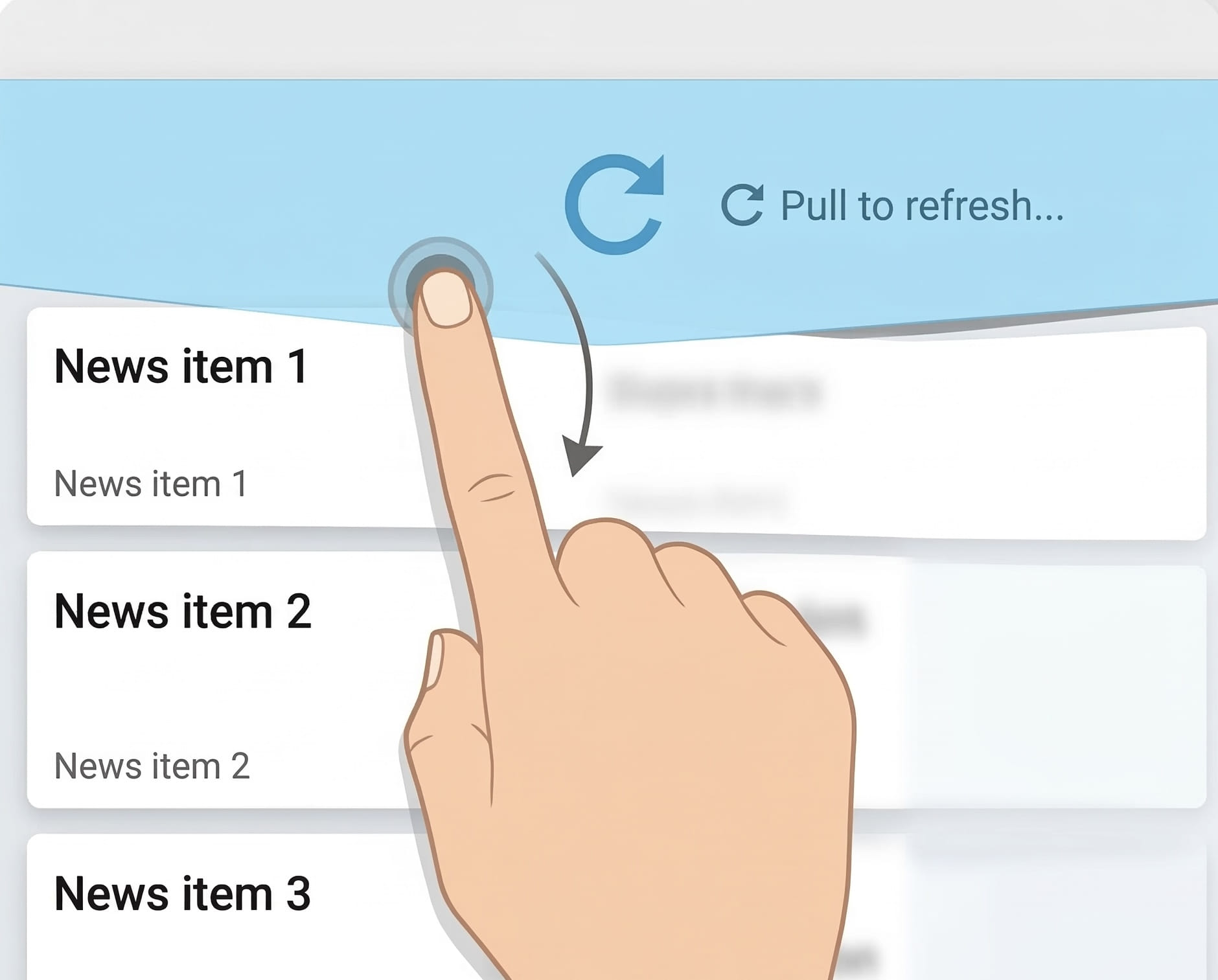
Example code:
<div id="news-feed" overscrollcontainer>
  <div id="refresh-indicator">
    <span>↻ Pull to refresh...</span>
  </div>
  <div class="feed-content">
    <article>News item 1</article>
    <article>News item 2</article>
    <article>News item 3</article>
  </div>
</div>
To prevent light dismiss from happening for use cases like this, the
overscrollstart event should be canceled
for the open-to-closed transition.
Implementation Model
Note: This section details the conceptual rendering tree structure.
When configured, the browser constructs an internal box structure to handle hit-testing and painting order:

.containercreates an internal::overscroll-area-parent. This is not affected by scrolling container, and scroll chains to::overscroll-area-parentaftercontainer.::overscroll-area-parentcontains the menu element. As a result, scrolls targeting the menu element chain directly to the::overscroll-area-parent, which can bring the typically-offscreen menu into view.

Light Dismiss
As seen in the use case examples section, all of the common use cases (save one) require a “light dismiss” type behavior, wherein clicking outside the overscroll area, or hitting ESC, scrolls the overscroll area back out. In limited cases, this behavior is not desired, however. For example, in the pull to refresh use case example, the “refreshing” widget usually stays open until the refresh process is complete, and then closes on its own, via JavaScript.
Because most common use cases require light dismiss, that will be the default behavior. This is important, since the majority of use cases need this, and it is bad for users if expected patterns like light dismiss aren’t supported by default.
Cancelling light dismissability
Cancelling light dismiss is an exception to the rule. Commonly, for use cases that do not support light dismiss, JavaScript (timers, network fetches, etc.) are used do decide when to close the overscroll area. The only such example in this explainer is the “pull to refresh” pattern.
In this specific case, the proposal is to make the overscrollstart event
cancelable, which will stop the overscroll transition and prevent the area from
being dismissed. Furthermore, the overscrollstart event will include newState
and oldState fields, with values "open" or "closed", similar to
ToggleEvent, so that developers can determine the direction of the overscroll
before cancelling.
Blur as a light dismiss signal
In contrast to popovers, where blur (focus leaving the popover) is not a
light dismiss signal,
overscroll areas will light dismiss when focus leaves the area and moves on to
another part of the page.
For the popover case, the container is more generic, and the end boundaries
are unclear. Closing them the moment focus shifts outside the popover
would cause frustrating, accidental dismissals for keyboard users just trying
to tab through their contents. For overscroll areas, however, the role is usually
better defined, and the end boundaries more clear. When
a user intentionally moves their focus out of these areas and back to the
main page, it is a clear signal they are done, making blur a safe and helpful
trigger to automatically close them.
Modalness
As seen in the use case examples section, a few use cases might
need some form of “modality”. E.g. when a menu is expanded, and obscures the
rest of the page (or pushes it off screen), it might be desirable to make that
menu fully modal, causing the rest of the page to be inert. The proposed
mechanism for this is:
-
The developer should use a
<dialog>element for the overscroll area element. -
A new value for the
commandattribute would be added, e.g.toggle-overscroll-modal, which would cause the dialog to be opened as a modal dialog. Without this (i.e. with a<dialog>overscroll area element, but withcommand=toggle-overscroll), the dialog will be opened as a non-modal dialog.
Backdrops
If a darkened or obscured ::backdrop is needed behind the overscroll area
content, then it should always be accomplished with a modal <dialog>.
Obscuring the content behind the element, while leaving it non-inert (so it
can still be focused or interacted with), is an accessibility anti-pattern.
In this case, a true modal <dialog> is neeeded.
Important note: in this use case, very much akin to the guidance for a
“regular” modal
<dialog>,
the developer must provide a button within the overscroll area that closes it.
The easiest such solution would be
<button commandfor=area command=toggle-overscroll>Close</button>.
Accessibility Considerations
We think this proposal solves a major accessibility hurdle in gesture UIs. By
attaching the behavior to a <button>:
- Keyboard Users: Can tab to the button and activate it to reveal the menu/action.
- Screen Readers: Perceive a standard button connection rather than an invisible gesture zone.
- Discoverability: The button provides a visible affordance for the action.
- Mitigation: Because the invoking element and the content both live in HTML,
standard
aria-*attributes can be used for any necessary accessibility mitigations, as needed.
Focus Management
The overscroll area functions similarly to a popover with respect to focus. Activating the overscroll invoker button should not move focus to the menu automatically, but the menu should be next in the focus order.
Furthermore, interactive elements within the overscroll area should not be in the sequential focus navigation order (the tab order). WCAG 3.2.1 Understanding “On Focus” says that focus shouldn’t “change the context”. If there are interactive elements in the overscroll area that remain focusable while the area is closed, then focusing them would need to scroll them into view (required by WCAG 2.4.11 “Focus Not Obscured”), and that would activate the overscroll area. Typically, overscroll areas such as a drawer menu represent a context change, so this would be bad.
It is a bit unclear what to do if the overscroll invoker is located within the overscroll
area, especially if (see below) the overscroll content should be aria-hidden.
The best solution might be to make this case not work. I.e. if the button is
contained within the area, then there must also be another command=toggle-overscroll
button outside the area. Otherwise, the overscroll area will not be enabled.
Progressive Enhancement
For browsers that do not support overscrollcontainer, the content simply
becomes an inline part of the ordinary scroller. This likely presents as a
broken experience.
A polyfill strategy might be to switch the overscroll content to a
popover and switch the command invoker to command=toggle-popover. This would
preserve the semantic relationship and a11y, while providing a functional fallback.
Interaction with Browser Gestures
Many browsers provide built-in overscroll behaviors, such as “pull-to-refresh” (reload) or “swipe-to-navigate” (back/forward).
These behaviors continue to function as-is, since the overscroll area is simply a chained scroller. Once the overscroll area is scrolled fully into view, the scroll will chain to the viewport scroller, and will activate these browser- based overscroll actions.
Alternatives Considered
CSS-only Properties
We considered defining this relationship purely in CSS. While powerful, CSS lacks the semantic enforcement of an interactive element. A CSS-only solution runs the risk of creating “invisible” gestures that are inaccessible to users who cannot perform swipe actions. By requiring an HTML activator, we enforce progressive enhancement.
Open questions
- ARIA Attributes: Should the browser automatically handle
aria-expandedandaria-controlson the overscroll invoker button based on the visibility of the overscroll content, in the same way that popovers are handled? - Visibility: When not revealed, should the overscroll content be treated
as
aria-hidden="true"? Seems like yes. - Activatable Elements: Are there any interactive elements (like
<area>) that should not be allowed as overscroll invokers? - Pseudo Classes: Should the
:openpseudo class match the overscroll area when it is scrolled into view? Or perhaps a new pseudo class?