 Open UI
 Switch Attribute (Explainer)
- Authors
- Andres Regalado Rosas
- Created
- Last Updated
Overview
Switch controls (also called toggles) are binary on/off controls that take immediate effect, as opposed to checkboxes which typically require form submission. They are common across native platforms (iOS, Android, Windows, macOS) and web applications (settings pages, feature toggles, consent dialogs, dark mode switches).
Despite being one of the most commonly implemented UI components on the web, HTML does not yet standardize a native switch control. The Open UI component research identified switches as a high-priority gap in the platform. The WHATWG HTML PR #9546 proposes filling this gap by adding a switch attribute to <input type="checkbox">.
<label>
  <input type="checkbox" switch>
  Dark mode
</label>
Alternative proposal
There is a switch element proposal at Open UI that would introduce a standalone <switch> element. This explainer focuses on the attribute approach (<input type="checkbox" switch>). See Alternatives Considered for a comparison.
An implementation of the attribute approach has shipped in stable Safari since version 17.4 (https://github.com/whatwg/html/pull/9546#issuecomment-1865357407).
Use Cases
A switch can be used anywhere a user toggles a binary state with immediate effect:
- Settings pages (dark mode, notifications, privacy preferences)
- Feature toggles (enable/disable functionality)
- Consent dialogs (accept/reject cookies)
- Accessibility preferences (reduce motion, high contrast)
Non-Goals
- Replacing component library switches for applications that need highly custom behavior
- Providing an API that covers every possible switch variant (loading states, multi-position switches, etc.)
- Defining a switch customization API before the broader
appearance: basemodel reaches consensus - Breaking backward compatibility with existing checkbox behavior
User-Facing Problem
End-users encounter toggle switches on nearly every website and app (settings pages, preferences, feature toggles, consent dialogs). These controls look and behave consistently across native platforms (iOS, Android, desktop OS settings), but on the web every implementation is different.
This inconsistency leads to:
- Unreliable accessibility: Screen reader announcements vary depending on how the developer built the switch. Some announce “checkbox,” some announce “switch,” and some announce nothing useful.
- Broken keyboard navigation: Custom implementations often miss keyboard handling, leaving keyboard-only users unable to toggle settings.
- Inconsistent interaction patterns: Some switches toggle on click, some on drag, some on both. Users cannot predict behavior.
- Performance cost: Users on low-end devices pay for JavaScript bundles that reimplement what should be a native control.
Today, developers have three options to implement switches, none of which adequately serve end-users:
1. JavaScript component libraries
// React + Material UI
import Switch from '@mui/material/Switch';

function Settings() {
  const [checked, setChecked] = useState(false);
  return (
    <FormControlLabel
      control={<Switch checked={checked} onChange={(e) => setChecked(e.target.checked)} />}
      label="Dark mode"
    />
  );
}
Requires a framework, a component library dependency, and JavaScript for basic toggle functionality. Accessibility quality depends entirely on the library author.
2. CSS-only switches using hidden checkboxes
<label class="switch">
  <input type="checkbox">
  <span class="slider"></span>
</label>
.switch {
  position: relative;
  display: inline-block;
  width: 60px;
  height: 34px;
}
.switch input {
  opacity: 0;
  width: 0;
  height: 0;
  position: absolute;
}
.slider {
  position: absolute;
  inset: 0;
  background-color: #ccc;
  border-radius: 34px;
  transition: 0.4s;
  cursor: pointer;
}
.slider::before {
  content: "";
  position: absolute;
  height: 26px;
  width: 26px;
  left: 4px;
  bottom: 4px;
  background-color: white;
  border-radius: 50%;
  transition: 0.4s;
}
input:checked + .slider { background-color: #2196F3; }
input:checked + .slider::before { transform: translateX(26px); }
The input is visually hidden; the “switch” is a sibling <span> styled to look like a toggle. This approach is fragile, hard to maintain, and screen readers announce it as “checkbox” rather than “switch.”
3. role="switch" on generic elements
<div role="switch" tabindex="0" aria-checked="false" aria-labelledby="theme-label" id="theme-switch">
  <span class="track">
    <span class="thumb"></span>
  </span>
  <span id="theme-label">Dark mode</span>
</div>
const sw = document.getElementById('theme-switch');
sw.addEventListener('click', () => {
  const checked = sw.getAttribute('aria-checked') === 'true';
  sw.setAttribute('aria-checked', String(!checked));
});
sw.addEventListener('keydown', (e) => {
  if (e.key === ' ' || e.key === 'Enter') {
    e.preventDefault();
    sw.click();
  }
});
Developers must reimplement keyboard handling, state management, and ARIA attributes from scratch. Form participation requires additional workarounds like ElementInternals or hidden inputs, making the pattern error-prone.
Together, these approaches lead to inconsistency and accessibility gaps, and some require unnecessary JavaScript for a basic control.
Design
Proposed Approach
<input type="checkbox" switch>
Adding the switch attribute to a checkbox changes its native appearance and accessibility role to a switch control.
Basic Usage
<!-- Simple switch -->
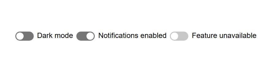
<label>
  <input type="checkbox" switch>
  Dark mode
</label>

<!-- Pre-checked -->
<label>
  <input type="checkbox" switch checked>
  Notifications enabled
</label>

<!-- Disabled -->
<label>
  <input type="checkbox" switch disabled>
  Feature unavailable
</label>
Appearance and Customization
In the initial scope of this proposal, switches use appearance: auto. This allows the user agent to provide a native switch appearance appropriate for the platform.
This proposal does not define a switch-specific customization API. Styling of the switch’s internal parts will instead be considered as part of the broader cross-control work on appearance: base and form-control pseudo-elements.
Related CSSWG discussions include the incremental rollout of appearance: base and when form-control pseudo-elements should be exposed.
Form Participation
The switch behaves identically to a checkbox for form submission:
<form>
  <input type="checkbox" switch name="darkmode" value="on">
  <button type="submit">Save</button>
</form>
When checked, submits darkmode=on. When unchecked, omits the field (standard checkbox behavior).
Animation
With appearance: auto, the exact rendering and animation are defined by the user agent. A user agent can animate the track and thumb when the checked state changes without requiring author JavaScript.

APIs
Properties and Attributes
| Property Name | Attribute Name | Type | Default Value | Description |
|---|---|---|---|---|
checked | checked | boolean | false | Indicates if the switch is in the “on” state. |
value | value | string | "on" | The value submitted with the form when checked. |
name | name | string | "" | The name of the control for form submission. |
disabled | disabled | boolean | false | Disables the control, preventing user interaction. |
required | required | boolean | false | Indicates the switch must be checked for form validation. |
form | form | string | "" | Associates the element with a form whose id is this value. |
switch | switch | boolean | false | When present on a checkbox, renders as a switch control. |
Events
| Event Name | Bubbles | Composed | Cancellable | Description |
|---|---|---|---|---|
change | true | false | false | Fired when the checked state changes. |
input | true | true | false | Fired when the user commits a value change. |
What the Attribute Approach Cannot Do
There are use cases that the attribute approach cannot handle. These require real DOM children inside the switch, which is not possible because <input> cannot have child elements.
- Loading spinner in the thumb: showing a rotating animation while an async action completes
- Avatar or photo in the thumb: e.g. a user profile picture that slides with the toggle
- Multi-line track content: a title + subtitle inside the track
- Nested interactive elements: e.g. a settings button or slider embedded in the thumb
- Tooltip anchored to the thumb: e.g. a popover that follows the thumb position

These are real limitations. However, none of these patterns appear in the popular component libraries surveyed, suggesting they are edge cases rather than common needs. The alternatives section below describes approaches that could handle these cases in the future.
Behavior
States and Interactions
| State Group | States | Initial State | Description | Interaction/Transition |
|---|---|---|---|---|
checked | true/false | false | The current on/off state of the switch. | Changed on click, touch, Space key (when focused), or drag gesture. |
disabled | true/false | false | When true, disables the control. | No interaction. Controlled programmatically. |
focused | true/false | false | Whether the switch has keyboard focus. | Tab key navigation. |
User Interaction
- Click/tap: Toggles the switch
- Space: Toggles the switch when focused
- Drag: Slide the thumb to toggle (similar to
<input type="range">)
Accessibility
The switch attribute maps to the switch role in the accessibility tree.
- Screen readers: Announce the control as a “switch” rather than a “checkbox”
- Keyboard: Space key toggles (same as checkbox)
- States: The accessibility checked state is automatically mapped from the
checkedproperty - Labels: Standard
<label>association works unchanged
Keyboard Navigation
| Key | Description |
|---|---|
| Space | Toggles the switch when focused. |
| Tab | Moves focus to the next focusable element. |
Globalization
The switch adapts to the current text direction:
| Writing mode | Direction | “on” position |
|---|---|---|
| horizontal-tb | Left to right | right side |
| horizontal-tb | Right to left | left side |
Privacy
This proposal introduces no new privacy concerns. The switch attribute:
- Does not add new network requests or data exposure
- Does not change form submission behavior (same as checkbox)
- Does not expose any new information that could be used to identify or track users
Security
The switch attribute introduces no new security capabilities:
- Does not require new permissions or capabilities
- Does not execute scripts
- Reuses the existing checkbox state, interaction, and form-submission model
Alternatives Considered
1. New <switch> element
<switch>
  <track>
    <toggled></toggled>
    <untoggled></untoggled>
  </track>
  <thumb></thumb>
</switch>
Pros
- Clean API, purpose-built for the use case
- Allows child content directly (track text, icons, spinners, avatars)
- Not tied to existing checkbox semantics
Since a <switch> element can hold child elements, the use cases listed above as unattainable with the attribute approach would be straightforward:
<!-- Loading spinner in thumb -->
<switch>
  <thumb><span class="spinner"></span></thumb>
</switch>

<!-- Avatar in thumb -->
<switch>
  <thumb><img src="avatar.jpg" alt="User"></thumb>
</switch>

<!-- Multi-line track content -->
<switch>
  <track>
    <span class="title">Dark Mode</span>
    <span class="subtitle">enabled</span>
  </track>
</switch>

<!-- Nested interactive -->
<switch>
  <thumb><button onclick="openSettings()">⚙</button></thumb>
</switch>

<!-- Tooltip anchored to thumb -->
<switch>
  <thumb><div class="tooltip">Notifications ON</div></thumb>
</switch>
Cons
- Must reimplement all checkbox infrastructure (form participation, label association, ARIA, keyboard handling,
:checkedpseudo-class, disabled/readonly states, constraint validation) - Higher spec complexity and implementation cost
- Not backwards compatible
- The use cases that truly require child content (spinners, avatars, nested interactives) do not appear in any of the 44 design systems surveyed. Most inner content found in the survey is presentational, so adding a new element solely for those cases would introduce significant complexity before the broader form-control customization model is settled.
Why we prioritize the attribute approach
The attribute approach gets a native switch into developers’ hands faster and with less risk:
- No new infrastructure needed. The attribute reuses checkbox form participation, label association, keyboard handling,
:checked, disabled/readonly states, and constraint validation. A new element must reimplement all of these from scratch. - Backwards compatible. In older browsers,
<input type="checkbox" switch>renders as a working checkbox. A<switch>element would render as nothing (or need a polyfill). - The child content gap is small. The cases that truly require DOM children (spinners, avatars, nested interactives) do not appear in any of the popular component libraries surveyed. This proposal prioritizes native semantics and behavior while deeper visual customization follows the broader form-control customization model.
- Not mutually exclusive. Shipping the attribute now does not prevent a future
<switch>element for advanced use cases.
For more on the element approach, see the Open UI Switch Element Explainer.
2. A new input type (type="switch")
Pros
- Clean, obvious API
- Distinct from checkbox
Cons
- No backwards compatibility (renders as
type="text"in browsers that don’t support it) - Would need a separate processing model even though it is semantically identical to a checkbox
- Duplicates all checkbox infrastructure
Why we prioritize the attribute approach
The attribute approach (<input type="checkbox" switch>) provides the same benefit while remaining backwards compatible with older browsers (renders as a checkbox).
Stakeholder Feedback / Opposition
| Vendor | Position | Notes |
|---|---|---|
| WebKit/Safari | Positive (shipped) | Shipped unflagged since Safari 17.4. WebKit’s experimental pseudo-elements (::slider-thumb, ::slider-track) remain behind a flag and are not part of this proposal’s initial scope. |
| Mozilla/Firefox | Under review | Standards position #990 |
Resources
- WHATWG HTML PR #9546 - Add switch attribute
- Open UI Switch Explainer (element approach)
- WebKit Blog: An HTML Switch Control
- CSSWG issue #10804 - Incremental rollout plan for form controls
- CSSWG issue #12365 - Should new pseudo-elements be restricted to base appearance mode?
- HTML Spec: The input element
- ARIA in HTML: switch role
- ARIA Authoring Practices: Switch Pattern
Acknowledgements
Thanks to the following for prior art and discussion that informed this proposal:
- Ana Sollano Kim and Jacques Newman for their help drafting this explainer and throughout the switch attribute discussion
- The Open UI community group for extensive switch component research
- WebKit team for the initial implementation and blog post