 Open UI
 Tabs (Editor's Draft)
Tabs Component Specification
Overview
Tabs are a set of layered sections of content, known as tab panels, that display one panel of content at a time. Each tab panel has an associated tab element, that when activated, displays the panel. Tabs allow one-at-a-time, non-sequential viewing over a series of thematically grouped, state independent and labelled sections.
Background
Relevant historical or background information, related existing issues, etc.
Use Cases
-
Steve is researching for an upcoming vacation for him and his family. He opens his web browser and opens a new tab to make a rental car reservation and another for his flight information. Steve can quickly switch back and fourth between tabs to get the information he needs for the rental car reservation.
-
Monika visits a website to learn how to fix her leaky sink. The website displays a vertical tab interface with each step. Monika can jump ahead steps or go back to previous steps by selecting various tabs.
Non-goals
A list of use cases, features, or functionality which are not goals for the component.
Features
- Orientation: Allows the tab list to be oriented horizontally above the tab content or vertically to the left or right (depending on language region) of the tab content.
- Supplemental content: Offers a way to add content via start and end to the left and/or right (depending on language region) of the the tab list.
- ActiveIndicator: Offers a way to add or remove an active indicator that highlights the currently active tab and animates to the next active tab. Defaults to true.
- ActiveTab: Provides a reference to the currently active tab vis the
changeevent. - ActiveId: Provides a way to set the active tab.
Risks and Challenges
Tabs has specific guidance on DOM structure by the WC3. This structure lacks logical groupings by separating the tab from its content. Some component libraries compensate for this by creating some kind of intermediary grouping that makes it easier for app authors to implement. Even though the DOM structure disassociates that logical grouping. While other component libraries stick to the DOM structure model.
Some scenarios require an indicator that highlights the currently active tab then animates to the next activated tab. Most solutions rely on finding active tab’s position on screen and then preforming some math to get the position. This works for most cases but if the tab list repositions itself either by window resizing or other layout changes the active indicator is no longer aligned properly.
Prior Art/Examples
Design Systems
Tabs Implementations
Design
Describe the design of the component, thinking through several perspectives:
- A customer using the component on a web page.
- A developer building an app with the component and interacting through HTML/CSS/JavaScript.
- A designer customizing the component.
API
Outline the key elements of the component’s public API surface, taking into consideration conformance guidelines. Make sure to discuss differences and rationalizations. Consider high and low-level APIs. Attempt to design a powerful and extensible low-level API with a high-level API for developer/designer ergonomics and simplicity.
Properties and Attributes
Tabs
| Property Name | Attribute Name | Type | Default Value | Description |
|---|---|---|---|---|
orientation | orientation | enum | horizontal | horizontal or vertical |
activeid | activeid | string | id of the active element. | |
activeindicator | activeindicator | boolean | true |
Tab
| Property Name | Attribute Name | Type | Default Value | Description |
|---|---|---|---|---|
id | id | string |
Tab Panel
| Property Name | Attribute Name | Type | Default Value | Description |
|---|---|---|---|---|
id | id | string |
Methods
Example Table
| Signature | Description |
|---|---|
increment(value: number = this.step): void | Increments the value of the component by the amount specified by step, clamped within min/max values. |
decrement(value: number = this.step): void | Decrements the value of the component by the amount specified by step, clamped within min/max values. |
Events
Example Table
| Event Name | Detail Type | Bubbles | Composed | Cancellable | Dispatch Behavior |
|---|---|---|---|---|---|
change | none | true | true | false | fires when component activetab updates. |
Appearance
Screenshots and/or description of the basic appearance of the component.
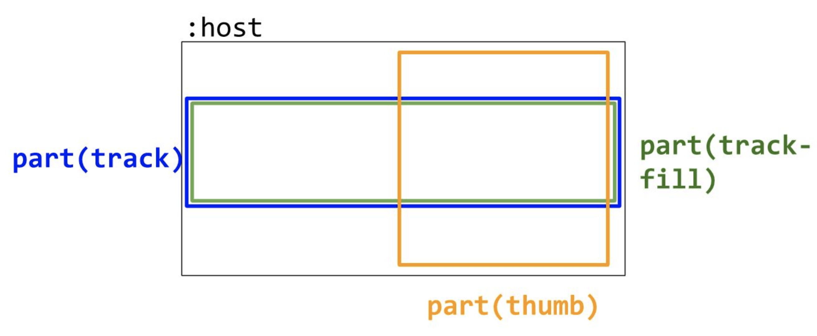
Anatomy
Outline the component’s structure with a diagram of its render tree. Enumerate key areas of visual composition and customization.
Diagram
Example
DOM Structure
Template:
<div class="tabs" class="tabs">
  <slot class="start" name="start" part="start"></slot>
  <div class="tablist" part="tablist" role="tablist" aria-label="Sample Tabs">
    <button
      class="tab"
      part="tab"
      role="tab"
      aria-selected="true"
      aria-controls="panel-1"
      id="tab-1"
      tabindex="0"
    >
      Tab One
    </button>
    <button
      class="tab"
      part="tab"
      role="tab"
      aria-selected="false"
      aria-controls="panel-2"
      id="tab-2"
      tabindex="-1"
    >
      Tab Two
    </button>
    <button
      class="tab"
      part="tab"
      role="tab"
      aria-selected="false"
      aria-controls="panel-3"
      id="tab-3"
      tabindex="-1"
    >
      Tab Three
    </button>
    <div class="activeindicator" part="activeindicator"></div>
  </div>
  <slot class="end" name="end" part="end"></slot>
  <div
    class="tabpanel"
    part="tabpanel"
    id="panel-1"
    role="tabpanel"
    tabindex="0"
    aria-labelledby="tab-1"
  >
    Content of the first tab
  </div>
  <div
    class="tabpanel"
    part="tabpanel"
    id="panel-2"
    role="tabpanel"
    tabindex="0"
    aria-labelledby="tab-2"
    hidden
  >
    Content of the second tab
  </div>
  <div
    class="tabpanel"
    part="tabpanel"
    id="panel-3"
    role="tabpanel"
    tabindex="0"
    aria-labelledby="tab-3"
    hidden
  >
    Content of the third tab
  </div>
</div>
Slots
Tabs
| Slot Name | Description | Fallback Content |
|---|---|---|
start | ||
end |
Tab
| Slot Name | Description | Fallback Content |
|---|---|---|
start | ||
end |
Host Classes
What classes does the component add to the host element?
| Class Name | Description |
|---|
Slotted Content Classes
What classes on slotted content does the component respond to?
| Class Name | Description |
|---|
CSS Parts
Tabs
| Part Name | Description |
|---|---|
tabs | |
tablist | |
tab | |
tabpanel | |
activeindicator |
Behavior
States and Interactions
Tabs can either be controlled or uncontrolled, meaning if activeid is passed the app author is taking control of the selected tab. When the change event fires it updates the activeid and pass a reference to the activetab.
List key component states, valid state transitions, and how interactions trigger state transitions.
- Are states changed as a result of keyboard? mouse? touch?
- Are there corresponding keyboard interactions for mouse/touch interactions?
- Are some events triggered on key down vs key press? On swipe?
Example Table
| State Group | States | Initial State | Description | Interaction/Transition |
|---|---|---|---|---|
disabled | true/false | false | When true, disables the control, preventing user interaction and displaying the control with a disabled appearance. | No interaction. Controlled programmatically. |
Accessibility
Consider the accessibility of the component.
Keyboard Navigation and Focus
-
Arrow vs tabbing key behavior
-
Modifier key effects (e.g. shift, ctrl, meta)
-
Does this component use focus delegation?
-
What is the behavior around disabled tabs?
-
What is the behavior around tabs that move around in the UI (i.e. using flexbox order to move the active tab to be “first” in the tabgroup?
Example Table
| Key | Description |
|---|---|
| Up/Right | Increments the value of the component by calling the increment method. If the shift modifier is pressed, increases by 10x the step value. |
| Down/Left | Decrements the value of the component by calling the decrement method. If the shift modifier is pressed, decreases by 10x the step value. |
Form Input
Does this component integrate with form submission, form validation, etc.? Can integration be accomplish with standard APIs or are special work-arounds required?
Use with Assistive Technology
Are there any details about shadow dom, focus delegation, or aria attributes that need special attention?
Globalization
Tabs should mirror in RTL languages, meaning the tabs and tab content should flip direction.
Security
Are there any security implications surrounding the component?
Performance
Are there any performance pitfalls or challenges with implementing the component? (examples below)
- If the component renders a loop of items, should certain areas be considered for virtualization?
- If the component needs to measure an area before rendering, how will jank be avoided?
- If any measuring is needed at all, can rAF techniques help queue measures and prevent synchronous reflows?
Dependencies
Will implementing the component require taking on any dependencies?
- 3rd party libraries
- Upcoming standards we need to polyfill
- Do any dependencies bring along an associated timeline?
Platform Requirements
Are there any core web platform features that are needed to implement this component well?
Tooling
Are there any special considerations for DevTools? Will tooling changes need to be made? Is there a special way to light up this component in DevTools that would be compelling for developers/designers?
Resources
Next Steps
What next steps, if any, are there? Is there some functionality that would be a nice-to-have or a common feature in other implementations that could be added but is not considered part of the MVP? Link all feature additions, modifications, bugs, or editorial change issues.