 Open UI
 Filterable Select (Explainer)
- Authors
- @josepharhar
- Created
- Last Updated
- Feedback
- https://github.com/openui/open-ui/issues/924
- WHATWG Issue
- https://github.com/whatwg/html/issues/12050
Participate
- File an Issue: Please file a new OpenUI issue or comment on WHATWG HTML Issue #12050.
- Related Discussion & Issues: OpenUI Github Issue #924, Issue #847, Issue #1441, Issue #1491
- Related Proposals: Customizable Select, Combobox
Introduction
Filterable Select is a proposal to enable user text-input filtering for HTML <select> elements. While the native <select> element enforces choosing from a predefined set of options—and has recently been made fully stylable via Customizable Select (appearance:base-select)—it currently lacks any native mechanism for users to filter options by typing into an input field.
Three architectural syntaxes (Option A, Option B, and Option C below) have been explored and discussed. Options A and B have been prototyped and implemented in Chromium behind the Experimental Web Platform Features flag: chrome://flags/#enable-experimental-web-platform-features
This proposal introduces a way to declaratively add a filtering text field to a select element, paired with native CSS and DOM primitives (search attribute, beforefilter event, :filtered pseudo-class, and :active-option selection states). This enables accessible, high-performance option filtering without requiring heavy JavaScript widget replacements.
User-Facing Problem
End-users frequently encounter <select> elements containing dozens or hundreds of predefined choices (such as long lists of countries, repositories, organization members, or product categories).
On the web today:
- Poor built-in search experience: In standard dropdown
<select>controls, typing alphanumeric characters only performs a primitive “first-character jump” or basic prefix matching on the closed select trigger. Users cannot see what they have typed or search for options. - Accessibility and reliability trade-offs of custom controls: Because native
<select>controls have historically lacked both stylability and filtering, developers build custom script-based dropdown replacements. As noted in the Custom Control UI Explainer and the 2020 MDN Browser Compatibility Report, custom controls frequently fail to achieve the level of accessibility, keyboard support, interoperability, and performance provided by native browser controls.
Goals
- Declarative option filtering for
<select>: Allow developers to associate a text input or filter attribute with a<select>element so typing filters visible options while enforcing selection from the predefined<option>items. - Dynamic & server-side option loading: Support custom script-based filtering and asynchronously fetching or appending options from a server in response to user input (enabling remote option search and DOM virtualization).
- Stylability & animation support: Allow CSS styling of filtered-out options (
option:filtered) and highlight active keyboard-navigated options (option:active-option). - Extensible filtering logic: Provide sensible browser defaults (
startswith,includes,pattern) while exposing a script event (beforefilter) for dynamic or custom filtering algorithms.
Non-goals
- Arbitrary text input submission (Combobox): Allowing users to submit arbitrary, custom text strings that do not correspond to an existing
<option>is explicitly out of scope. That use case is addressed by<input list>+<datalist>in the separate Combobox Explainer.
User Research
Form control customization surveys consistently highlight option search as the top missing capability of native selects:
- MDN & Industry Surveys: According to developer survey findings compiled by Greg Whitworth (survey reference), “not being able to create a good user experience for searching within the list” ranked as the #1 design pain point for
<select>. - Design System Analysis: Many component libraries, including GitHub Primer and Ant Design), maintain a distinct “Filterable Select” or “Select with Search” component alongside their free-form “Autocomplete/Combobox” component.
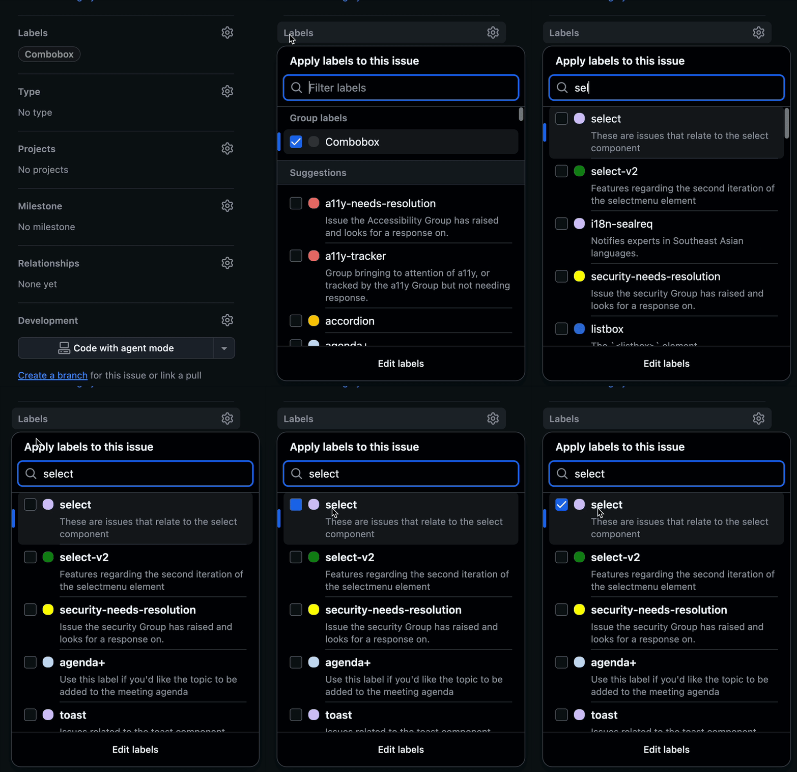
The GitHub labels picker popup is a representative real-world target use case where a user filters a bounded set of colored label items:
Proposed Approach
We propose allowing an <input type=text> element or a dedicated HTML attribute to act as a filtering trigger for a <select> element. Three architectural syntaxes have been explored:
Option A: Sibling input and listbox/dropdown select using filter attribute
In the sibling approach the <input> references the <select> element via a filter attribute pointing to the <select> element’s id:
<!-- Listbox filterable select -->
<input filter=label-select placeholder="Filter labels...">
<select id=label-select size=4 style="appearance:base-select">
  <option value="bug">Bug</option>
  <option value="enhancement">Enhancement</option>
  <option value="documentation">Documentation</option>
</select>
For dropdown popover <select> controls, authors combine Customizable Select popover triggers with the filter input inside the picker dialog:
<button commandfor=picker command=toggle-popover>
  <selectedcontent for=label-select></selectedcontent>
</button>
<dialog popover id=picker>
  <input filter=label-select placeholder="Search options...">
  <select size=4 id=label-select>
    <option value="bug">Bug</option>
    <option value="enhancement">Enhancement</option>
    <option value="documentation">Documentation</option>
  </select>
</dialog>
Pros:
- Clean HTML parser compatibility: Works today without modifications to HTML parsing rules.
- Direct element access: Authors retain a direct DOM/JavaScript handle to the
<input>element for standard event listeners, custom attributes, and CSS styling. - Flexible composition: Easily accommodates complex picker dialog layouts with auxiliary controls (such as an “Edit labels” button or custom category headers).
Cons:
- Authoring overhead: Requires explicit idref linking between elements.
- Dropdown markup verbosity: Constructing custom dropdown select popovers requires additional HTML (
<dialog popover>,<button>,<selectedcontent>). - Missing popover closing behavior: Selecting an option in a single select does not automatically dismiss the author-defined dialog popover without explicit commands or script. We could try to add fixes to make this work better, but the explicit linking between the picker and the listbox select element is missing.
Option B: Nested input inside select
Alternatively, placing an <input> element directly inside <select> establishes an implicit structural connection. The HTML parser changes and lack of graceful degredation are major issues with this option.
<select>
  <input type="text" placeholder="Filter options...">
  <option value="one">Option One</option>
  <option value="two">Option Two</option>
</select>
Pros:
- Minimal markup: Clean, compact syntax with an implicit parent-child relationship.
- Direct element access: Authors retain direct access to the
<input>element.
Cons:
- HTML parser modifications: Requires changes to HTML parsing rules to allow
<input>inside<select>, which poses site compatibility risks where legacy markup relies on<input>implicitly closing<select>. - No graceful degredation: Even if we did change the HTML parser in a way which hopefully won’t break existing websites by allowing
<input>inside<select>if it comes before the<option>s, non-supporting and older browsers would render a completely broken control because all of the<option>s would be dumped out after the end of the select element. More details here. - Harder to polyfill: HTML parser changes make this pattern difficult or impossible to polyfill.
- Input in scrollable area: Without additional changes, the input element will be included in the scroller for the listbox of options, which is not desired. This could be addressed by adding a new element-backed pseudo-element for the listbox: Issue #1441.
Option C: HTML attribute on <select> (e.g. <select filterable>)
A third approach adds a dedicated attribute directly to <select> (such as filterable or filter), causing the browser to automatically create and manage a filter text input within the select’s picker popup:
<select filterable>
  <option value="bug">Bug</option>
  <option value="enhancement">Enhancement</option>
  <option value="documentation">Documentation</option>
</select>
Pros:
- Minimal markup: Single attribute on the existing
<select>tag. - No parser changes: Avoids HTML parser modifications required for nesting.
Cons:
- No direct access to input element: Authors lack direct DOM/JavaScript access to the generated
<input>element in order to modify attributes or listen to events. - Requires new IDL APIs: Exposing basic attributes and event handling for the generated input element requires adding multiple new IDLs to HTMLSelectElement.
- It may also be useful to expose HTML attributes directly on the select element as new HTML attributes in order to declaratively set the placeholder attribute on the generated input element.
- Input in scrollable area: Without additional changes, the input element will be included in the scroller for the listbox of options, which is not desired. This could be addressed by adding a new element-backed pseudo-element for the listbox: Issue #1441.
Interaction and Focus Model
To ensure seamless simultaneous typing and list navigation:
- Focus remains in
<input>: While the user types and navigates options, DOM focus stays inside the<input>element so character entry is never interrupted. - Virtual highlight with
:active-option: As the user pressesArrowDownorArrowUp, the browser moves the:active-optionpseudo-class across visible (unfiltered)<option>elements in DOM order. - Commit selection on
Enter: PressingEnteror clicking an option selects that<option>, sets the<select>element’s value, and closes the dropdown picker if applicable.
The beforefilter Event
Before the browser runs its internal matching algorithm and updates :filtered states, it fires a cancellable beforefilter event on the <input> element. When event.preventDefault() is called, script takes control to perform custom filtering or asynchronously fetch matching options from a server:
filterInput.addEventListener('beforefilter', async (event) => {
  const query = event.query;
  // Prevent default client-side regex/prefix filtering
  event.preventDefault();

  // Asynchronously fetch matching options from a remote server endpoint
  const response = await fetch(`/api/search-options?q=${encodeURIComponent(query)}`);
  const results = await response.json();

  // Dynamically update `<option>` elements inside the associated `<select>`
  selectElement.innerHTML = results.map(item =>
    `<option value="${item.id}">${item.label}</option>`
  ).join('');
});
CSS Reactive Rendering (:filtered)
Options that do not match the filter query receive the browser-applied :filtered pseudo-class. A User Agent stylesheet rule applies default hiding:
/* User Agent stylesheet default */
option:filtered {
  display: none !important;
}

/* Optional custom author styling for active keyboard option */
option:active-option {
  background-color: #0969da;
  color: white;
}
If the beforefilter event is preventDefault()ed, then none of the options will match :filtered and it is left up to the author to decide how to render the options.
Considerations
Accessibility
There is an active discussion in aria about this proposal here: aria issue 2841
- Focus and Keyboard Navigation: Retaining focus in
<input>while navigating<option>elements viaArrowDown/ArrowUpmirrorsaria-activedescendantpatterns. - Semantic Roles: Authors will not need to use aria or role attributes.
Security & Privacy
- Privacy: Filtering operates entirely locally on option text already present in the client DOM (unless script explicitly initiates network requests via
beforefilter). No sensitive keystroke telemetry is leaked. - Security: CSS filtering via
:filteredand text matching viasearchintroduce no script-execution or HTML-injection vectors.
Internationalization (i18n)
- Case folding: Case folding performed by the browser’s builtin filtering algorithm will be aware of special languages. More details in issue 1366.
- RTL Support: In Right-to-Left (RTL) document layouts, alignment of filter inputs, search indicators, and options automatically mirror according to CSS logical properties.